



Open prompts
en sample 02 AI Image Prompt
en sample 02, its complete AI image prompt, and the XXD Panel 026 · Geometric Order style are free to view and copy.
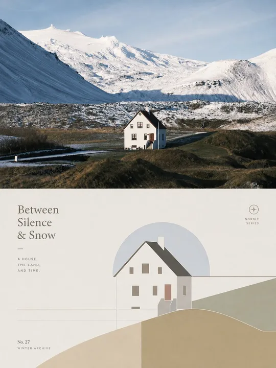
Complete AI image prompt
Please make every photo I upload into its own standalone high-end design poster; no multi-image collages, each photo output separately. The overall composition uses a 3:4 vertical format, with the upper and lower zones strictly 1:1 in height, each taking up 50% of the frame. The upper half keeps the original photo, preserving the subject's structure, real texture, natural light and shadow, and original color atmosphere, applying only a slight high-end photographic color grade so that it has the texture of magazine photography and art exhibitions. To fit the frame, the sky, ground, or environmental background may be extended naturally, but the subject must not be stretched, distorted, or altered. The lower half extracts the most recognizable **subject, outline, pose, and narrative relationships** from the photo and reconstructs them as a minimalist abstract geometric visual expression. Re-summarize the subject with simple geometric shapes, flat color blocks, fine lines, structural lines, and negative space. Do not create a realistic illustration or pile up complex details, but retain clear characteristics so the original object can be recognized at a glance. A small number of horizontal lines, contour lines, spatial dividing lines, or abstract environmental elements may be added according to the relationships in the original image, allowing the composition to retain order and breathing room within its restraint. The composition emphasizes **balance, rhythm, and a humanistic temperament**. The subject in the lower half is the sole visual focus. The overall layout is generally centered but not rigidly symmetrical, establishing a quiet and professional layout order through control of proportions, positive-negative form relationships, variations in density, slight staggered layering, and large areas of negative space. The image should be simple, stable, and restrained, while carrying a touch of gentle spatial undulation and a shallow relief effect, so that the geometric forms seem lightly embossed or slightly raised above the paper surface, creating a delicate and understated three-dimensional layering rather than an obvious 3D effect. Extract the colors from the photo above, but do not copy them mechanically; instead, transform them into a soft color group with a more **humanistic temperament**. Use low-stimulation, warm, and restrained colors such as off-white, warm white, light gray, sand, dusty pink, light ochre, mist blue, and sage green as the foundation. Preserve from the original image the primary and supporting colors with the most character, using a limited palette to create harmonious, quiet, and enduring relationships. The overall colors should be gentle, clear, and rich in cultural and lived-in feeling, avoiding cheap high saturation, distorted muddy gray, a cold technological feel, and ordinary commercial color schemes. Keep text sparse and sophisticated. It should not merely be a place name; instead, distill a concise title in the target language specified by the user from the photo's **theme, identity, emotion, action, time, or metaphor**, paired with a small amount of numbering, state words, or micro-annotations. Text may be arranged naturally along the subject's contour, structural lines, the edge of the negative space, or the image axis, composing together with the graphic in a restrained, sophisticated editorial manner to form a subtle yet designed typographic relationship. The overall reference is international design studios, architectural posters, art exhibition posters, and high-end brand visual systems, presenting a visual temperament that is **high-end, modern, quiet, humanistic, artistic, restrained, and gentle**. Avoid ordinary filters, a cheap vector feel, overly strong 3D, a cartoon feel, an e-commerce feel, and a template feel.
More open images in the “XXD Panel 026 · Geometric Order” style