


Open prompts
en sample 05 AI Image Prompt
en sample 05, its complete AI image prompt, and the XXD Panel 083 · Ugly-Cute Character Journal style are free to view and copy.
Complete AI image prompt
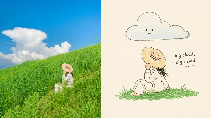
Turn each photograph I upload into a separate premium design poster. Do not combine multiple images; output each photograph separately. Use an overall 3:4 portrait composition, with the upper and lower regions kept at a strict 1:1 height ratio, each occupying 50% of the image.

Retain the original photograph in the upper half, preserving the subject's identity, structure, pose, authentic texture, natural light and shadow, and original colour atmosphere. Apply only subtle, premium colour grading to give it the quality of an art magazine, independent publication, or exhibition image. The surrounding environment may be extended naturally to fit the aspect ratio, but the subject must not be stretched, distorted, or altered.

In the lower half, first reinterpret the photograph instead of directly redrawing it. Extract its most recognisable **subject, silhouette, pose, and narrative relationships**, retain only the one visual core most worth remembering, and actively remove most of the background and irrelevant detail. Then find the photograph's most interesting character, action, contrast, or latent metaphor and develop it into a **deliberately ugly, humorous visual character that remains instantly recognisable**. Exaggerate a proportion, action, expression, or structure where appropriate, giving an ordinary object a touch of absurdity, blankness, awkwardness, or unexpected comedy. Do not merely turn the photograph into line art.

Use an **Ugly-cute naïve doodle / wonky hand-drawn illustration** style: loose, trembling, uneven hand-drawn contours; deliberately inaccurate proportions; moderately abandoned perspective; and clumsy, crooked forms that look slightly “badly drawn,” while keeping every inaccuracy controlled. The central rule is: **drawing it too correctly is failure; it works only when it is a little ugly, a little clumsy, and a little funny.**

Redesign the composition rather than copying the photograph's layout. Keep, as far as possible, only **one subject + no more than one or two genuinely necessary environmental hints**, strengthening the subject's character through enlargement, reduction, eccentric placement, suspension, cropping, or expansive negative space. Do not draw every object in the photograph or create a “household-item inventory.” Let one action, one silhouette, or one absurd relationship carry the whole narrative, making the page simpler and more memorable.

Colour with crayons, coloured pencils, dry brush, or slightly rough flat fills, selecting and simplifying only the few most distinctive and spirited colours from the upper photograph. Allow incomplete fill, slight overspill, local uncoloured gaps, and rubbed grain so the image resembles a private zine or casual sketchbook rather than a commercially polished illustration. Keep the background clean, pale, and broadly empty.

If text appears, add only a very small number of words, short phrases, or handwritten notes that genuinely strengthen the humour or character. Do not restrict the language or impose a fixed title format. Text may interact subtly with the subject, but it must not become a complex information system; it should feel like an offhand complaint, observation, or aside added by the author.

Aim overall for **few, strange, clumsy, precise**: very few elements, slightly strange forms, deliberately clumsy drawing, but accurate judgement of identity and humour. It should resemble an independently published ugly-cute doodle zine—casual, funny, personal, and memorable, yet guided by mature editing and compositional judgement. Avoid full-scene reconstruction, accumulated backgrounds, multiple equal subjects, precise perspective, realistic depiction, beautiful commercial illustration, excessively cute cartooning, and template styling.
More open images in the “XXD Panel 083 · Ugly-Cute Character Journal” style