



Open prompts
en sample 05 AI Image Prompt
en sample 05, its complete AI image prompt, and the XXD Panel 073 · Geometric City Journal style are free to view and copy.
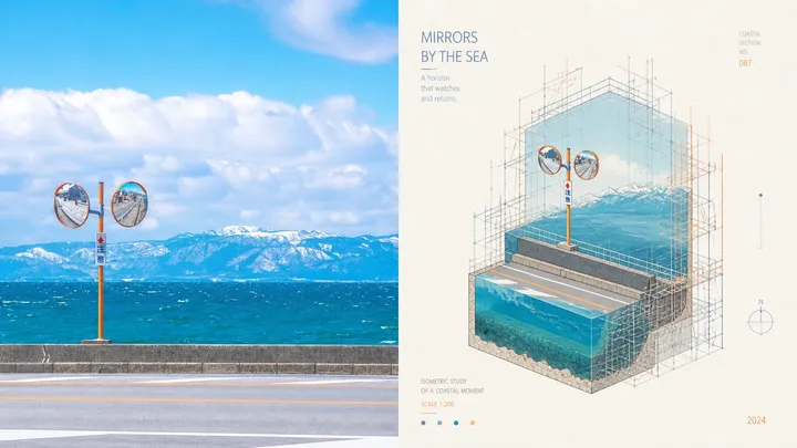
Complete AI image prompt
Please turn every photo I upload into its own standalone high-end design poster. Do not make a multi-image collage; output each photo separately. Use an overall 3:4 portrait composition, with the upper and lower regions in a strict 1:1 height ratio, each occupying 50% of the image.

The upper half retains the original photograph, preserving the subject's identity, structure, pose, authentic texture, natural light and shadow, and original colour atmosphere. Apply only subtle high-end grading so it feels appropriate for an art magazine, independent publication, or exhibition image. The surrounding environment may be extended naturally to fit the canvas, but the subject must not be stretched, distorted, or changed.

In the lower half, extract the subject's most recognisable **outline, structure, pose, and narrative relationships**, then reconstruct them as a minimalist artwork in a **3D miniature architectural landscape** style. Present it through an **isometric view / cut cube composition / perspective of an underwater continental shelf**: the subject resembles a cut-open miniature dimensional scene with correct isometric projection and clear spatial hierarchy. Use a **miniature lighthouse landscape** as the central semantic idea, adapting it flexibly to the source subject while preserving immediate recognisability and the original narrative relationship.

The lower half is not realistic illustration. Compress the subject into an abstract expression of **simple geometric forms, flat colour fields, fine lines, and negative space**. Retain moderately rich structural detail within the minimal system so the work feels both like an architectural diagram and an art poster. The subject should resemble a miniature dimensional model placed on textured white paper, with the character of a **hand-drawn architectural illustration**: precise fine lines, clear layers, and restrained, accurate detail without heavy realistic rendering.

Add a clear **scaffolding logic**. The scaffolding is not arbitrary decoration; it is a rational system that wraps, supports, constructs, or intervenes in the subject's structure and forms spatial order together with it. It may consist of fine horizontal and vertical members with local connection nodes, unfolding around the outer contour, key turns, or dimensional cut faces. It should suggest something being constructed, repaired, surveyed, or exhibited. The view must be accurate and the perspective relationships clear; do not turn it into a floating collage.

Keep the **subject centred, the image balanced, and the order restrained**. Use a few horizontal lines, vertical compositional guides, rings, or sectional boundaries to reinforce space. Set the background on **textured white paper or an extremely pale ivory paper field**: clean, quiet, shadowless or with only the faintest structural depth, and no heavy cast shadow. Preserve ample negative space so the subject appears suspended on an exhibition catalogue or architectural research poster page.

Draw colour inspiration from the upper photograph, then rework it into a **brighter, more translucent, healing, and vital** high-end palette rather than copying exact source values. Preserve the source's hue cues, then moderately brighten, purify, and remove greyness so colours feel more vivid and light. They may form soft yet bright relationships among clear blue, lake cyan, fresh green, bright yellow, coral orange, peach pink, pale violet, and related mixed hues, using warm–cool contrast and value rhythm for refined depth. Avoid dirty, dark, aged, Morandi-muted, cheap candy, or plastic colour.

Text may enter sparingly as a concise English title, number, or year, arranged naturally with the subject, scaffolding, or negative space. Typography should be refined, modern, and restrained, like editorial notation from an international design studio, architecture poster, art exhibition poster, or premium brand visual system, without overpowering the image.

The overall result should feel **high-end, modern, elegant, restrained, and artistic**, combining miniature dimensional landscape, architectural section, isometric view, scaffolding system, and minimalist poster layout. Avoid excessive filters, cheap plastic texture, cartoon styling, an overtly computer-generated feel, templated effects, incorrect projection, and decorative structures without logic.
More open images in the “XXD Panel 073 · Geometric City Journal” style