



Open prompts
en sample 05 AI Image Prompt
en sample 05, its complete AI image prompt, and the XXD Panel 102 · Healing Geometry Journal style are free to view and copy.
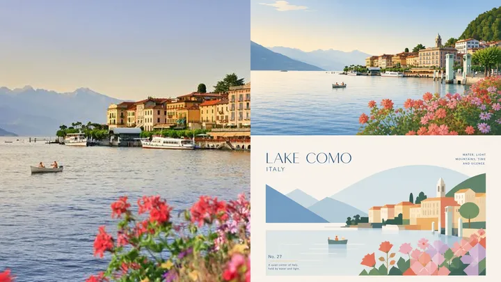
Complete AI image prompt
Please turn each photograph I upload into a separate premium design poster. Do not combine multiple images; output each photograph individually. Use an overall 3:4 portrait composition, divided into upper and lower regions in a strict 1:1 height ratio, each occupying 50% of the image. Preserve the original photograph in the upper half, retaining the subject's identity, structure, pose, authentic texture, natural light and shadow, and original colour atmosphere. Apply only subtle, refined colour grading so it carries the visual quality of an art magazine, independent publication, or exhibition image. The surrounding environment may be extended naturally to fit the format, but the subject must not be stretched, distorted, or altered. In the lower half, extract the most recognisable **subject, contour, structure, pose, and narrative relationships** of the photograph's main subject, retaining only the core image and silhouette most worth remembering, and reconstruct them as a **geometrised, flattened** artistic expression. Do not use realistic illustration or copy details from the original. Instead, compress complex information into a few key visual elements using concise geometric shapes, flat colour blocks, clear contours, fine lines, and whitespace. The source object's most essential identifying features must be preserved so it is immediately recognisable as coming from the same image above. The lower-half composition should feel more professional, with close attention to **layout order, visual centre of gravity, primary and secondary hierarchy, positive–negative shape relationships, the rhythm of whitespace, and the balance of image and text**. The subject may remain centred or shift slightly, but the whole must stay balanced, restrained, and quiet, avoiding complex accumulation. Use off-white or a very pale background intelligently matched to the source image, preserve large areas of whitespace, and let the subject sit like a distilled memory specimen within a clean, rational layout. Extract the brightest, freshest, and most vital colours from the photograph above, reorganising them into a clearer, softer, more healing **“Shenwenist” healing-system** palette. Increase overall lightness and colour purity, and establish the atmosphere through light, clean, warm colour relationships. Colour blocks should be distinct but never harsh, creating a visual sensation that is gentle, fresh, quiet, and alive. Avoid muddy grey, darkness, ageing, heaviness, fluorescent colour, and a cheap candy-like appearance. A small amount of text may enter the composition: add a concise title, number, or micro-annotation, and arrange it naturally with the subject and whitespace. Typography should remain restrained, refined, and editorial, like the small annotations found in an international design studio, architectural poster, art-exhibition poster, or premium brand identity system. It should never overpower the main subject, but should help establish a more sophisticated order between image and text. The overall style should draw on international design studios, architectural posters, art-exhibition posters, and premium brand identity systems, producing a visual result that is **high-end, modern, elegant, restrained, geometric, flat, and strongly healing**. Avoid excessive filters, cheap plastic texture, cartoon styling, an obvious computer-generated look, templated effects, and meaningless decoration.
More open images in the “XXD Panel 102 · Healing Geometry Journal” style