


Open prompts
en sample 06 AI Image Prompt
en sample 06, its complete AI image prompt, and the XXD Panel 072 · Bright Color Journal style are free to view and copy.
Complete AI image prompt
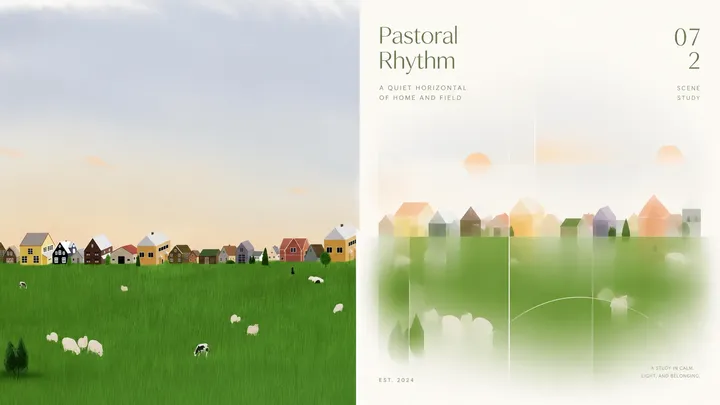
Please turn every photo I upload into its own standalone high-end design poster. Do not make a multi-image collage; output each photo separately. Use an overall 3:4 portrait composition, with the upper and lower regions in a strict 1:1 height ratio, each occupying 50% of the image.

The upper half retains the original photograph, preserving the subject's identity, structure, pose, authentic texture, natural light and shadow, and original colour atmosphere. Apply only subtle high-end grading so it feels appropriate for an art magazine, independent publication, or exhibition image. The surrounding environment may be extended naturally to fit the canvas, but the subject must not be stretched, distorted, or changed.

In the lower half, extract the subject's most recognisable outline, structure, pose, and narrative relationships, then reconstruct them as a minimalist abstract image with a frosted-glass quality. Do not use realistic illustration or add complex detail. Instead, highly summarise and refine the subject through simple geometric shapes, flat colour fields, fine lines, and abundant negative space. Preserve its essential identifying features so viewers immediately recognise that it comes from the same scene above.

The lower half should resemble a designed system of translucent frosted windows or matte-glass graphics. Different areas should carry different degrees of defocus, blur, and translucent overlap. Build varied layers of soft focus inside the subject, along its edges, or within supporting forms, combining a clearly recognisable silhouette with a hazy sense of air. Blur must be hierarchical and region-specific rather than uniformly applied to the whole block. A small number of horizontal lines, vertical compositional guides, or abstract rings may reinforce order and space.

Keep the subject centred, the image balanced, and the rhythm restrained. Use positive and negative form, scale relationships, and controlled whitespace to create refinement. Set the background in ivory or a light family intelligently matched to the source, leaving ample open space so the subject seems suspended in a quiet, clean visual field.

Use the upper photograph's most vital and memorable colours as inspiration rather than copying its exact values. Preserve the source's hue identity first, then brighten, purify, remove greyness, clean, and soften it so the colour becomes more vivid, translucent, and spirited while remaining gentle and healing. It may naturally shift into clear blue, lake cyan, fresh green, bright yellow, coral orange, peach pink, pale violet, and other buoyant mixed hues. Build depth through fresh warm–cool relationships and value differences. Main colours should be distinct but not harsh; one or two brighter warm accents may work like sunlight. The overall colour atmosphere should feel bright, vivid, light, soft, warm, and airy. Avoid dirty colour, ageing, Morandi muting, dark brown filters, fluorescence, and cheap candy colour.

Text may enter sparingly as a concise English title, number, or year, arranged naturally with the subject or negative space. Typography and layout should remain restrained, modern, and refined, like editorial type from an international design studio, architecture poster, art exhibition poster, or premium brand system, without overpowering the image.

The overall result should feel high-end, modern, elegant, restrained, and artistic, emphasising minimalist abstraction, layered frosted glass, vivid healing colour, soft negative space, and professional typography. Avoid excessive filters, cheap plastic texture, cartoon styling, an overtly computer-generated feel, templated effects, and indiscriminate uniform blur.
More open images in the “XXD Panel 072 · Bright Color Journal” style