


Open prompts
en sample 08 AI Image Prompt
en sample 08, its complete AI image prompt, and the XXD Panel 101 · Nine-Cell Memory Notebook style are free to view and copy.
Complete AI image prompt
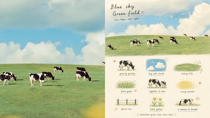
Please turn each photograph I upload into a separate premium design poster. Do not combine multiple images; output each photograph individually. Use an overall 3:4 portrait composition, divided into upper and lower regions in a strict 1:1 height ratio, each occupying 50% of the image.

Preserve the original photograph in the upper half, retaining the subject's identity, structure, pose, authentic texture, natural light and shadow, and original colour atmosphere. Apply only subtle, refined colour grading so it carries the visual quality of an art magazine, independent publication, or exhibition image. The surrounding environment may be extended naturally to fit the format, but the subject must not be stretched, distorted, or altered.

In the lower half, extract the photograph's most recognisable **subjects, local elements, cues of movement, object details, and narrative relationships**, and reconstruct them as a visual system of **a 3×3 modular icon grid + naïve hand-drawn doodle illustrations + crayon/coloured-pencil grain + handwritten text**. Do not trace the whole original image or create a realistic illustration. Instead, compress the complex information into the nine visual units most worth remembering: these may be the subject itself, distinctive details, personal objects, plants, food, means of transport, poses, emotional symbols, or small memory points from the scene. Every unit should extend the meaning of the same image above, so viewers immediately feel that they form a “memory list” belonging to that photograph.

Use an **implicit, loose 3×3 grid**. The nine-cell grid is only an underlying order and need not look overly regular; the position, size, angle, and resting point of each icon may shift slightly, creating an ordered but non-mechanical **loose grid / organic grid**. A short handwritten title may appear at the top with a few relaxed wavy lines, star-like dots, or symbols; a tiny handwritten caption may appear at the bottom, so the composition feels like a page from a private notebook, visual diary, or collection sheet. Leave ample breathing space. The layout should feel relaxed, charming, restrained, and never messy.

Use a **Naïve Hand-drawn Doodle Illustration** style: simple forms with a slightly childlike awkwardness, gently trembling outlines, uneven stroke weights, and contours that do not always close, preserving intentional imperfection. Do not fill colours too completely; allow the paper texture, white grains, and rough edges to remain visible. Black fine-line contours, coloured-pencil/crayon fills, and a few local colour blocks may be mixed together. Build graphic relationships through flat colour / spot colour rather than realistic light and shadow. If guide lines appear, they should be extremely faint, like a lightly pencilled underdrawing rather than a computer-drawn table.

Use a **low-saturation retro candy palette**, set against warm off-white, heavily textured paper. Keep the colour soft, light, friendly, and refined. Colours may be extracted from the original image and translated into relationships among sage green, mint green, crayon blue, cobalt blue, creamy yellow, dusty pink, strawberry pink, and coral orange-red. Blue-greens usually serve as the primary colours, yellow and pink fill objects, and orange-red appears only as a very small accent. The overall balance should consist of a large off-white background, a measured amount of blue-green, small areas of yellow and pink, and only a touch of orange-red, producing richness without clutter.

Add a sparse layer of **hand-drawn red annotation marks**, such as circles, arrows, hearts, starbursts, small crosses, wavy lines, or emphasis marks, turning an ordinary icon page into a more editorial and personal visual diary. These annotations must be few and precise, used only as secondary accents and never allowed to dominate.

The wording and language are not fixed. Generate only a small amount of genuinely meaningful text based on the photograph's subject, mood, location, action, or sense of everyday life. Titles and explanatory text should use **small, light, relaxed handwriting with slight pauses and drifting letter spacing**, as if casually written on paper rather than typeset as a commercial headline. Keep all text sparse and small with ample whitespace, allowing the words, icons, and annotations to form a natural editorial composition.

The overall mood should be **naïve, relaxed, nostalgic, healing, light, friendly, and editorially designed**, like a carefully kept private notebook, happiness list, or page of observations from everyday life. Avoid a clean vector look, realistic lighting, complex textures, heavy shadows, overly orderly UI-icon styling, commercial templates, and children's-cartoon treatment.
More open images in the “XXD Panel 101 · Nine-Cell Memory Notebook” style