



Open prompts
sample 01 AI Image Prompt
sample 01, its complete AI image prompt, and the Good Morning & Daily Greetings · Good Night · 166 style are free to view and copy.
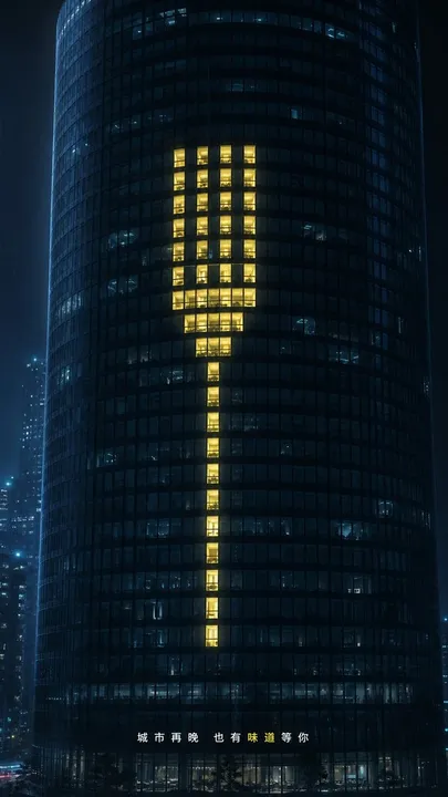
Complete AI image prompt
Make the subject’s central meaning appear first as a monumental, instantly legible sign assembled from small regular modules. Organize those units on a strict square matrix, axial scaffold, or column system, then create one controlled breach through a missing, displaced, or overreaching unit so the eye completes the whole from fragments. The sign may be built from warm illuminated cells inside a dark environment or from layered paper pieces, color fields, and letter components; in either material mode it must read decisively at a distance and reveal its modular construction up close. Give this primary mass several times the visual weight of everything else. Reduce secondary actors to bold black silhouettes that hold, touch, pinch, inspect, magnify, or frame the sign; use solid ink-like shapes, clearly articulated gestures, emphatic cropping from the edges, and direct overlap with the main form so human scale and the act of making become visible together. Derive a sparse orbit of specimen-like fragments, symbols, and information slips from the subject itself. Construct the main title as extremely heavy, low-contrast, compressed display lettering embedded in the same module system; let valid glyphs share strokes, cuts, counters, or outer contours with the imagery so type and sign become one figure while preserving the anatomy and recognition rules of the chosen writing system. Set supporting information as narrow columns of small, widely tracked type separated by fine rules near the margins, creating an abrupt scale shift between dense monumental lettering and restrained annotation. Govern the space through a central monumental weight counterbalanced by peripheral information and a generous surrounding field: the gaze strikes the sign, follows repeated modules through the silhouette action and tiny markers, then settles on a quiet information band. Permit only one hand, module, or text segment to cross the governing grid as the deliberate structural violation. Let the subject choose the exact hues while preserving the role ratio: a broad low-chroma dark field or warm paper-white field, a black structural layer, one reserved cool support color, and one small high-recognition warm accent. Confine the warm accent to emitted focal cells, a subject-derived color shape, or a locator mark. In the environmental mode, light originates inside individual cells and softly spills onto adjacent dark surfaces; in the print mode, a limited set of flat inks sits solidly on cut paper. Keep both production paths tied to the same skeleton: glass modules, low ambient illumination, scattered windows, and foreground occlusion create depth in the environmental treatment; cut-paper edges, screen-printed flat shapes, and locally visible paper fibers create tactile layering in the collage treatment. Restrict fibrous and ink-bite variation to paper pieces, printed silhouettes, and inked shapes, while base fields and small lettering remain even and sharply resolved. Balance nocturnal metropolitan restraint with approachable handmade intimacy, and make every attachment, symbol, material cue, and information tier arise from the subject while serving modular revelation, tactile intervention, and hierarchy.
More open images in the “Good Morning & Daily Greetings · Good Night · 166” style