



Open prompts
sample 02 AI Image Prompt
sample 02, its complete AI image prompt, and the Typography & Posters · Line Art · Bright · 230 style are free to view and copy.
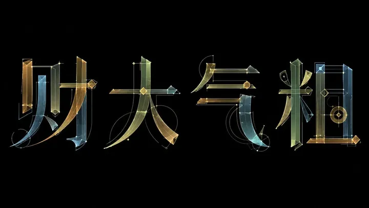
Complete AI image prompt
Build the composition around one overwhelming display phrase, preserving valid topology, component logic, essential counters, and immediate orthographic recognition in the chosen writing system while radically engineering its stroke anatomy. Compress horizontals into taut hairlines; stretch load-bearing verticals into tall blades with abrupt width modulation; turn conventional terminals into inward-curving facets, wedge cuts, long outward points, and a few detached shards. Strokes may separate, shift, interlock, or share a structural segment, yet every gap must close perceptually through an extension line, circular trajectory, or directional continuity into the neighboring glyph. Treat the complete phrase as a family of precision-built parts rather than unrelated decorated letters. Give the primary letter mass monumental weight over all secondary information, stabilize it with strong horizontal baselines and rising vertical axes, then break that stability with a limited number of long diagonal sweeps, descending curves, and terminals that press beyond the core silhouette. Let pointed vectors and breathing counters determine spacing. Lead the eye into the brightest broad stem, carry it laterally across hairlines and arcs, then release it through elongated uprights and sharp outer tips into a generous field of quiet negative space. Derive wording, symbolic components, rhythm, and information hierarchy from the subject meaning. Generate every accent from the lettering construction itself: sparse diamond nodes, circles, calibration ticks, tangents, bounding frames, and extremely fine guide lines attached only to joins, turns, and load points, so they read as evidence of an actively calibrated glyph system. Render the finished letterforms as shallow, thin-sheet relief with cool luminous reflection; edge highlights travel along sharp contours and curved ridges, broad strokes transition continuously from bright faces into cool shadow planes, tips remain crisp, and dark faces retain separation. Let subject emotion and material associations select one bounded color state: silver-white, pale gold, and cool cyan reflections against a deep restrained field, or low-chroma coral, amber, mint, and ice-blue translucent plates against a bright shadowless field. In either state, preserve the area hierarchy of a dominant neutral ground, one luminous main phrase, and very few high-chroma nodes. A construction-study treatment uses overlapping translucent plates, intersection colors, and doubled contour lines; a resolved treatment condenses the phrase into silver or warm-white metal while retaining only a sparse underlayer of grid lines, compass arcs, nodes, and pin lights. Both treatments require a continuous even ground, exact fine rules, clean cutting edges, and tightly bounded glow. If supporting copy is present, set it extremely small with wide tracking as pronunciation or annotation, creating a severe scale contrast while remaining optically subordinate to the main letter mass. The result should feel cool, elegant, meticulously engineered, and fast, with structural reasoning, material light, and semantic sharpness produced by the same stroke logic.
More open images in the “Typography & Posters · Line Art · Bright · 230” style