



Open prompts
sample 03 AI Image Prompt
sample 03, its complete AI image prompt, and the Typography & Posters · Line Art · Minimal · 244 style are free to view and copy.
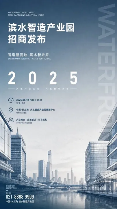
Complete AI image prompt
Build the first read around a forceful information anchor suspended over a generous field of breathing space, while a theme-derived environment rises from an edge or the lower field to carry the information rather than compete with it. Distill the subject into one immediately legible proposition, one key numeral or compact code, and a recognizable scenic silhouette generated from its meaning; stage roughly a two-to-one-to-one jump from headline to numeral to environment, keeping emptiness larger than solid mass so the primary message arrests the eye and subordinate detail slows it in measured steps. Use a disciplined single-column or compound editorial grid governed by one clear axis, aligning display copy, bilingual secondary lines, date, venue, description, and credits; introduce exactly one controlled breach through an oversized numeral, rotated edge title, or immense low-opacity word extending beyond its column. Route attention from the highest-contrast headline across an open tonal interval punctuated by short rules, down to the scene's dominant peak, then out through precise micro-information and symbols. Construct display lettering as a modern low-contrast sans system: CJK glyphs remain compact, square, forceful, and orthographically sound; Latin characters and numerals use narrow geometric bodies, crisp counters, and open tracking; small text follows exact baselines and restrained weights with the order of a technical document, and different scripts align by optical mass rather than nominal point size. Translate the subject's structure, product logic, human relationships, or abstract concept into a staggered family of contours instead of inheriting a fixed object class. Define the near plane with crisp fine lines and a few solid facets, repeat upright forms through the middle plane to frame a perspective channel toward the focal form, then reduce scale and contrast progressively until the distance dissolves into air. A single recognizable high point near the governing axis, balanced by lower groups across a broad interval, creates ceremonial stability; let the subject's own most distinctive form occupy that role. Derive one low-saturation dominant hue from the theme and spread it as a continuous matte field; use luminous white or deep ink for structural contrast, reserving one warm glint for short rules, fine icons, and a few information accents. The main family may move within misted off-white, cool blue-green, or sunset copper-orange according to the subject's emotional temperature, while preserving a near-monochrome value hierarchy, transparent highlights, and tightly controlled total chroma. Shape the background with a broad, soft tonal falloff that behaves like open sky and atmospheric depth: keep the information field quiet, increase separation gently around the scenic contours, and localize diffusion to distant planes and light transitions. Render the environment through precise drafting-like linework, pale wash, or a clean fusion of monochrome photography and drawing; stabilize the base with a long supporting plane and a faint reflection when the theme provides an equivalent surface. Thin dividers, clock and location-style geometric symbols, tiny secondary annotations, and a measured footer create calibrated rhythm without entering the primary hierarchy. Keep edges crisp and continuous, the matte field even, and all information clustered at a few deliberate nodes. The result should feel authoritative, open, and forward-looking, with exhibition-grade gravity and blueprint-like lightness produced by text and imagery acting as mutual scale references.
More open images in the “Typography & Posters · Line Art · Minimal · 244” style