



Open prompts
sample 07 AI Image Prompt
sample 07, its complete AI image prompt, and the Typography & Posters · Printmaking · 3D · 229 style are free to view and copy.
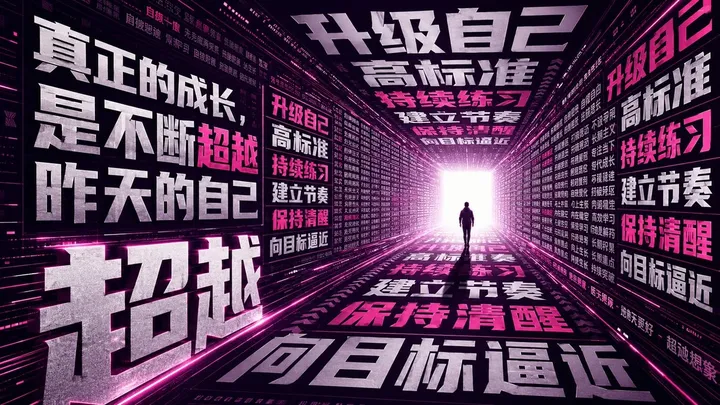
Complete AI image prompt
Build the entire visual system around one concise Chinese headline enlarged into the dominant image, the primary mass, and the spatial framework. Give the display glyphs immense scale, heavy strokes, compressed proportions, and a dramatic jump from headline to supporting copy, so the message reads instantly as a declaration. Let the subject meaning reshape selected strokes, counters, joins, and angular cuts into a visible action such as resistance, release, ascent, or growth while preserving valid Chinese topology, stable centers of gravity, and immediate recognition. Organize information in three sharply separated densities: monumental headline forms, medium-scale action phrases, and fine explanatory text. Arrange the smaller language as narrow columns, horizontal rails, caption tabs, marginal notes, or continuous typographic bands; alignment, spacing, rules, and directional repetition create rhythm. Permit one controlled violation where a giant glyph crosses the grid, presses against an edge, crops beyond the field, or penetrates a module, while all remaining content stays disciplined inside a readable modular structure with strong occupied-to-empty contrast. Select one coherent spatial state according to the subject’s emotional temperature. For a restrained subject, construct a flat editorial field: balance the monumental lettering asymmetrically with theme-derived line illustration, symbolic forms, or a narrative path, then stabilize the composition with fine frames, divided information cells, small emblems, and seal-like markers. For an urgent, forward-moving subject, turn repeated typography into a perspective environment: text covers structural walls, overhead planes, and ground, all converging toward one luminous destination; near-field glyphs stretch through perspective and crop hard at the boundaries, repeated phrases diminish through the middle distance, and a simple theme-derived silhouette establishes human scale and direction. Keep the chosen depth logic and material genealogy consistent throughout. In either state, the eye must strike the giant headline first, travel through the typographic structure second, and resolve at the subject’s symbolic focal point last. Derive the palette from the subject but limit it to one thematic hue, structural dark and light values, and one high-energy accent. The flat state uses a broad low-chroma paper field, dark ink, and restrained thematic color; the depth state uses a near-black enclosure, bright neutral letterforms, and a saturated thematic accent that traces the route, with peak luminance reserved for the convergence point. Match finish to the selected state: use pale natural-fiber stock with absorbent single-color ink for the flat construction, allowing localized under-inking and slight edge breakup only inside large printed solids while open paper and fine lettering remain clear; use matte dark architectural surfaces, graphite-gray type faces, and narrow boundary light strips for the spatial construction, combining hard glyph edges in the foreground with a controlled bloom at the distant opening. Let the subject determine headline semantics, stroke behavior, symbolic imagery, color source, narrative cues, and the hierarchy of supporting copy. The result should operate as a flexible large-type cover language whose density remains ordered and whose force comes from typographic anatomy, scale, and spatial causality.
More open images in the “Typography & Posters · Printmaking · 3D · 229” style