会员账号

Open prompts

Typography & Posters

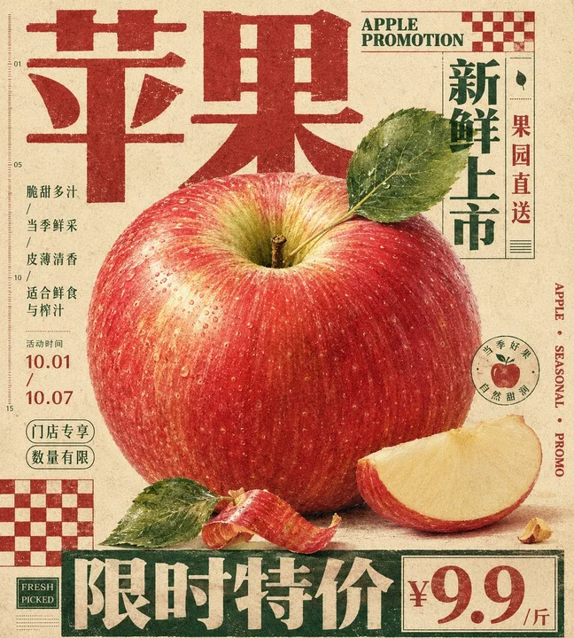
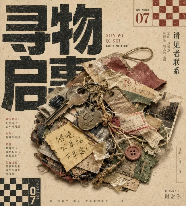
2 real examples in the Typography & Posters · Paper Texture · Retro · 228 style, with complete prompts available to copy without signing in.
Original style prompt

Drive a single theme-defined physical carrier into the information field at close range and monumental scale, giving it roughly one half to two thirds of the visual weight. It may remain one intact object or become a tactile bundle of physical evidence generated by the theme, yet it must keep one instantly legible outer silhouette, convincing overlap, and a grounded contact shadow. Set an equally oversized display phrase in the required writing system as the second dominant mass: broad faces, low stroke contrast, squared construction, compressed spacing, and valid glyph topology. Let the physical carrier occlude parts of the phrase while exposed strokes continue around it, so continuity completes the wording and the lettering behaves like background architecture while the object reads as foreground evidence. Build the field as a central monument held in asymmetric dynamic equilibrium. The object and display phrase command the first read; narrow side columns, short directional lines, serial numbers, dates, scales, explanatory entries, circular seals, and framed data recede into second and third tiers along an implied modular grid near the edges, counterbalancing the center through distance and density. Allow the carrier to cross one column rule as the controlled grid break. Lead the eye from the huge wording into material detail, then outward through marginal notices, and arrest it with one heavy continuous information band. Regenerate all copy from the theme and preserve the authentic anatomy and reading direction of its writing system. Use a fine high-contrast serif skeleton and open rhythm for supporting copy against the dense black display face; reserve a small handwritten note for a human narrative trace. Make the ground uncoated cotton-pulp stock whose visible fibers and long storage produce an even warm cream field. Limit the graphic system to paper color, one dark primary ink derived from the theme, and one brick-red or equally warm secondary ink: the primary ink carries headline and rules, while the warm ink occupies only small serials, seals, checker units, and alert marks; retain the carrier's natural colors under the same muted ink relationship. Unify photograph, lettering, and rules through old letterpress and coarse-screen reproduction: solid ink catches unevenly on raised paper fibers with fine localized interruptions and a softly spread perimeter, while dark masses remain blocklike and readable. Confine this broken ink behavior to printed layers; keep decisive material cues, reflections, and silhouette edges of the physical carrier clear. Repeat small checker modules, hairline frames, short rules, dots, folio numbers, and directional scales to create the measured editorial beat of an inexpensive public notice, using every ornament to divide information. Soft frontal diffuse light gives the carrier real volume, and a broad shallow contact shadow presses any assembled layers back onto the paper, producing a direct, plainspoken public-information character with palpable accumulated time.
正在加载…

找回密码

输入注册邮箱,我们会发送一封重置邮件。

确认删除

删除后将从网站中移除。

API 迁移

导入 API 配置