

Open prompts
en sample 02 AI Image Prompt
en sample 02, its complete AI image prompt, and the XXD Panel 054 · Memory Sticker Album style are free to view and copy.
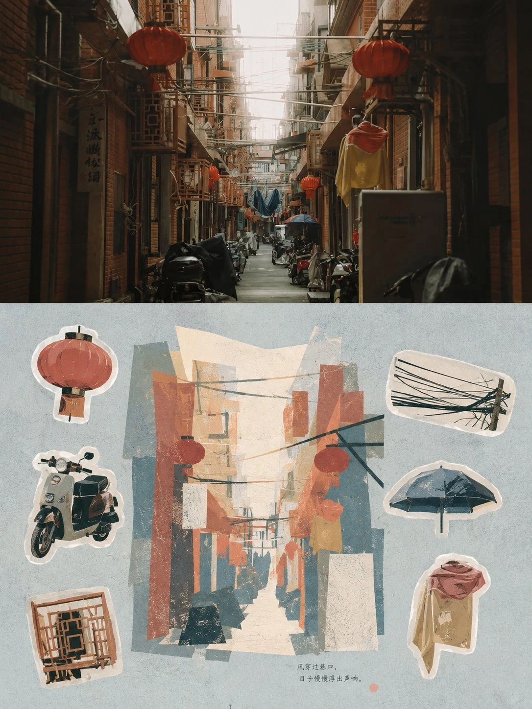
Complete AI image prompt
Please turn each photo I upload into its own standalone premium design poster. Do not create multi-image collages; output each photo separately. Use an overall 3:4 vertical composition and continue the two-layer upper-and-lower logic: real photography in the upper half and a graphic reconstruction based on selective memory in the lower half, with the upper and lower sections naturally echoing one another.

The upper half retains the original photo, preserving the subject’s identity, structure, pose, realistic texture, natural light and shadow, and original color atmosphere. Apply only slight, sophisticated photographic color grading so it has the texture of an art magazine, independent publication, and exhibition photography. To fit the frame, the environmental background may be extended naturally, but the subject must not be stretched, distorted, or altered.

In the lower half, extract the most recognizable subject, outline, pose, and narrative relationships from the photo and reconstruct them through “selective memory” rather than descriptive realism. Do not trace the photo in full. Retain only the visual clues most worth remembering, compressing the complex scene into 3–6 large shapes and color planes, then reorganize them using matte gouache, cut-paper collage, Risograph, and screen-print-like flat color. The subject should remain recognizable at a glance while gaining a distinctive modern graphic composition and handcrafted texture.

The lower half uses a compositional logic of main visual + six memory stickers. The main visual carries the primary narrative and visual center of gravity. Select six additional details with mnemonic value from the original photo—which may be a subject characteristic, action, local structure, plant, utensil, mode of transport, food, pattern, material, light and shadow, or an incidental detail—and distill each into an independent sticker. Give the stickers thick, light-colored cut borders, and lay them out naturally at different scales in a staggered distribution. They may form two loose rows, gather near the edges, or establish an asymmetrical relationship around the main visual. Preserve sufficient negative space and do not arrange them like a tidy product catalog. The six stickers should have a clear hierarchy and variations in size, like fragments cut from the same memory rather than six equally important icons.

The composition values visual center of gravity, proportions of color planes, scale contrast, positive and negative shapes, front-back overlap, and the rhythm of negative space. The main visual should be noticeably larger than the sticker fragments. Stickers may partially cross the boundary, rotate slightly, offset one another, or echo the subject, but they must not steal the primary focus. Proactively simplify complex environments, allowing broad areas of quiet ground color to serve as breathing space, so the whole has both graphic order and the relaxed, natural feel of a scrapbook.

Use opaque gouache, cut paper, Risograph, or screen-print-like color blocks as the material language, retaining slightly powdery edges, paper grain, hand-cut borders, and registration offsets. Use the same material language for the stickers and the main visual. Avoid watercolor bleeding, complex brushwork, dense line art, realistic textures, smooth vectors, and 3D plastic texture.

Base the palette on soft, translucent, slightly desaturated premium colors. It may be adjusted by extracting the overall color temperature from the original image, but should remain light and unified overall. Use **pale powder blue, misty blue, sky blue, and cool airy blue** to create the main atmosphere, balanced by **ivory, creamy white, light beige, soft gray-green, and neutral architectural colors**. Permit only small amounts of dusty rose or muted blush as tiny accents for flowers, clothing, small signs, awnings, or local decorations, giving the image both breathing room and refined layering.

Do not preset a fixed title, number, location, or language for the text. Based on the photo’s subject, action, environment, mood, sound, memory, or cultural context, freely generate an extremely small amount of genuinely meaningful text and let it enter the negative space, gaps between stickers, or the edge of the main visual naturally, forming an editorial typographic relationship with the graphics. The text should be small, light, and restrained. Do not create a menu-like information bar or label every sticker individually.

The whole should resemble an independently published visual travel journal, private memory album, and premium sticker art page: quiet, modern, perceptive, and relaxed, with professional graphic order as well as the warmth of collage, collecting, and handmade materials. Avoid the feel of a sticker product catalog, a six-panel grid, equal-size arrangements, complete realistic landscapes, dense details, commercial postcard templates, cartoons, anime, and e-commerce stock assets.
Original style prompt
Please turn each photo I upload into its own standalone premium design poster. Do not create multi-image collages; output each photo separately. Use an overall 3:4 vertical composition and continue the two-layer upper-and-lower logic: real photography in the upper half and a graphic reconstruction based on selective memory in the lower half, with the upper and lower sections naturally echoing one another.

The upper half retains the original photo, preserving the subject’s identity, structure, pose, realistic texture, natural light and shadow, and original color atmosphere. Apply only slight, sophisticated photographic color grading so it has the texture of an art magazine, independent publication, and exhibition photography. To fit the frame, the environmental background may be extended naturally, but the subject must not be stretched, distorted, or altered.

In the lower half, extract the most recognizable subject, outline, pose, and narrative relationships from the photo and reconstruct them through “selective memory” rather than descriptive realism. Do not trace the photo in full. Retain only the visual clues most worth remembering, compressing the complex scene into 3–6 large shapes and color planes, then reorganize them using matte gouache, cut-paper collage, Risograph, and screen-print-like flat color. The subject should remain recognizable at a glance while gaining a distinctive modern graphic composition and handcrafted texture.

The lower half uses a compositional logic of main visual + six memory stickers. The main visual carries the primary narrative and visual center of gravity. Select six additional details with mnemonic value from the original photo—which may be a subject characteristic, action, local structure, plant, utensil, mode of transport, food, pattern, material, light and shadow, or an incidental detail—and distill each into an independent sticker. Give the stickers thick, light-colored cut borders, and lay them out naturally at different scales in a staggered distribution. They may form two loose rows, gather near the edges, or establish an asymmetrical relationship around the main visual. Preserve sufficient negative space and do not arrange them like a tidy product catalog. The six stickers should have a clear hierarchy and variations in size, like fragments cut from the same memory rather than six equally important icons.

The composition values visual center of gravity, proportions of color planes, scale contrast, positive and negative shapes, front-back overlap, and the rhythm of negative space. The main visual should be noticeably larger than the sticker fragments. Stickers may partially cross the boundary, rotate slightly, offset one another, or echo the subject, but they must not steal the primary focus. Proactively simplify complex environments, allowing broad areas of quiet ground color to serve as breathing space, so the whole has both graphic order and the relaxed, natural feel of a scrapbook.

Use opaque gouache, cut paper, Risograph, or screen-print-like color blocks as the material language, retaining slightly powdery edges, paper grain, hand-cut borders, and registration offsets. Use the same material language for the stickers and the main visual. Avoid watercolor bleeding, complex brushwork, dense line art, realistic textures, smooth vectors, and 3D plastic texture.

Base the palette on soft, translucent, slightly desaturated premium colors. It may be adjusted by extracting the overall color temperature from the original image, but should remain light and unified overall. Use **pale powder blue, misty blue, sky blue, and cool airy blue** to create the main atmosphere, balanced by **ivory, creamy white, light beige, soft gray-green, and neutral architectural colors**. Permit only small amounts of dusty rose or muted blush as tiny accents for flowers, clothing, small signs, awnings, or local decorations, giving the image both breathing room and refined layering.

Do not preset a fixed title, number, location, or language for the text. Based on the photo’s subject, action, environment, mood, sound, memory, or cultural context, freely generate an extremely small amount of genuinely meaningful text and let it enter the negative space, gaps between stickers, or the edge of the main visual naturally, forming an editorial typographic relationship with the graphics. The text should be small, light, and restrained. Do not create a menu-like information bar or label every sticker individually.

The whole should resemble an independently published visual travel journal, private memory album, and premium sticker art page: quiet, modern, perceptive, and relaxed, with professional graphic order as well as the warmth of collage, collecting, and handmade materials. Avoid the feel of a sticker product catalog, a six-panel grid, equal-size arrangements, complete realistic landscapes, dense details, commercial postcard templates, cartoons, anime, and e-commerce stock assets.
More open images in the “XXD Panel 054 · Memory Sticker Album” style