

Open prompts
en sample 02 AI Image Prompt
en sample 02, its complete AI image prompt, and the XXD Panel 036 · Streamline Picture Book style are free to view and copy.
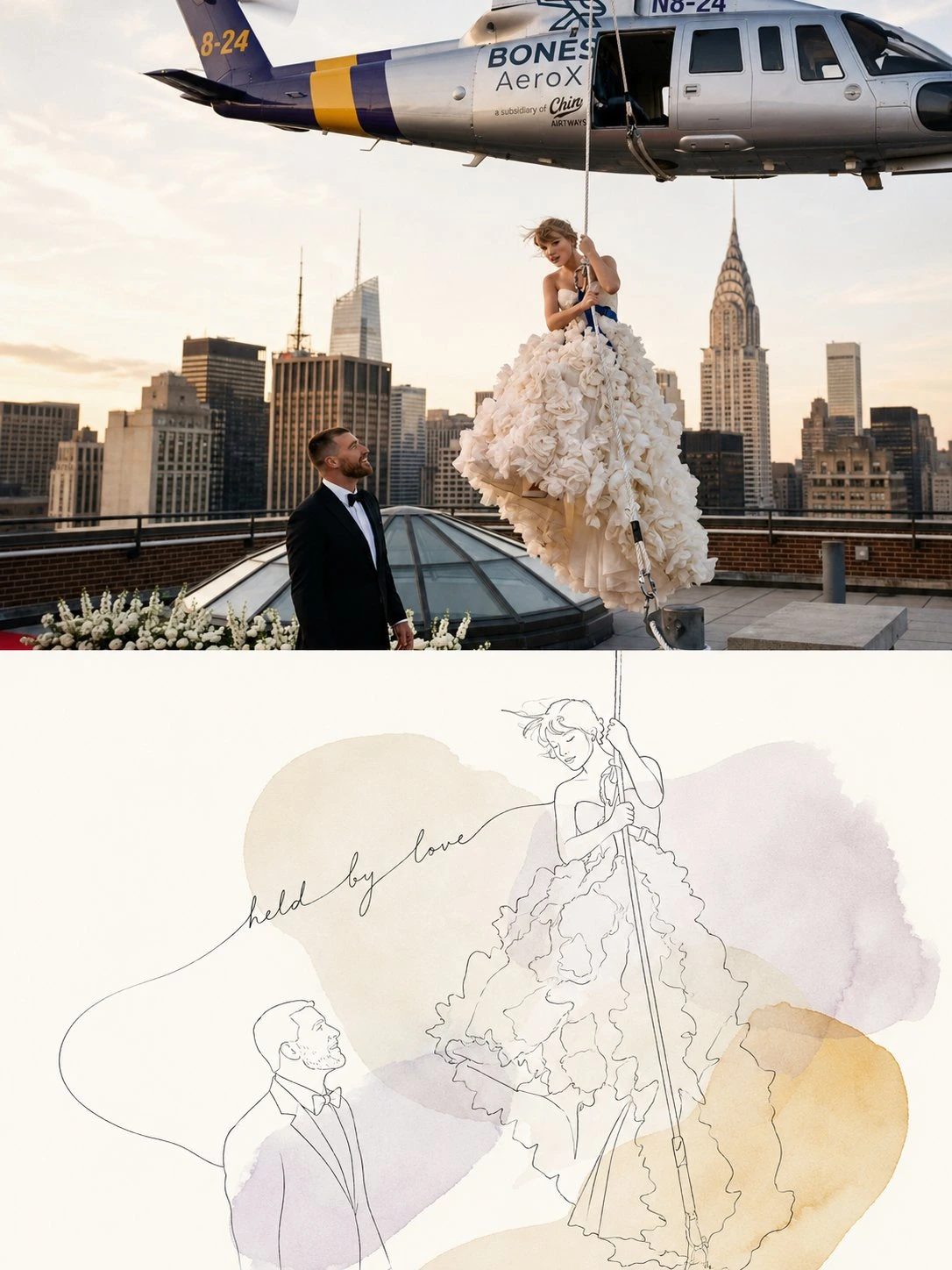
Complete AI image prompt
Please make every photo I upload into its own standalone high-end design poster; no multi-image collages, each photo output separately. The overall composition uses a 3:4 vertical format, with the upper and lower zones strictly 1:1 in height, each taking up 50% of the frame.

The upper half keeps the original photo, preserving the subject's identity, structure, pose, real texture, natural light and shadow, and original color atmosphere, applying only a slight high-end photographic color grade so that it carries the texture of art magazines, independent publications, and exhibition photography. To fit the frame, the sky, ground, or environmental background may be extended naturally, but the subject must not be stretched, distorted, or altered.

The lower half extracts the most recognizable **subject, outline, pose, and narrative relationships** from the photo, further distilling its most meaningful emotion, direction of movement, spatial relationship, or metaphor, and reconstructs it as a light, healing, and restrained minimalist continuous-line work. Do not mechanically trace the photo; instead, reduce details and reorganize the subject with fine, natural lines that contain slight hand-drawn pauses. Preserve the most crucial recognizable features through omission, connection, displacement, extension, and a sense of incompletion, allowing a small number of lines to carry the primary narrative.

The composition emphasizes **one core relationship, extensive negative space, and a naturally flowing visual rhythm**. The subject may be offset, cropped, suspended, or freely extended, creating variations in density and center of gravity according to the original image's pose and direction of movement. For people, emphasize their relationships; for animals, emphasize movement and vitality; for objects, emphasize key structures; and for buildings, spaces, and natural landscapes, distill proportions, directions, and distances. Avoid uniform centering, complex depiction, and meaningless lines.

Add **2–4 healing organic color fields distilled from the original image's colors and emotions** to the background. The color patches are not independent decoration; they should be dynamically distributed along the subject's outline, direction of movement, negative space, and visual center of gravity. Some may be hidden behind the subject, some may extend to the edges, and they may overlap slightly to form new transparent composite colors. Keep the shapes relaxed, asymmetrical, and varied in size. Their edges are not regular vector curves but carry slight watercolor bleeding, pigment seepage, and uneven diffusion, locally clear and locally fading naturally into the paper white, so that color flows slowly through the image like emotion.

The palette is based on **warm paper white + fine black-gray lines + 2–4 soft colors of low to medium saturation and high lightness**. Select and remix the colors with the greatest emotional value and vitality from the photo above rather than applying a fixed pastel color palette. Establish an area hierarchy through a primary color field, supporting color fields, and extremely small accent colors. Transparent color overlap is allowed, but avoid evenly spread color, rainbow palettes, heavy color patches, and digital gradients.

The text also uses the same **light, hand-drawn linear language** as the line art. Distill an extremely short word or phrase from the photo's emotion, relationship, action, or metaphor. It may use a fine, relaxed, slightly irregular handwritten script, monoline handwriting, or an extremely light editorial typeface. The text may extend naturally along a person's movement, a contour curve, or a visual direction, allowing a line to become the beginning stroke, ending stroke, baseline, or connecting line of a letter. It may also float or curve slightly in the negative space or be crossed by the subject. Keep auxiliary small text extremely sparse and fine, making the text feel like another kind of line in the image rather than a typographic module added afterward.

The overall presentation creates a visual relationship in which **continuous fine lines, flowing color fields, transparent color overlaps, soft negative space, and handwritten text breathe together**. It is light, intimate, healing, romantic, subtle, and rich in a sense of life. The final result is not a conversion of the photo into line art, but a re-distillation of the real scene into a modern, minimalist, picture-book-style editorial work with emotional flow. Avoid rigid vector color patches, regular circular spots, complex backgrounds, cartoonization, commercial typefaces, and a template feel.
Original style prompt
Please make every photo I upload into its own standalone high-end design poster; no multi-image collages, each photo output separately. The overall composition uses a 3:4 vertical format, with the upper and lower zones strictly 1:1 in height, each taking up 50% of the frame.

The upper half keeps the original photo, preserving the subject's identity, structure, pose, real texture, natural light and shadow, and original color atmosphere, applying only a slight high-end photographic color grade so that it carries the texture of art magazines, independent publications, and exhibition photography. To fit the frame, the sky, ground, or environmental background may be extended naturally, but the subject must not be stretched, distorted, or altered.

The lower half extracts the most recognizable **subject, outline, pose, and narrative relationships** from the photo, further distilling its most meaningful emotion, direction of movement, spatial relationship, or metaphor, and reconstructs it as a light, healing, and restrained minimalist continuous-line work. Do not mechanically trace the photo; instead, reduce details and reorganize the subject with fine, natural lines that contain slight hand-drawn pauses. Preserve the most crucial recognizable features through omission, connection, displacement, extension, and a sense of incompletion, allowing a small number of lines to carry the primary narrative.

The composition emphasizes **one core relationship, extensive negative space, and a naturally flowing visual rhythm**. The subject may be offset, cropped, suspended, or freely extended, creating variations in density and center of gravity according to the original image's pose and direction of movement. For people, emphasize their relationships; for animals, emphasize movement and vitality; for objects, emphasize key structures; and for buildings, spaces, and natural landscapes, distill proportions, directions, and distances. Avoid uniform centering, complex depiction, and meaningless lines.

Add **2–4 healing organic color fields distilled from the original image's colors and emotions** to the background. The color patches are not independent decoration; they should be dynamically distributed along the subject's outline, direction of movement, negative space, and visual center of gravity. Some may be hidden behind the subject, some may extend to the edges, and they may overlap slightly to form new transparent composite colors. Keep the shapes relaxed, asymmetrical, and varied in size. Their edges are not regular vector curves but carry slight watercolor bleeding, pigment seepage, and uneven diffusion, locally clear and locally fading naturally into the paper white, so that color flows slowly through the image like emotion.

The palette is based on **warm paper white + fine black-gray lines + 2–4 soft colors of low to medium saturation and high lightness**. Select and remix the colors with the greatest emotional value and vitality from the photo above rather than applying a fixed pastel color palette. Establish an area hierarchy through a primary color field, supporting color fields, and extremely small accent colors. Transparent color overlap is allowed, but avoid evenly spread color, rainbow palettes, heavy color patches, and digital gradients.

The text also uses the same **light, hand-drawn linear language** as the line art. Distill an extremely short word or phrase from the photo's emotion, relationship, action, or metaphor. It may use a fine, relaxed, slightly irregular handwritten script, monoline handwriting, or an extremely light editorial typeface. The text may extend naturally along a person's movement, a contour curve, or a visual direction, allowing a line to become the beginning stroke, ending stroke, baseline, or connecting line of a letter. It may also float or curve slightly in the negative space or be crossed by the subject. Keep auxiliary small text extremely sparse and fine, making the text feel like another kind of line in the image rather than a typographic module added afterward.

The overall presentation creates a visual relationship in which **continuous fine lines, flowing color fields, transparent color overlaps, soft negative space, and handwritten text breathe together**. It is light, intimate, healing, romantic, subtle, and rich in a sense of life. The final result is not a conversion of the photo into line art, but a re-distillation of the real scene into a modern, minimalist, picture-book-style editorial work with emotional flow. Avoid rigid vector color patches, regular circular spots, complex backgrounds, cartoonization, commercial typefaces, and a template feel.
More open images in the “XXD Panel 036 · Streamline Picture Book” style