

Open prompts
en sample 03 AI Image Prompt
en sample 03, its complete AI image prompt, and the XXD Panel 019 · Retro Graphic Journal style are free to view and copy.
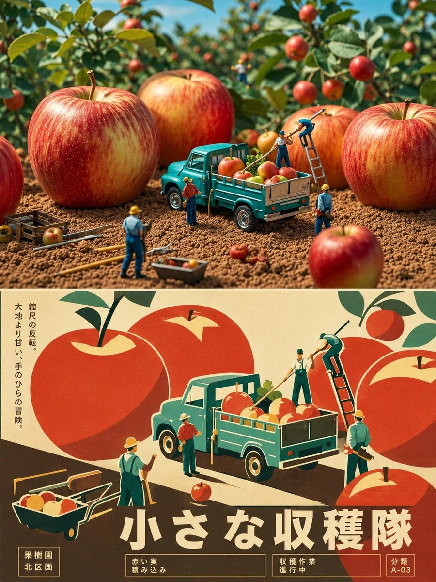
Complete AI image prompt
Please make every photo I upload into its own standalone high-end design poster; no multi-image collages, each photo output separately. The overall composition uses a 3:4 vertical format, with the upper and lower zones strictly 1:1 in height, each taking up 50% of the frame.

The upper half keeps the original photo, preserving the subject's structure, real texture, natural light and shadow, and original color atmosphere, applying only a slight high-end photographic color grade so that it carries the texture of art magazines, independent publications, and exhibition photography. To fit the frame, the sky, ground, or environmental background may be extended naturally, but the subject must not be stretched, distorted, or altered.

The lower half extracts the most recognizable **subject, outline, pose, and narrative relationships** from the photo and reconstructs them as a retro-modernist graphic illustration. Do not mechanically trace details; instead, distill the subject into a clear silhouette, geometric color blocks, bold faceted planes, and concise curves, retaining the most crucial proportions, outline, movement, and structural features so that it can be matched to the original object above at a glance. The composition emphasizes visual focus, contrast in scale, foreground-background hierarchy, positive and negative shapes, and geometric rhythm. The subject may be moderately enlarged, cropped, offset, or overlapped, with a small number of supporting forms used to establish space; do not create a complex realistic scene.

Extract the most distinctive and spirited colors from the photo above and reorganize them into a **limited retro palette of 3–5 colors**, using a main color, a dark structural color, a light background, and a small amount of contrasting color to establish a clear hierarchy. Colors may be moderately purified and artistically translated to present a warm, vivid, restrained character of vintage printing and modern graphic design. Avoid muddy grayness, neon, a jumble of many colors, complex gradients, and a cheap cartoon feel.

The text establishes a **modernist editorial typography system**, with language following the user's language preference and the current input language as the priority. Distill a short main title from the subject's identity, action, mood, setting, material, or metaphor in the photo, and pair it with 2–4 groups of extremely small supporting text. Short phrases, location or object information, numbers, serial numbers, status words, directional words, category labels, or micro-descriptions may be used; do not use years. When necessary, a small amount of another language may be mixed in as an editorial accent, but the main information must always use the user's preferred language. Text may align with, cut through, interweave with, wrap around, press against corners of, run vertically beside, or cross geometric forms and color blocks. Use contrasts in type size, light and bold weights, letter spacing, and a strict grid to establish visual order, making the typography itself part of the illustration's composition.

The overall work presents a visual character of **real photography × retro graphic illustration × high-end editorial design**: concise, vivid, geometric, stylish, restrained, and rich in graphic tension, combining the visual force of classic posters with the systematic quality of contemporary design. Avoid realistic illustration, complex textures, 3D rendering, a UI-interface feel, a commercial stock-material feel, and formulaic vector illustration.
Original style prompt
Please make every photo I upload into its own standalone high-end design poster; no multi-image collages, each photo output separately. The overall composition uses a 3:4 vertical format, with the upper and lower zones strictly 1:1 in height, each taking up 50% of the frame.

The upper half keeps the original photo, preserving the subject's structure, real texture, natural light and shadow, and original color atmosphere, applying only a slight high-end photographic color grade so that it carries the texture of art magazines, independent publications, and exhibition photography. To fit the frame, the sky, ground, or environmental background may be extended naturally, but the subject must not be stretched, distorted, or altered.

The lower half extracts the most recognizable **subject, outline, pose, and narrative relationships** from the photo and reconstructs them as a retro-modernist graphic illustration. Do not mechanically trace details; instead, distill the subject into a clear silhouette, geometric color blocks, bold faceted planes, and concise curves, retaining the most crucial proportions, outline, movement, and structural features so that it can be matched to the original object above at a glance. The composition emphasizes visual focus, contrast in scale, foreground-background hierarchy, positive and negative shapes, and geometric rhythm. The subject may be moderately enlarged, cropped, offset, or overlapped, with a small number of supporting forms used to establish space; do not create a complex realistic scene.

Extract the most distinctive and spirited colors from the photo above and reorganize them into a **limited retro palette of 3–5 colors**, using a main color, a dark structural color, a light background, and a small amount of contrasting color to establish a clear hierarchy. Colors may be moderately purified and artistically translated to present a warm, vivid, restrained character of vintage printing and modern graphic design. Avoid muddy grayness, neon, a jumble of many colors, complex gradients, and a cheap cartoon feel.

The text establishes a **modernist editorial typography system**, with language following the user's language preference and the current input language as the priority. Distill a short main title from the subject's identity, action, mood, setting, material, or metaphor in the photo, and pair it with 2–4 groups of extremely small supporting text. Short phrases, location or object information, numbers, serial numbers, status words, directional words, category labels, or micro-descriptions may be used; do not use years. When necessary, a small amount of another language may be mixed in as an editorial accent, but the main information must always use the user's preferred language. Text may align with, cut through, interweave with, wrap around, press against corners of, run vertically beside, or cross geometric forms and color blocks. Use contrasts in type size, light and bold weights, letter spacing, and a strict grid to establish visual order, making the typography itself part of the illustration's composition.

The overall work presents a visual character of **real photography × retro graphic illustration × high-end editorial design**: concise, vivid, geometric, stylish, restrained, and rich in graphic tension, combining the visual force of classic posters with the systematic quality of contemporary design. Avoid realistic illustration, complex textures, 3D rendering, a UI-interface feel, a commercial stock-material feel, and formulaic vector illustration.
More open images in the “XXD Panel 019 · Retro Graphic Journal” style