

Open prompts
en sample 04 AI Image Prompt
en sample 04, its complete AI image prompt, and the XXD Panel 055 · Painted Memory Field style are free to view and copy.
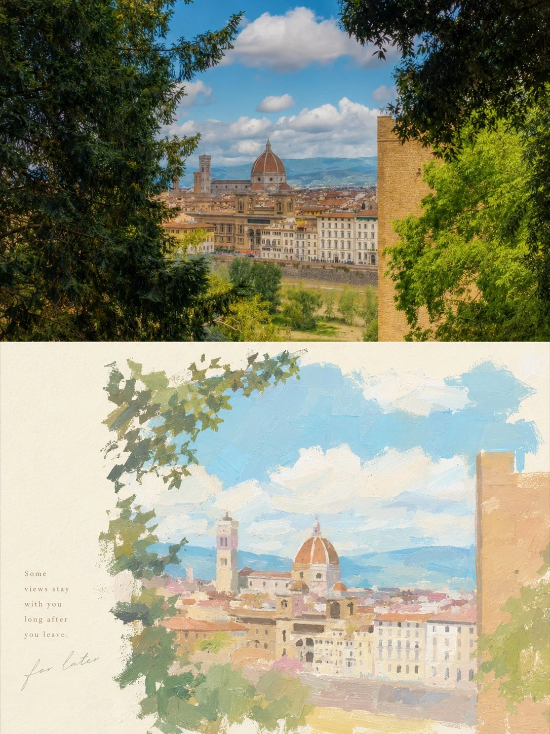
Complete AI image prompt
Please turn each photo I upload into a separate high-end design poster, without multi-image collage, and output each photo separately. The overall composition uses a 3:4 vertical format and continues the upper-and-lower two-layer logic: the upper half is real photography, and the lower half is a painterly reconstruction based on the subject's narrative.

The upper half retains the original photo, preserving the subject's identity, structure, pose, realistic texture, natural light and shadow, and original color atmosphere, with only slight high-end photographic color grading to give it the texture of an art magazine, independent publication, and exhibition photography. To fit the format, the environmental background may be extended naturally, but the subject must not be stretched, distorted, or altered.

The lower half extracts the most recognizable subject, outline, pose, and narrative relationships from the photo and reconstructs them into a painterly image with a stronger sense of art and layout. Do not fully trace the photo, and do not use sticker-collage logic again; instead, retain only the visual clues most worth remembering, compressing the complex scene into clear subject relationships, several groups of key planes, and quiet negative space, so that the original subject is recognizable at a glance while conveying the narrative beauty of memory, generalization, and reorganization.

The overall painting style references a gentle, bright, healing pastel-painted texture: like thickly applied gouache, acrylic, pastel crayon, or handmade painting with palette-knife traces. The color planes are soft, the brushstrokes clear but not heavy, and the edges clean with a little looseness, with slight paint buildup, coverage, and a handmade tactile quality. Avoid a sticker feel, smooth vector feel, 3D plastic feel, and excessive realism.

The composition should be more professional than an ordinary illustration, emphasizing visual center of gravity, subject placement, the proportion of negative space, foreground-background layering, planar rhythm, directional guidance, and layout order. The subject may be moderately off-center, enlarged, cropped, or concentrated in the middle-lower area to form a clear narrative core. Proactively simplify the background and secondary elements, retaining only a small number of scenes, spatial cues, or environmental relationships that best support the atmosphere, so the image has both room to breathe and a clear hierarchy and reading path.

The colors continue the logic you currently prefer: overall, use a soft, translucent, slightly desaturated high-end palette. The composite color temperature may be extracted from the original image and adjusted, while keeping the whole light and unified. Use pale pink-blue, mist blue, sky blue, and airy cool blue to create the main atmosphere, balanced by ivory white, cream white, light beige, soft gray-green, and architectural neutrals; a small amount of blush pink, soft peach, dusty rose, or muted blush may be added as local accents, giving the image a more healing Instagram-style feel, breathing room, and refined layering. Avoid dirty gray, overly strong contrast, high-saturation clashing colors, and a cheap retro feel.

Do not preset fixed titles, numbers, locations, or languages for the text, and do not use menu-like information. Based on the photo's subject, action, environment, emotion, memory, or cultural context, freely generate a very small amount of truly meaningful characters, words, short sentences, or fragments, and integrate them naturally into the image through more professional typography. The text may enter the negative space, sit close to the subject, follow a visual axis, or participate in the composition as a marginal note; overall, keep it small, light, restrained, and refined, like editorial text in an independent publication rather than a commercial headline.

The overall character should resemble an independently published visual handbook or art travel magazine: gentle, bright, healing, modern, quiet, and relaxed, while possessing a clear subject narrative and high-end typographic order. Avoid sticker logic, fully realistic scenery, fragmented accumulation, heavy outlines, a templated poster feel, an e-commerce illustration feel, a cartoon feel, and excessive decoration.
Original style prompt
Please turn each photo I upload into a separate high-end design poster, without multi-image collage, and output each photo separately. The overall composition uses a 3:4 vertical format and continues the upper-and-lower two-layer logic: the upper half is real photography, and the lower half is a painterly reconstruction based on the subject's narrative.

The upper half retains the original photo, preserving the subject's identity, structure, pose, realistic texture, natural light and shadow, and original color atmosphere, with only slight high-end photographic color grading to give it the texture of an art magazine, independent publication, and exhibition photography. To fit the format, the environmental background may be extended naturally, but the subject must not be stretched, distorted, or altered.

The lower half extracts the most recognizable subject, outline, pose, and narrative relationships from the photo and reconstructs them into a painterly image with a stronger sense of art and layout. Do not fully trace the photo, and do not use sticker-collage logic again; instead, retain only the visual clues most worth remembering, compressing the complex scene into clear subject relationships, several groups of key planes, and quiet negative space, so that the original subject is recognizable at a glance while conveying the narrative beauty of memory, generalization, and reorganization.

The overall painting style references a gentle, bright, healing pastel-painted texture: like thickly applied gouache, acrylic, pastel crayon, or handmade painting with palette-knife traces. The color planes are soft, the brushstrokes clear but not heavy, and the edges clean with a little looseness, with slight paint buildup, coverage, and a handmade tactile quality. Avoid a sticker feel, smooth vector feel, 3D plastic feel, and excessive realism.

The composition should be more professional than an ordinary illustration, emphasizing visual center of gravity, subject placement, the proportion of negative space, foreground-background layering, planar rhythm, directional guidance, and layout order. The subject may be moderately off-center, enlarged, cropped, or concentrated in the middle-lower area to form a clear narrative core. Proactively simplify the background and secondary elements, retaining only a small number of scenes, spatial cues, or environmental relationships that best support the atmosphere, so the image has both room to breathe and a clear hierarchy and reading path.

The colors continue the logic you currently prefer: overall, use a soft, translucent, slightly desaturated high-end palette. The composite color temperature may be extracted from the original image and adjusted, while keeping the whole light and unified. Use pale pink-blue, mist blue, sky blue, and airy cool blue to create the main atmosphere, balanced by ivory white, cream white, light beige, soft gray-green, and architectural neutrals; a small amount of blush pink, soft peach, dusty rose, or muted blush may be added as local accents, giving the image a more healing Instagram-style feel, breathing room, and refined layering. Avoid dirty gray, overly strong contrast, high-saturation clashing colors, and a cheap retro feel.

Do not preset fixed titles, numbers, locations, or languages for the text, and do not use menu-like information. Based on the photo's subject, action, environment, emotion, memory, or cultural context, freely generate a very small amount of truly meaningful characters, words, short sentences, or fragments, and integrate them naturally into the image through more professional typography. The text may enter the negative space, sit close to the subject, follow a visual axis, or participate in the composition as a marginal note; overall, keep it small, light, restrained, and refined, like editorial text in an independent publication rather than a commercial headline.

The overall character should resemble an independently published visual handbook or art travel magazine: gentle, bright, healing, modern, quiet, and relaxed, while possessing a clear subject narrative and high-end typographic order. Avoid sticker logic, fully realistic scenery, fragmented accumulation, heavy outlines, a templated poster feel, an e-commerce illustration feel, a cartoon feel, and excessive decoration.
More open images in the “XXD Panel 055 · Painted Memory Field” style