

Open prompts
en sample 05 AI Image Prompt
en sample 05, its complete AI image prompt, and the XXD Panel 032 · Graphic Wordmark style are free to view and copy.
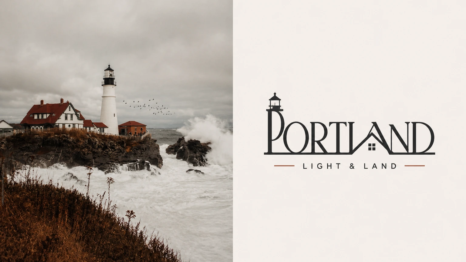
Complete AI image prompt
Please make every photo I upload into its own standalone high-end design poster; no multi-image collages, each photo output separately. The overall composition uses a 3:4 vertical format, with the upper and lower zones strictly 1:1 in height, each taking up 50% of the frame.

The upper half keeps the original photo, preserving the subject's structure, real texture, natural light and shadow, and original color atmosphere, applying only a slight high-end photographic color grade so that it carries the texture of art magazines, independent publications, and exhibition photography. To fit the frame, the sky, ground, or environmental background may be extended naturally, but the subject must not be stretched, distorted, or altered.

The lower half extracts the most recognizable **subject, outline, pose, and narrative relationships** from the photo and reconstructs them as a **concise, professional custom wordmark / Logo graphic with a distinctive brand identity**. Do not place the subject graphic separately beside the text; instead, cleverly integrate its most crucial outline, structure, or feature into the letters themselves or into the overall logo structure, making the graphic and text into one unified, complete, and recognizable visual symbol. Whether the subject is a person, animal, plant, building, object, vehicle, or natural landscape, distill its most essential visual features and transform them into a concise, geometric, graphic logo language that maintains an instantly recognizable sense of identity with very little information.

Distill a short primary text from the photo's subject name, thematic attributes, location clues, state of action, or symbolic meaning. If the original image itself has a clear proper name, it may be directly transformed into the primary identifier name; if it has no clear name, distill in the user's specified target language a highly concise, readily recognizable word or phrase suitable for use as a brand wordmark. A very small amount of supporting small text may accompany it, such as category, region, status word, or short slogan, but it must be highly restrained and serve only as a supplement to the identification hierarchy. The text and graphic must jointly form the logo, rather than a conventional “icon + title” collage.

The overall style remains **minimal, modern, geometric, striking, elegant, ample in negative space, and balanced in composition**. Use a pale solid color or an extremely pale neutral color for the background, keeping it clean and simple; render the logo in black and white or with very little color. One color with the greatest spiritual character may be extracted from the upper photo for limited translation, but restraint, professionalism, and brand character still take priority overall. Keep the logo at a comfortable medium visual size within the lower half, neither too large nor too small, with the degree of finish of an established brand identity, a cultural visual system, or the work of a high-end design studio.

The overall design emphasizes **the integration of graphic and text, subject recognizability, geometric order, refined letter spacing, professional layout, and high-end negative space**, presenting a visual character that combines modern logo design with an art poster. Avoid the feel of a travel poster, a simple icon plus text, cartoonization, decorative accumulation, an e-commerce feel, cheap graphics, and a templated feel.
Original style prompt
Please make every photo I upload into its own standalone high-end design poster; no multi-image collages, each photo output separately. The overall composition uses a 3:4 vertical format, with the upper and lower zones strictly 1:1 in height, each taking up 50% of the frame.

The upper half keeps the original photo, preserving the subject's structure, real texture, natural light and shadow, and original color atmosphere, applying only a slight high-end photographic color grade so that it carries the texture of art magazines, independent publications, and exhibition photography. To fit the frame, the sky, ground, or environmental background may be extended naturally, but the subject must not be stretched, distorted, or altered.

The lower half extracts the most recognizable **subject, outline, pose, and narrative relationships** from the photo and reconstructs them as a **concise, professional custom wordmark / Logo graphic with a distinctive brand identity**. Do not place the subject graphic separately beside the text; instead, cleverly integrate its most crucial outline, structure, or feature into the letters themselves or into the overall logo structure, making the graphic and text into one unified, complete, and recognizable visual symbol. Whether the subject is a person, animal, plant, building, object, vehicle, or natural landscape, distill its most essential visual features and transform them into a concise, geometric, graphic logo language that maintains an instantly recognizable sense of identity with very little information.

Distill a short primary text from the photo's subject name, thematic attributes, location clues, state of action, or symbolic meaning. If the original image itself has a clear proper name, it may be directly transformed into the primary identifier name; if it has no clear name, distill in the user's specified target language a highly concise, readily recognizable word or phrase suitable for use as a brand wordmark. A very small amount of supporting small text may accompany it, such as category, region, status word, or short slogan, but it must be highly restrained and serve only as a supplement to the identification hierarchy. The text and graphic must jointly form the logo, rather than a conventional “icon + title” collage.

The overall style remains **minimal, modern, geometric, striking, elegant, ample in negative space, and balanced in composition**. Use a pale solid color or an extremely pale neutral color for the background, keeping it clean and simple; render the logo in black and white or with very little color. One color with the greatest spiritual character may be extracted from the upper photo for limited translation, but restraint, professionalism, and brand character still take priority overall. Keep the logo at a comfortable medium visual size within the lower half, neither too large nor too small, with the degree of finish of an established brand identity, a cultural visual system, or the work of a high-end design studio.

The overall design emphasizes **the integration of graphic and text, subject recognizability, geometric order, refined letter spacing, professional layout, and high-end negative space**, presenting a visual character that combines modern logo design with an art poster. Avoid the feel of a travel poster, a simple icon plus text, cartoonization, decorative accumulation, an e-commerce feel, cheap graphics, and a templated feel.
More open images in the “XXD Panel 032 · Graphic Wordmark” style