



Open prompts
en sample 05 AI Image Prompt
en sample 05, its complete AI image prompt, and the XXD Panel 069 · Vivid Smear Window style are free to view and copy.
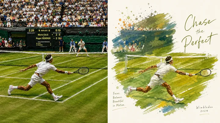
Complete AI image prompt
Turn every photograph I upload into a separate premium design poster. Do not combine multiple images; output each photograph independently. Use an overall 3:4 portrait composition with two regions of strictly equal height, each occupying 50% of the canvas.

Keep the original photograph in the upper half. Preserve the subject's identity, structure, pose, realistic texture, natural light and shadow, and original colour atmosphere. Apply only subtle, refined colour grading so it feels appropriate for an art magazine, independent publication, or exhibition image. The surrounding environment may be extended naturally to fit the format, but the subject must never be stretched, distorted, or altered.

In the lower half, extract the photograph's most recognisable **subject, silhouette, pose, and narrative relationship**. Retain only the core theme, visual metaphor, and aesthetic logic most worth remembering, then reconstruct them as an artwork combining hand-drawn contours, broad painted colour masses, and sophisticated image–text composition. Do not fully depict the photograph. Use only a few key forms and spatial relationships to preserve the subject's identity, so the source is immediately recognisable while the poetry of reduction, generalisation, and reorganisation remains unmistakable.

Place the subject mainly within an **irregular painted window made directly with a large coarse brush, broad wash brush, or flat brush**. This window is neither a softly diffused watercolour blot nor a tidy geometric frame. Build it from several bold, wide, directional horizontal, diagonal, or overlapping strokes. Preserve visible brush marks, bristle texture, variations in paint thickness, broken dry-brush passages, rough edges, exposed white, and local overlaps, so the viewer can clearly feel that “this area was painted with a large brush.” The window need not form a closed contour or fully contain the subject. Let the subject emerge from the broad colour masses, while selected outlines, plants, figures, architectural spires, or other defining features cross naturally beyond the brush boundary, creating free yet deliberate interlocking relationships.

Retain generous bright whitespace outside the window. Give careful attention to **visual centre of gravity, subject placement, whitespace ratio, scale of colour masses, positive and negative form, directional tension, and image–text rhythm**. The broad-brush window itself must function as an important compositional shape rather than a simple background frame. Let the most beautiful directional logic in the source determine the movement of the strokes, the subject's placement, and the boundary crossings, so painted masses, empty space, and typography form a professional yet relaxed visual order.

Combine **fine hand-drawn contour lines + bright watercolour or gouache colour masses + a small amount of oil-paint-like impasto**. Draw the subject with clear, natural lines that show subtle pressure variation and a slight searching quality. Interior colour may remain light and transparent, while a few focal areas may use denser, thicker, more materially present strokes. The broad-brush window must be visibly wider, bolder, and more reductive than the marks inside the subject, establishing a scale contrast between “coarse colour mass and fine contour.” Avoid soft watercolour halo frames, rounded colour-blot frames, neat vector borders, and the appearance of a photographic mask.

Recompose the palette from the **brightest, freshest, and most vital colours in the upper photograph**, rather than averaging its colours. Raise overall luminosity and chromatic clarity. Use lively hues naturally derived from the source—such as **clear sky blue, lake cyan, tender green, warm yellow, coral orange, or peach pink**—and create a healing feeling through a clean cool–warm relationship. Use abundant pure warm white as breathing space. Main colours should be vivid without becoming harsh; small touches of warm orange, golden yellow, or pink may act like sunlight, giving the work a clear, fresh, warm, buoyant, life-filled colour spirit. Avoid dirty greys, aged or gloomy Morandi treatment, dark brown filters, fluorescent colour, and cheap candy sweetness.

Use text sparingly. Freely distil a small amount of meaningful wording from the photograph's subject, place, emotion, action, or metaphor, without fixing the language or information type. Use **fine, relaxed editorial type with slight handmade writing irregularity and an independent-publishing character**. It may carry a subtle handwritten quality or mildly irregular letterforms, but should remain restrained, legible, and refined. Text may enter the generous whitespace, follow the direction of broad brush marks in a staggered arrangement, sit close to the subject's edge, or answer forms that cross outside the painted window. Image and text should feel like one complete art direction, not a title added afterward.

The finished work should combine a **bright white ground, broad-brush painted window, vivid colour, fine hand-drawn contours, local impasto, generous whitespace, and free image–text composition** into a premium and restorative atmosphere. Whether the subject is architecture, a person, an animal, a plant, an object, a vehicle, or a natural landscape, preserve clear identity, artistic whitespace, professional composition, and vivid life. Avoid soft watercolour halo frames, regular picture frames, fully realistic landscape rendering, filled backgrounds, sticker logic, heavy black outlines, smooth vectors, 3D rendering, cartoonishness, e-commerce illustration, and template-like poster design.
More open images in the “XXD Panel 069 · Vivid Smear Window” style