

Open prompts
en sample 05 AI Image Prompt
en sample 05, its complete AI image prompt, and the XXD Panel 089 · Everyday Vignette Notebook style are free to view and copy.
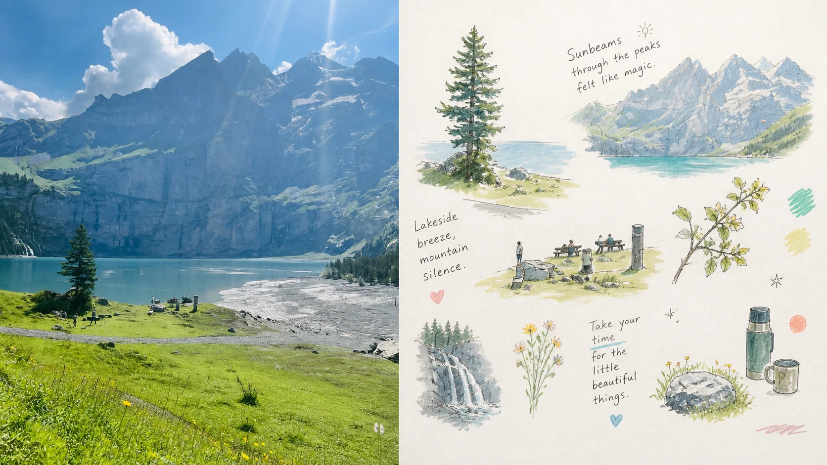
Complete AI image prompt
Please turn each photo I upload into its own independent, high-end design poster, with no multi-image collage; output each photo separately. Use an overall 3:4 portrait composition, with the upper and lower regions in a strict 1:1 height ratio, each occupying 50% of the image.

Retain the original photo in the upper half, preserving the subject's identity, structure, pose, authentic texture, natural light and shadow, and original colour atmosphere. Apply only subtle, refined colour grading so that it has the visual quality of an art magazine, independent publication, or exhibition image. To fit the format, the surrounding environment may be extended naturally, but the subject must not be stretched, distorted, or altered.

In the lower half, extract the photo's most recognisable subject, contours, pose, and narrative relationships, and reconstruct them as a journal-like set in the Hand-drawn Lifestyle Spot Illustration style. Do not redraw a complete scene. Instead, break the photo's most memorable subject and details into several independent vignette illustrations: let one clearly defined subject unit carry the core narrative, then derive a small number of actions, local features, plants, objects, food, clothing, architectural details, materials, or incidental items from the original image as supporting visual fragments. Each element should exist independently, without forming a complete background or unified perspective.

Use a floating, scattered editorial layout that emphasises natural variation in size, vertical position, spacing, density, and direction, making the small illustrations feel like fragments of life casually recorded on a page. Give the main subject the greatest visual weight, with the other elements forming loose echoes around it. Preserve abundant blank space; individual elements may slightly cross boundaries, tilt, or weave through text, but do not arrange them evenly, use a regular grid, or turn them into a sticker product catalogue. The whole should look casual while actually possessing a clear visual focus, reading path, and rhythm of whitespace.

Use loose, naively unpolished hand-drawn lines + watercolour + coloured pencil + a small amount of soft-pastel texture. Lines should be fine, natural, and slightly tremulous and hesitant. Proportions need not be absolutely precise, and contours may be slightly crooked or broken; colours may stray slightly beyond the lines or leave areas incompletely filled, while allowing the paper to show through and preserving pencil grain, thin watercolour layers, and localised areas of crayon rubbing. The overall feeling should be approachable, personal, and relaxed, but not childishly cartoonish.

From the upper photograph, select the brightest, most vivid colours that best express the image's spirit, then soften and purify them rather than sampling all colours evenly. Translate the original naturally into a light, lively mixed palette such as clear blue, lake aqua, fresh green, cream yellow, apricot orange, coral pink, and soft violet. Use a bright warm-white paper surface as the main breathing space, creating a healing feeling through crisp warm–cool relationships and a few high-value accents. Colours should be vivid yet soft: not dim, aged, or muted into a Morandi palette, while also avoiding fluorescent hues and cheap candy colours.

Let text intervene freely like a hand-lettered annotation in a private journal, without presetting a fixed title, place, number, or language. Based on the photo's actions, mood, sounds, smells, memories, or incidental details, generate a small number of words, short phrases, spontaneous exclamations, or symbols. Use fine, casual handwriting with slight variations in pen pressure and natural baseline drift; letterforms may be somewhat irregular but should remain light and legible. Text may sit between illustrations, follow an object's contour, scatter diagonally, or occupy an area of blank space, forming a natural interweaving of text and small illustrations. A very small number of little stars, short lines, dots, or hand-drawn symbols may be added as rhythmic accents, but do not overdecorate.

The whole should resemble a carefully edited private lifestyle journal, an independent-magazine insert, or an artist's visual diary: light, relaxed, fragmented, everyday, gentle, healing, and slightly naive, yet informed by mature whitespace, composition, and editorial-design awareness. Avoid complete-scene redraws, complex backgrounds, regular grids, a sticker-UI feel, heavy black outlines, children's cartoons, precise vectors, 3D rendering, and a commercial-template feel.
Original style prompt
Please turn each photo I upload into its own independent, high-end design poster, with no multi-image collage; output each photo separately. Use an overall 3:4 portrait composition, with the upper and lower regions in a strict 1:1 height ratio, each occupying 50% of the image.

Retain the original photo in the upper half, preserving the subject's identity, structure, pose, authentic texture, natural light and shadow, and original colour atmosphere. Apply only subtle, refined colour grading so that it has the visual quality of an art magazine, independent publication, or exhibition image. To fit the format, the surrounding environment may be extended naturally, but the subject must not be stretched, distorted, or altered.

In the lower half, extract the photo's most recognisable subject, contours, pose, and narrative relationships, and reconstruct them as a journal-like set in the Hand-drawn Lifestyle Spot Illustration style. Do not redraw a complete scene. Instead, break the photo's most memorable subject and details into several independent vignette illustrations: let one clearly defined subject unit carry the core narrative, then derive a small number of actions, local features, plants, objects, food, clothing, architectural details, materials, or incidental items from the original image as supporting visual fragments. Each element should exist independently, without forming a complete background or unified perspective.

Use a floating, scattered editorial layout that emphasises natural variation in size, vertical position, spacing, density, and direction, making the small illustrations feel like fragments of life casually recorded on a page. Give the main subject the greatest visual weight, with the other elements forming loose echoes around it. Preserve abundant blank space; individual elements may slightly cross boundaries, tilt, or weave through text, but do not arrange them evenly, use a regular grid, or turn them into a sticker product catalogue. The whole should look casual while actually possessing a clear visual focus, reading path, and rhythm of whitespace.

Use loose, naively unpolished hand-drawn lines + watercolour + coloured pencil + a small amount of soft-pastel texture. Lines should be fine, natural, and slightly tremulous and hesitant. Proportions need not be absolutely precise, and contours may be slightly crooked or broken; colours may stray slightly beyond the lines or leave areas incompletely filled, while allowing the paper to show through and preserving pencil grain, thin watercolour layers, and localised areas of crayon rubbing. The overall feeling should be approachable, personal, and relaxed, but not childishly cartoonish.

From the upper photograph, select the brightest, most vivid colours that best express the image's spirit, then soften and purify them rather than sampling all colours evenly. Translate the original naturally into a light, lively mixed palette such as clear blue, lake aqua, fresh green, cream yellow, apricot orange, coral pink, and soft violet. Use a bright warm-white paper surface as the main breathing space, creating a healing feeling through crisp warm–cool relationships and a few high-value accents. Colours should be vivid yet soft: not dim, aged, or muted into a Morandi palette, while also avoiding fluorescent hues and cheap candy colours.

Let text intervene freely like a hand-lettered annotation in a private journal, without presetting a fixed title, place, number, or language. Based on the photo's actions, mood, sounds, smells, memories, or incidental details, generate a small number of words, short phrases, spontaneous exclamations, or symbols. Use fine, casual handwriting with slight variations in pen pressure and natural baseline drift; letterforms may be somewhat irregular but should remain light and legible. Text may sit between illustrations, follow an object's contour, scatter diagonally, or occupy an area of blank space, forming a natural interweaving of text and small illustrations. A very small number of little stars, short lines, dots, or hand-drawn symbols may be added as rhythmic accents, but do not overdecorate.

The whole should resemble a carefully edited private lifestyle journal, an independent-magazine insert, or an artist's visual diary: light, relaxed, fragmented, everyday, gentle, healing, and slightly naive, yet informed by mature whitespace, composition, and editorial-design awareness. Avoid complete-scene redraws, complex backgrounds, regular grids, a sticker-UI feel, heavy black outlines, children's cartoons, precise vectors, 3D rendering, and a commercial-template feel.
More open images in the “XXD Panel 089 · Everyday Vignette Notebook” style