

Open prompts
en sample 06 AI Image Prompt
en sample 06, its complete AI image prompt, and the XXD Panel 067 · Everyday Humor Drawing style are free to view and copy.
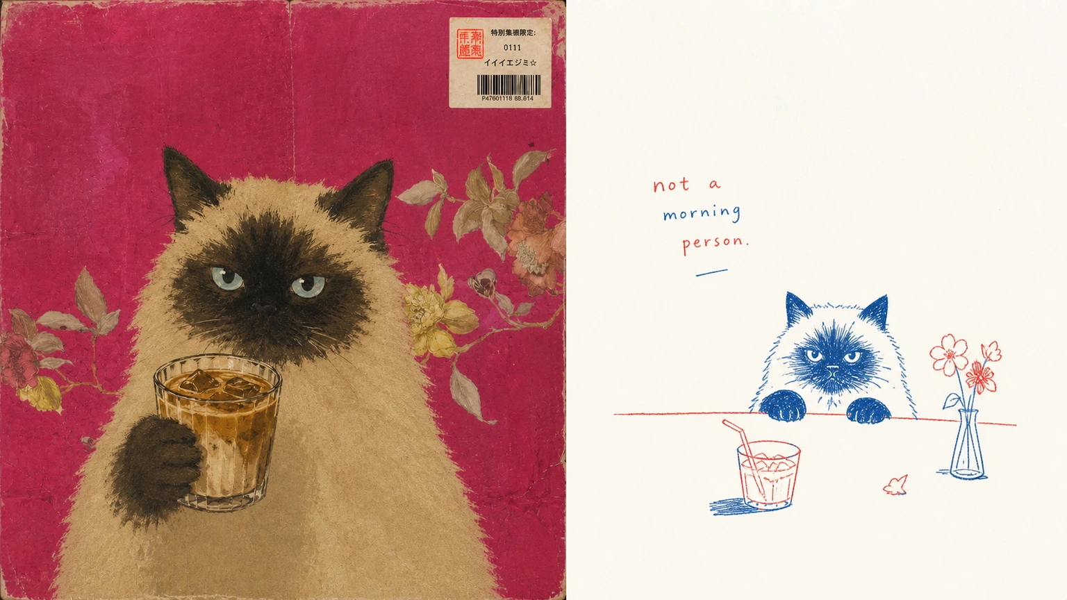
Complete AI image prompt
Please make each photo I upload into an independent high-end design poster. No splicing of multiple pictures, and each photo will be output separately. The overall composition adopts a 3:4 vertical composition, with ** strictly cut in a 50:50 ratio from top to bottom, each occupying 50% of the screen**.

The upper part retains the original photo, maintaining the main structure, real texture, natural light and shadow, and original color atmosphere. It only undergoes slight advanced photography color grading to give it the texture of art magazine and exhibition photography. The sky, ground, or environmental background can be naturally expanded to fit the frame, but the subject must not be stretched, distorted, or altered.

The second half extracts the most identifiable ** subject, outline, posture and narrative relationship ** in the photo, and re-summarizes it after understanding the truly interesting, moving or metaphorical core of the original picture. Don't completely trace the photo, keep only a main narrative center and a few necessary clues, and re-express it in a minimalist, childlike, and slightly clumsy hand-drawn way, so that people can associate it with the original picture at a glance, and at the same time generate new humor, poetry or daily observations.

The picture uses two fixed hand-painted ink colors ** red and blue **, with no other main colors added except for a very light paper background. The blue is refreshing, retro, with a slight crayon or ballpoint pen feel, while the red is warm, bright, with a hint of vermilion or tomato red. The two colors naturally alternate through lines, partial coloring, symbols and text, and are not evenly distributed or spread over a large area.

Lines are kept thin, loose, slightly askew and hand-incorrect, allowing for jitters, breaks, repeated tracings, slight exaggeration of proportions and incomplete closure. The form is simple and direct, like a casually drawn observation of life, but the key outlines, postures and relationships must be accurate. Avoid glossy vectors, neat strokes, and overly cutesy cartoon shapes.

The composition emphasizes **white space, visual focus, scale contrast and rhythm of graphics and text**. The subject can be offset, reduced, suspended or concentrated in part, without filling the lower half of the picture; the large blank space assumes the sense of air and emotion. A very small number of small elements, symbols, movement traces or directional lines with real narrative significance can be extracted from the original picture to form a loose but logical relationship with the subject, rather than being scattered decoratively. The whole seems random, but actually has a clear balance, rhythm and reading path.

The background was intelligently matched based on the comprehensive color temperature of the photo above to **, an extremely light, nearly white paper background color **, with only a very slight warm-to-cold tendency and natural paper fiber particles. It is not yellowed, old, or distracting from the image.

The text arises freely from the mood, movement, relationship, sound, memory or metaphor of the photograph without presupposing a title, place, number, year or language. It can be a very short word, a spoken word, an exclamation, a fragment, onomatopoeia or a small sentence with an aftertaste. ** uses a small, loose handwritten font with slight children's writing errors and uneven baselines. ** Text can be interspersed around the subject, close to the outline, along the direction of the action, suspended in the blank, or echoed with arrows, short lines, and symbols, making the text itself a part of the picture instead of a regular information bar.

Overall temperament: ** is childlike, clumsy, relaxed, smart, humorous, gentle and relaxed, with advanced editorial design and awareness of white space. ** is like a carefully designed personal observation note rather than a children's illustration. Avoid complex backgrounds, complete scene reproductions, accumulation of details, use of multiple colors, sticker logic, commercial cartoons, cute templates, smooth digital lines and e-commerce sense.
Original style prompt
Please make each photo I upload into an independent high-end design poster. No splicing of multiple pictures, and each photo will be output separately. The overall composition adopts a 3:4 vertical composition, with ** strictly cut in a 50:50 ratio from top to bottom, each occupying 50% of the screen**.

The upper part retains the original photo, maintaining the main structure, real texture, natural light and shadow, and original color atmosphere. It only undergoes slight advanced photography color grading to give it the texture of art magazine and exhibition photography. The sky, ground, or environmental background can be naturally expanded to fit the frame, but the subject must not be stretched, distorted, or altered.

The second half extracts the most identifiable ** subject, outline, posture and narrative relationship ** in the photo, and re-summarizes it after understanding the truly interesting, moving or metaphorical core of the original picture. Don't completely trace the photo, keep only a main narrative center and a few necessary clues, and re-express it in a minimalist, childlike, and slightly clumsy hand-drawn way, so that people can associate it with the original picture at a glance, and at the same time generate new humor, poetry or daily observations.

The picture uses two fixed hand-painted ink colors ** red and blue **, with no other main colors added except for a very light paper background. The blue is refreshing, retro, with a slight crayon or ballpoint pen feel, while the red is warm, bright, with a hint of vermilion or tomato red. The two colors naturally alternate through lines, partial coloring, symbols and text, and are not evenly distributed or spread over a large area.

Lines are kept thin, loose, slightly askew and hand-incorrect, allowing for jitters, breaks, repeated tracings, slight exaggeration of proportions and incomplete closure. The form is simple and direct, like a casually drawn observation of life, but the key outlines, postures and relationships must be accurate. Avoid glossy vectors, neat strokes, and overly cutesy cartoon shapes.

The composition emphasizes **white space, visual focus, scale contrast and rhythm of graphics and text**. The subject can be offset, reduced, suspended or concentrated in part, without filling the lower half of the picture; the large blank space assumes the sense of air and emotion. A very small number of small elements, symbols, movement traces or directional lines with real narrative significance can be extracted from the original picture to form a loose but logical relationship with the subject, rather than being scattered decoratively. The whole seems random, but actually has a clear balance, rhythm and reading path.

The background was intelligently matched based on the comprehensive color temperature of the photo above to **, an extremely light, nearly white paper background color **, with only a very slight warm-to-cold tendency and natural paper fiber particles. It is not yellowed, old, or distracting from the image.

The text arises freely from the mood, movement, relationship, sound, memory or metaphor of the photograph without presupposing a title, place, number, year or language. It can be a very short word, a spoken word, an exclamation, a fragment, onomatopoeia or a small sentence with an aftertaste. ** uses a small, loose handwritten font with slight children's writing errors and uneven baselines. ** Text can be interspersed around the subject, close to the outline, along the direction of the action, suspended in the blank, or echoed with arrows, short lines, and symbols, making the text itself a part of the picture instead of a regular information bar.

Overall temperament: ** is childlike, clumsy, relaxed, smart, humorous, gentle and relaxed, with advanced editorial design and awareness of white space. ** is like a carefully designed personal observation note rather than a children's illustration. Avoid complex backgrounds, complete scene reproductions, accumulation of details, use of multiple colors, sticker logic, commercial cartoons, cute templates, smooth digital lines and e-commerce sense.
More open images in the “XXD Panel 067 · Everyday Humor Drawing” style