

Open prompts
en sample 06 AI Image Prompt
en sample 06, its complete AI image prompt, and the XXD Panel 081 · Colored-Thread Keepsake Album style are free to view and copy.
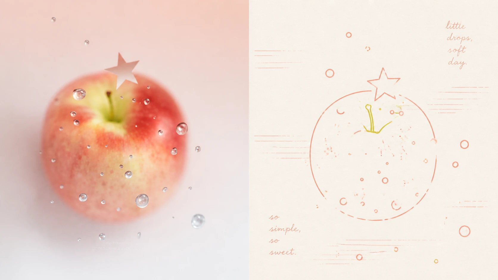
Complete AI image prompt
Turn each photograph I upload into a separate premium design poster. Do not combine multiple images; output each photograph separately. Use an overall 3:4 portrait composition, with the upper and lower regions kept at a strict 1:1 height ratio, each occupying 50% of the image.

Retain the original photograph in the upper half, preserving the subject's identity, structure, pose, authentic texture, natural light and shadow, and original colour atmosphere. Apply only subtle, premium colour grading to give it the quality of an art magazine, independent publication, or exhibition image. The surrounding environment may be extended naturally to fit the aspect ratio, but the subject must not be stretched, distorted, or altered.

In the lower half, extract the photograph's most recognisable **subject, silhouette, pose, and narrative relationships**, and reconstruct them as a **linear hand drawing + limited spot-colour print + commemorative poster**. The goal is not complete depiction but “turning memory into symbols through line”: retain only the few visual clues that truly determine identity and emotion, achieving maximum recognition with the fewest lines, so that people, architecture, plants, animals, objects, or environments appear redrawn after being filtered through memory.

Use a unified **even-weight monoline system** throughout. Lines describe shape and structure rather than realistic volume. Keep the line width nearly consistent, while introducing restrained, slight wobble, curvature, misregistration, and imprecise corners to remove any mechanical vector feeling. Make extensive use of open contours, broken edges, and line subtraction, drawing only until the subject is recognisable. Keep outer contours and internal structural lines at nearly equal visual weight, giving the image the design character of a travel atlas, map, or architectural diagram.

Organise the lines intelligently according to the subject. For architecture, objects, and structural forms, prioritise horizontal, vertical, diagonal, and curved lines plus geometric frameworks to establish **structural linework**. For people, plants, animals, and natural forms, use softer organic curves and repeated linear motifs. Do not draw every item in locally complex areas; aggregate repeated small linear symbols into larger forms and create spatial depth through a **hierarchy of line density**—denser, darker, and more concentrated at focal points; sparser, lighter, and looser in the background. The whole image should establish the dual contrast of “**geometric structural lines × organic gestural lines, dense line clusters × expansive negative space**.”

The lower half should place particular emphasis on **intelligent negative space and professional composition**. Do not spread elements evenly across the page or make every memory symbol the same size. First establish one clear visual core, then organise the composition asymmetrically according to subject direction, scale, line density, and visual weight. Secondary elements should appear only where needed, using clustering and dispersion, height, scale, direction, and blank space to form a reading path. Deliberately preserve broad areas of warm-white paper so that the emptiness carries air, distance, pause, and emotion, making the result feel like a precisely art-directed commemorative poster rather than a collection of hand-drawn elements.

Use a **limited spot-colour system**. Extract and retune the most vivid, memorable colours from the upper photograph—the colours that best represent the subject's character—and let 2–4 coloured lines directly carry the information hierarchy rather than using “black outlines + coloured fills.” Use clearer, stronger coloured lines for the main visual and lighter, softer analogous or adjacent colours for secondary information, establishing layers through **colour coding + line density + differences in value**. Colours should be bright, clean, warm, and full of life, with moderate increases in brightness and purity and reduced greyness. Keep the warm-white paper breathing, and add subtle grain, registration shift, and uneven inking to create the simulated material quality of Risograph / screen printing.

Let a small amount of text enter freely, without presetting a fixed title, place, date, or language. Generate short words, phrases, or handwritten notes from the photograph's identity, relationships, actions, memories, emotions, or a small telling clue. Use a **slender, light linear handwritten typeface with slight writing drift and imperfect spacing**, maintaining the same visual language as the monoline graphics. Text may enter large areas of negative space or be distributed along the subject's direction, structural axes, or the edges of line clusters, forming a shared reading rhythm with the image rather than a conventional menu-like “title + body” layout.

The overall result should combine **warm-white paper, even-weight hand-drawn monolines, coloured-line coding, limited spot-colour printing, line-density hierarchy, expansive artistic negative space, and private commemorative narrative** into a premium visual character: warm, intimate, intelligent, relaxed, and slightly naïve, yet governed by clear geometric order and mature editorial-design judgement. Avoid realistic sketching, excessively varied line weight, mechanical vectors, uniform black outlines, complete backgrounds, evenly arranged elements, cluttered collage, cartoon-sticker styling, and commercial-template styling.
Original style prompt
Turn each photograph I upload into a separate premium design poster. Do not combine multiple images; output each photograph separately. Use an overall 3:4 portrait composition, with the upper and lower regions kept at a strict 1:1 height ratio, each occupying 50% of the image.

Retain the original photograph in the upper half, preserving the subject's identity, structure, pose, authentic texture, natural light and shadow, and original colour atmosphere. Apply only subtle, premium colour grading to give it the quality of an art magazine, independent publication, or exhibition image. The surrounding environment may be extended naturally to fit the aspect ratio, but the subject must not be stretched, distorted, or altered.

In the lower half, extract the photograph's most recognisable **subject, silhouette, pose, and narrative relationships**, and reconstruct them as a **linear hand drawing + limited spot-colour print + commemorative poster**. The goal is not complete depiction but “turning memory into symbols through line”: retain only the few visual clues that truly determine identity and emotion, achieving maximum recognition with the fewest lines, so that people, architecture, plants, animals, objects, or environments appear redrawn after being filtered through memory.

Use a unified **even-weight monoline system** throughout. Lines describe shape and structure rather than realistic volume. Keep the line width nearly consistent, while introducing restrained, slight wobble, curvature, misregistration, and imprecise corners to remove any mechanical vector feeling. Make extensive use of open contours, broken edges, and line subtraction, drawing only until the subject is recognisable. Keep outer contours and internal structural lines at nearly equal visual weight, giving the image the design character of a travel atlas, map, or architectural diagram.

Organise the lines intelligently according to the subject. For architecture, objects, and structural forms, prioritise horizontal, vertical, diagonal, and curved lines plus geometric frameworks to establish **structural linework**. For people, plants, animals, and natural forms, use softer organic curves and repeated linear motifs. Do not draw every item in locally complex areas; aggregate repeated small linear symbols into larger forms and create spatial depth through a **hierarchy of line density**—denser, darker, and more concentrated at focal points; sparser, lighter, and looser in the background. The whole image should establish the dual contrast of “**geometric structural lines × organic gestural lines, dense line clusters × expansive negative space**.”

The lower half should place particular emphasis on **intelligent negative space and professional composition**. Do not spread elements evenly across the page or make every memory symbol the same size. First establish one clear visual core, then organise the composition asymmetrically according to subject direction, scale, line density, and visual weight. Secondary elements should appear only where needed, using clustering and dispersion, height, scale, direction, and blank space to form a reading path. Deliberately preserve broad areas of warm-white paper so that the emptiness carries air, distance, pause, and emotion, making the result feel like a precisely art-directed commemorative poster rather than a collection of hand-drawn elements.

Use a **limited spot-colour system**. Extract and retune the most vivid, memorable colours from the upper photograph—the colours that best represent the subject's character—and let 2–4 coloured lines directly carry the information hierarchy rather than using “black outlines + coloured fills.” Use clearer, stronger coloured lines for the main visual and lighter, softer analogous or adjacent colours for secondary information, establishing layers through **colour coding + line density + differences in value**. Colours should be bright, clean, warm, and full of life, with moderate increases in brightness and purity and reduced greyness. Keep the warm-white paper breathing, and add subtle grain, registration shift, and uneven inking to create the simulated material quality of Risograph / screen printing.

Let a small amount of text enter freely, without presetting a fixed title, place, date, or language. Generate short words, phrases, or handwritten notes from the photograph's identity, relationships, actions, memories, emotions, or a small telling clue. Use a **slender, light linear handwritten typeface with slight writing drift and imperfect spacing**, maintaining the same visual language as the monoline graphics. Text may enter large areas of negative space or be distributed along the subject's direction, structural axes, or the edges of line clusters, forming a shared reading rhythm with the image rather than a conventional menu-like “title + body” layout.

The overall result should combine **warm-white paper, even-weight hand-drawn monolines, coloured-line coding, limited spot-colour printing, line-density hierarchy, expansive artistic negative space, and private commemorative narrative** into a premium visual character: warm, intimate, intelligent, relaxed, and slightly naïve, yet governed by clear geometric order and mature editorial-design judgement. Avoid realistic sketching, excessively varied line weight, mechanical vectors, uniform black outlines, complete backgrounds, evenly arranged elements, cluttered collage, cartoon-sticker styling, and commercial-template styling.
More open images in the “XXD Panel 081 · Colored-Thread Keepsake Album” style