

Open prompts
en sample 06 AI Image Prompt
en sample 06, its complete AI image prompt, and the XXD Panel 056 · Negative-Space Memory Painting style are free to view and copy.
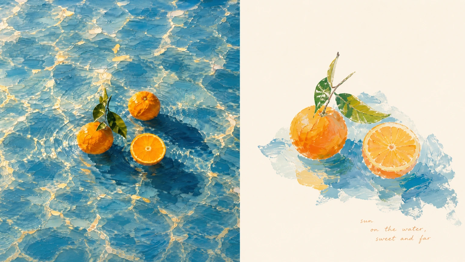
Complete AI image prompt
Please turn each photo I upload into a separate high-end design poster, without multi-image collage, and output each photo separately. The overall composition uses a 3:4 vertical format and continues the upper-and-lower two-layer logic: the upper half is real photography, while the lower half is a painterly distillation of the original image's core imagery, creating an interplay between reality and memory above and below.

The upper half retains the original photo, preserving the subject's identity, structure, pose, realistic texture, natural light and shadow, and original color atmosphere, with only slight high-end photographic color grading to give it the texture of an art magazine, independent publication, and exhibition photography. To fit the format, the environmental background may be extended naturally, but the subject must not be stretched, distorted, or altered.

The lower half extracts the most recognizable **subject, outline, pose, and narrative relationships** from the photo, then further determines the core theme, visual metaphor, or aesthetic relationship that truly makes the original image work, retaining only this most memorable layer of information for recreation. Do not fully reproduce the scene, do not pursue background restoration, and do not convert every object into an illustration one by one; proactively remove irrelevant surroundings and fragmented information, leaving only one core subject and the very few relationships that genuinely participate in the narrative, so the image resembles a reorganized visual memory.

The lower half uses an **extremely pale background and large areas of negative space** as its main spatial field. The background color is not fixed; intelligently match it to an extremely pale composite color close to white according to the original image's overall color temperature and mood. It may be slightly warm, slightly cool, or carry an extremely subtle hue, but it must be light, clean, and quiet. The blank space itself carries air, distance, time, and emotion, giving the subject ample room to breathe.

The composition emphasizes **visual center of gravity, scale relationships, negative space, directional tension, and incomplete symmetry**. The subject may be offset, partially cropped, suspended, or placed in an area with a low center of gravity, establishing beauty through contrast in size and expanses of negative space. If what is truly moving in the original image is the relationship between a person and space, an object and its environment, the distance between two objects, or some accidental relationship, preserve that relationship first rather than depicting the object alone.

The painting language uses relaxed, naive yet artistic **opaque gouache, acrylic, pastel crayon, and dry oil-paint textures**, shaping the subject with generalized color planes, hand-drawn outlines, localized scraping, coverage, and brushstrokes that are not completely filled in. Forms may be slightly clumsy and mildly exaggerated in proportion, but the subject's identity and key pose must be accurate. Retain the pauses, revisions, exposed ground, and accidental traces of real painting, avoiding an overly smooth, polished finish.

Extract the overall color temperature and the most vital colors from the original image, then translate them into a **warm, bright artist's palette with a slightly naive quality**. Overall, relaxed warm-cool contrasts are formed between warm color planes such as cream yellow, apricot, pink-orange, coral pink, and old rose, and cool colors such as sky blue, pale cyan-green, mint green, and gray-green; a very small amount of brick red, orange-red, dark green, earth brown, or black may serve as visual anchors. Colors need not completely obey the real objects; local color substitutions, misregistrations, and pops of color may be made according to the image's rhythm, but overall harmony must be maintained. The color planes should feel powdery, opaque, slightly faded yet still vivid. Avoid comprehensive Morandi-style graying, a uniform pastel filter, dirty brown, and highly saturated digital colors.

Do not preset fixed titles, locations, numbers, or languages for the text. Based on the original image's theme, action, environment, emotion, sound, memory, or metaphor, freely generate a very small amount of truly meaningful characters, words, short sentences, or fragments. The text may enter the negative space naturally like part of the painting, sit close to the subject, unfold along a spatial direction, or even retain a small amount of handwriting, misalignment, or imperfect regularity; it must still remain restrained overall, without mechanically adding information merely to “look like a poster.”

Overall, pursue an **extremely pale background, immense negative space, few subjects, vivid and warm color relationships, a naive hand-drawn feel, and a clear visual metaphor**. The image should be quiet but not bland, healing but not cloying, artistic but not affectedly high-end, like an independent publication painted by an artist's own hand. Avoid fully reproducing the scene, filling the background, listing objects, a uniform pastel filter, polished commercial illustration, smooth vectors, cartoon templates, and adding meaningless elements merely for richness.
Original style prompt
Please turn each photo I upload into a separate high-end design poster, without multi-image collage, and output each photo separately. The overall composition uses a 3:4 vertical format and continues the upper-and-lower two-layer logic: the upper half is real photography, while the lower half is a painterly distillation of the original image's core imagery, creating an interplay between reality and memory above and below.

The upper half retains the original photo, preserving the subject's identity, structure, pose, realistic texture, natural light and shadow, and original color atmosphere, with only slight high-end photographic color grading to give it the texture of an art magazine, independent publication, and exhibition photography. To fit the format, the environmental background may be extended naturally, but the subject must not be stretched, distorted, or altered.

The lower half extracts the most recognizable **subject, outline, pose, and narrative relationships** from the photo, then further determines the core theme, visual metaphor, or aesthetic relationship that truly makes the original image work, retaining only this most memorable layer of information for recreation. Do not fully reproduce the scene, do not pursue background restoration, and do not convert every object into an illustration one by one; proactively remove irrelevant surroundings and fragmented information, leaving only one core subject and the very few relationships that genuinely participate in the narrative, so the image resembles a reorganized visual memory.

The lower half uses an **extremely pale background and large areas of negative space** as its main spatial field. The background color is not fixed; intelligently match it to an extremely pale composite color close to white according to the original image's overall color temperature and mood. It may be slightly warm, slightly cool, or carry an extremely subtle hue, but it must be light, clean, and quiet. The blank space itself carries air, distance, time, and emotion, giving the subject ample room to breathe.

The composition emphasizes **visual center of gravity, scale relationships, negative space, directional tension, and incomplete symmetry**. The subject may be offset, partially cropped, suspended, or placed in an area with a low center of gravity, establishing beauty through contrast in size and expanses of negative space. If what is truly moving in the original image is the relationship between a person and space, an object and its environment, the distance between two objects, or some accidental relationship, preserve that relationship first rather than depicting the object alone.

The painting language uses relaxed, naive yet artistic **opaque gouache, acrylic, pastel crayon, and dry oil-paint textures**, shaping the subject with generalized color planes, hand-drawn outlines, localized scraping, coverage, and brushstrokes that are not completely filled in. Forms may be slightly clumsy and mildly exaggerated in proportion, but the subject's identity and key pose must be accurate. Retain the pauses, revisions, exposed ground, and accidental traces of real painting, avoiding an overly smooth, polished finish.

Extract the overall color temperature and the most vital colors from the original image, then translate them into a **warm, bright artist's palette with a slightly naive quality**. Overall, relaxed warm-cool contrasts are formed between warm color planes such as cream yellow, apricot, pink-orange, coral pink, and old rose, and cool colors such as sky blue, pale cyan-green, mint green, and gray-green; a very small amount of brick red, orange-red, dark green, earth brown, or black may serve as visual anchors. Colors need not completely obey the real objects; local color substitutions, misregistrations, and pops of color may be made according to the image's rhythm, but overall harmony must be maintained. The color planes should feel powdery, opaque, slightly faded yet still vivid. Avoid comprehensive Morandi-style graying, a uniform pastel filter, dirty brown, and highly saturated digital colors.

Do not preset fixed titles, locations, numbers, or languages for the text. Based on the original image's theme, action, environment, emotion, sound, memory, or metaphor, freely generate a very small amount of truly meaningful characters, words, short sentences, or fragments. The text may enter the negative space naturally like part of the painting, sit close to the subject, unfold along a spatial direction, or even retain a small amount of handwriting, misalignment, or imperfect regularity; it must still remain restrained overall, without mechanically adding information merely to “look like a poster.”

Overall, pursue an **extremely pale background, immense negative space, few subjects, vivid and warm color relationships, a naive hand-drawn feel, and a clear visual metaphor**. The image should be quiet but not bland, healing but not cloying, artistic but not affectedly high-end, like an independent publication painted by an artist's own hand. Avoid fully reproducing the scene, filling the background, listing objects, a uniform pastel filter, polished commercial illustration, smooth vectors, cartoon templates, and adding meaningless elements merely for richness.
More open images in the “XXD Panel 056 · Negative-Space Memory Painting” style