

Open prompts
en sample 07 AI Image Prompt
en sample 07, its complete AI image prompt, and the XXD Panel 095 · Red-and-Black Diagram Journal style are free to view and copy.
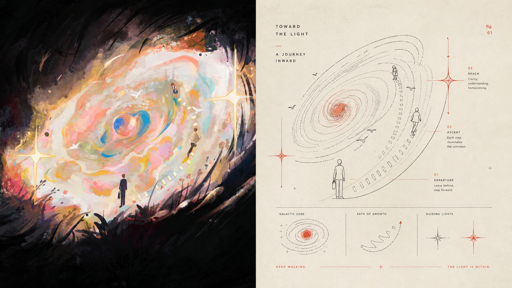
Complete AI image prompt
Turn each uploaded photograph into its own premium design poster; never combine several photographs. Use a 3:4 portrait canvas with strictly equal top and bottom regions, each occupying 50%.

Keep the original photograph above. Preserve identity, structure, pose, real texture, natural light and shadow, and the original colour atmosphere. Apply only subtle high-end grading for the quality of an art magazine, independent publication, or exhibition image. Extend the environment naturally if needed, but never stretch, distort, or alter the subject.

Below, extract the most recognisable **subject, contour, structure, pose, and narrative relationships** and rebuild them as a **mid-century modern diagrammatic editorial illustration**. Do not render realistically. Through **visual shorthand / pictographic simplification**, retain only identity-defining outlines, structural nodes, directions, actions, and symbolic relations. Re-express them with fine lines, simple geometry, arcs, icons, partial sections, and technical-diagram symbols so the source is immediately recognisable yet clearly explanatory.

Use **modular infographic logic**, not a rigid grid. Establish one primary diagram as the visual anchor and convert only necessary local features, actions, environmental relations, or symbols into smaller supporting diagrams. Build the reading path through scale contrast, offset, alignment, guide lines, and ample whitespace. Keep space flat, like a technical manual, broadcast sheet, transport diagram, or vintage magazine plate. Maintain one visual centre and avoid overload.

Make **fine black or deep-ink line** the main language: clean, even, restrained, and touched by hand-drawn technical illustration and early print. Compress architecture to key outline and construction, people or animals to pose and action, plants to growth form, objects to structure, and landscapes to topographic lines, horizons, paths, ripples, directions, or another natural diagram language. Explain clearly rather than merely draw beautifully.

Use a classic **black-and-red two-colour spot-printing system** on warm white or slightly grey-yellow paper. Black carries almost all contour, structure, and information. Restrained vermilion, coral red, or print red appears only as **spot colour** on a decisive structure, movement node, keyword, path, signal, region, or symbol. Place red like a precise editor's mark, using the area relationship among black, red, and paper white for rhythm. Retain slight ink grain, paper fibre, registration shift, and overprint; avoid gradients, rich multicolour, dirty distressing, and faux-antique filters.

Text belongs to the diagram system, not a headline bar. Derive only a few meaningful words from the photograph's theme, place, action, state, sound, or implication, without fixing language or information type. Use a **small, clear, modernist condensed sans-serif with slight letterpress irregularity**. Align it with icons, guide lines, red marks, whitespace, or numbering so it reads as a technical-publication annotation rather than a commercial headline.

The result combines **large whitespace, black technical linework, red spot emphasis, pictographic abstraction, modular diagrams, and vintage print texture**. It should feel rational, clear, intelligent, restrained, and humane, with mid-century graphic design, early information design, and independent art-publishing character. Avoid realism, geometric-block city pictures, complex perspective, cartoon icons, colourful infographics, tech UI, decorative clutter, and formulaic retro posters.
Original style prompt
Turn each uploaded photograph into its own premium design poster; never combine several photographs. Use a 3:4 portrait canvas with strictly equal top and bottom regions, each occupying 50%.

Keep the original photograph above. Preserve identity, structure, pose, real texture, natural light and shadow, and the original colour atmosphere. Apply only subtle high-end grading for the quality of an art magazine, independent publication, or exhibition image. Extend the environment naturally if needed, but never stretch, distort, or alter the subject.

Below, extract the most recognisable **subject, contour, structure, pose, and narrative relationships** and rebuild them as a **mid-century modern diagrammatic editorial illustration**. Do not render realistically. Through **visual shorthand / pictographic simplification**, retain only identity-defining outlines, structural nodes, directions, actions, and symbolic relations. Re-express them with fine lines, simple geometry, arcs, icons, partial sections, and technical-diagram symbols so the source is immediately recognisable yet clearly explanatory.

Use **modular infographic logic**, not a rigid grid. Establish one primary diagram as the visual anchor and convert only necessary local features, actions, environmental relations, or symbols into smaller supporting diagrams. Build the reading path through scale contrast, offset, alignment, guide lines, and ample whitespace. Keep space flat, like a technical manual, broadcast sheet, transport diagram, or vintage magazine plate. Maintain one visual centre and avoid overload.

Make **fine black or deep-ink line** the main language: clean, even, restrained, and touched by hand-drawn technical illustration and early print. Compress architecture to key outline and construction, people or animals to pose and action, plants to growth form, objects to structure, and landscapes to topographic lines, horizons, paths, ripples, directions, or another natural diagram language. Explain clearly rather than merely draw beautifully.

Use a classic **black-and-red two-colour spot-printing system** on warm white or slightly grey-yellow paper. Black carries almost all contour, structure, and information. Restrained vermilion, coral red, or print red appears only as **spot colour** on a decisive structure, movement node, keyword, path, signal, region, or symbol. Place red like a precise editor's mark, using the area relationship among black, red, and paper white for rhythm. Retain slight ink grain, paper fibre, registration shift, and overprint; avoid gradients, rich multicolour, dirty distressing, and faux-antique filters.

Text belongs to the diagram system, not a headline bar. Derive only a few meaningful words from the photograph's theme, place, action, state, sound, or implication, without fixing language or information type. Use a **small, clear, modernist condensed sans-serif with slight letterpress irregularity**. Align it with icons, guide lines, red marks, whitespace, or numbering so it reads as a technical-publication annotation rather than a commercial headline.

The result combines **large whitespace, black technical linework, red spot emphasis, pictographic abstraction, modular diagrams, and vintage print texture**. It should feel rational, clear, intelligent, restrained, and humane, with mid-century graphic design, early information design, and independent art-publishing character. Avoid realism, geometric-block city pictures, complex perspective, cartoon icons, colourful infographics, tech UI, decorative clutter, and formulaic retro posters.
More open images in the “XXD Panel 095 · Red-and-Black Diagram Journal” style