

Open prompts
en sample 07 AI Image Prompt
en sample 07, its complete AI image prompt, and the XXD Panel 017 · Childlike Graphic Journal style are free to view and copy.
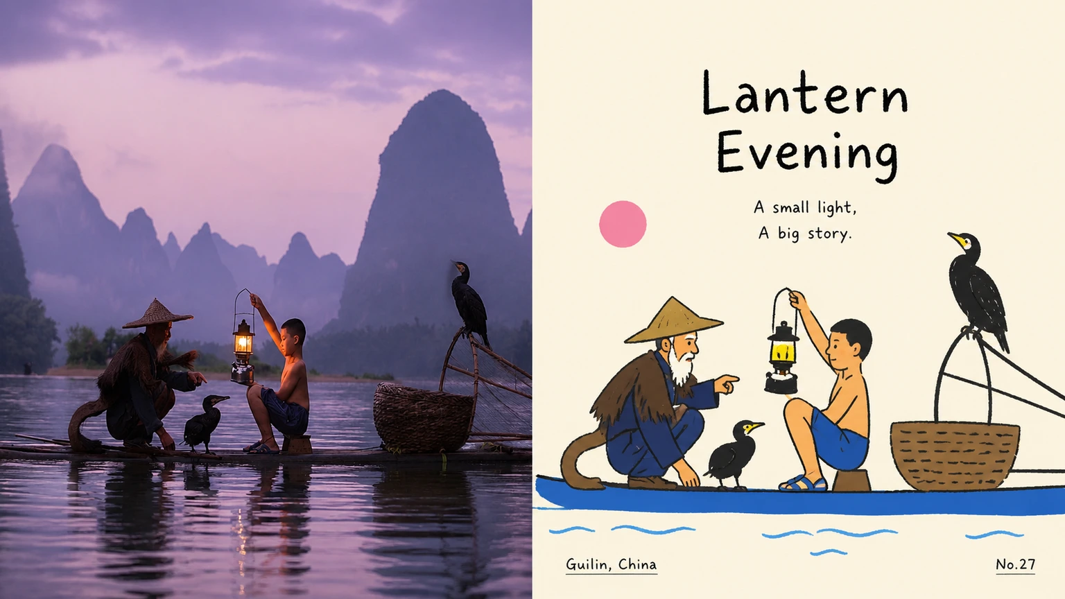
Complete AI image prompt
Please make every photo I upload into its own standalone high-end design poster; no multi-image collages, each photo output separately. The overall composition uses a 3:4 vertical format, with the upper and lower zones strictly 1:1 in height, each taking up 50% of the frame.

The upper half keeps the original photo, preserving the subject's structure, real texture, natural light and shadow, and original color atmosphere, applying only a slight high-end photographic color grade so that it carries the texture of art magazines, independent publications, and exhibition photography. To fit the frame, the environmental background may be extended naturally, but the subject must not be stretched, distorted, or altered.

The lower half extracts the most recognizable subject, outline, pose, and narrative relationships from the photo and reconstructs them into relaxed, childlike Korean-style flat editorial illustration. Retain the approximate layout, object relationships, and core action of the original image, but remove realistic light and shadow, perspective, and material details; summarize the subject as rounded, simple, slightly exaggerated geometric shapes, pairing rough, wavering black hand-drawn outlines that break in places with solid flat fills, so that the image remains recognizable at a glance without being overly realistic.

Keep one clear visual center in the composition, with the remaining objects serving as supporting elements. Establish a lively rhythm through differences in size, misalignment, overlap, slight cropping, and incomplete symmetry. Use large areas of bright solid color and negative space in the background to support the subject; complete color blocks may remain at the left, right, or in localized areas as breathing space. Do not pile up complex scenes, so that the image resembles a carefully designed children's picture book or independent editorial illustration rather than a cartoonized photograph.

Extract the most vibrant and recognizable colors from the photo above, then transform them into a limited number of high-lightness, high-saturation flat color blocks; bright blue, red, yellow, green, white, and other color relationships with childlike tension may be used, but do not mechanically apply a fixed color chart. Create a strong contrast of area between the background and the subject, avoiding gradients, shadows, muddy grays, complex color mixing, and a plastic feel.

The text likewise follows a childlike yet designed editorial logic. Distill a short title from the photo's subject, action, emotion, or story, and pair it with a small number of extremely short phrases, object words, place words, numbers, or playful annotations. The main title may use a typeface with a slightly handwritten feel, uneven stroke weight, or a slight tilt, while the small text remains clear and restrained. Text may be arranged along the subject's outline, the edge of a color block, the negative-space area, or the image axis; it may also be slightly rotated, misaligned, split apart, and interwoven, making the text feel like part of the illustration itself rather than typography added afterward.

The overall visual temperament combines real photography × childlike flat illustration × relaxed editorial design: bright, childlike, friendly, playful, easygoing, and designed. Whether the subject is a person, animal, plant, building, object, vehicle, food, or natural scene, maintain a clear visual correspondence between the identity of the original image and the illustration below, avoiding cheap cartoons, complex rendering, 3D texture, a commercial-sticker feel, and formulaic children's illustration.
Original style prompt
Please make every photo I upload into its own standalone high-end design poster; no multi-image collages, each photo output separately. The overall composition uses a 3:4 vertical format, with the upper and lower zones strictly 1:1 in height, each taking up 50% of the frame.

The upper half keeps the original photo, preserving the subject's structure, real texture, natural light and shadow, and original color atmosphere, applying only a slight high-end photographic color grade so that it carries the texture of art magazines, independent publications, and exhibition photography. To fit the frame, the environmental background may be extended naturally, but the subject must not be stretched, distorted, or altered.

The lower half extracts the most recognizable subject, outline, pose, and narrative relationships from the photo and reconstructs them into relaxed, childlike Korean-style flat editorial illustration. Retain the approximate layout, object relationships, and core action of the original image, but remove realistic light and shadow, perspective, and material details; summarize the subject as rounded, simple, slightly exaggerated geometric shapes, pairing rough, wavering black hand-drawn outlines that break in places with solid flat fills, so that the image remains recognizable at a glance without being overly realistic.

Keep one clear visual center in the composition, with the remaining objects serving as supporting elements. Establish a lively rhythm through differences in size, misalignment, overlap, slight cropping, and incomplete symmetry. Use large areas of bright solid color and negative space in the background to support the subject; complete color blocks may remain at the left, right, or in localized areas as breathing space. Do not pile up complex scenes, so that the image resembles a carefully designed children's picture book or independent editorial illustration rather than a cartoonized photograph.

Extract the most vibrant and recognizable colors from the photo above, then transform them into a limited number of high-lightness, high-saturation flat color blocks; bright blue, red, yellow, green, white, and other color relationships with childlike tension may be used, but do not mechanically apply a fixed color chart. Create a strong contrast of area between the background and the subject, avoiding gradients, shadows, muddy grays, complex color mixing, and a plastic feel.

The text likewise follows a childlike yet designed editorial logic. Distill a short title from the photo's subject, action, emotion, or story, and pair it with a small number of extremely short phrases, object words, place words, numbers, or playful annotations. The main title may use a typeface with a slightly handwritten feel, uneven stroke weight, or a slight tilt, while the small text remains clear and restrained. Text may be arranged along the subject's outline, the edge of a color block, the negative-space area, or the image axis; it may also be slightly rotated, misaligned, split apart, and interwoven, making the text feel like part of the illustration itself rather than typography added afterward.

The overall visual temperament combines real photography × childlike flat illustration × relaxed editorial design: bright, childlike, friendly, playful, easygoing, and designed. Whether the subject is a person, animal, plant, building, object, vehicle, food, or natural scene, maintain a clear visual correspondence between the identity of the original image and the illustration below, avoiding cheap cartoons, complex rendering, 3D texture, a commercial-sticker feel, and formulaic children's illustration.
More open images in the “XXD Panel 017 · Childlike Graphic Journal” style