

Open prompts
en sample 08 AI Image Prompt
en sample 08, its complete AI image prompt, and the XXD Panel 088 · Typographic Form Poem style are free to view and copy.
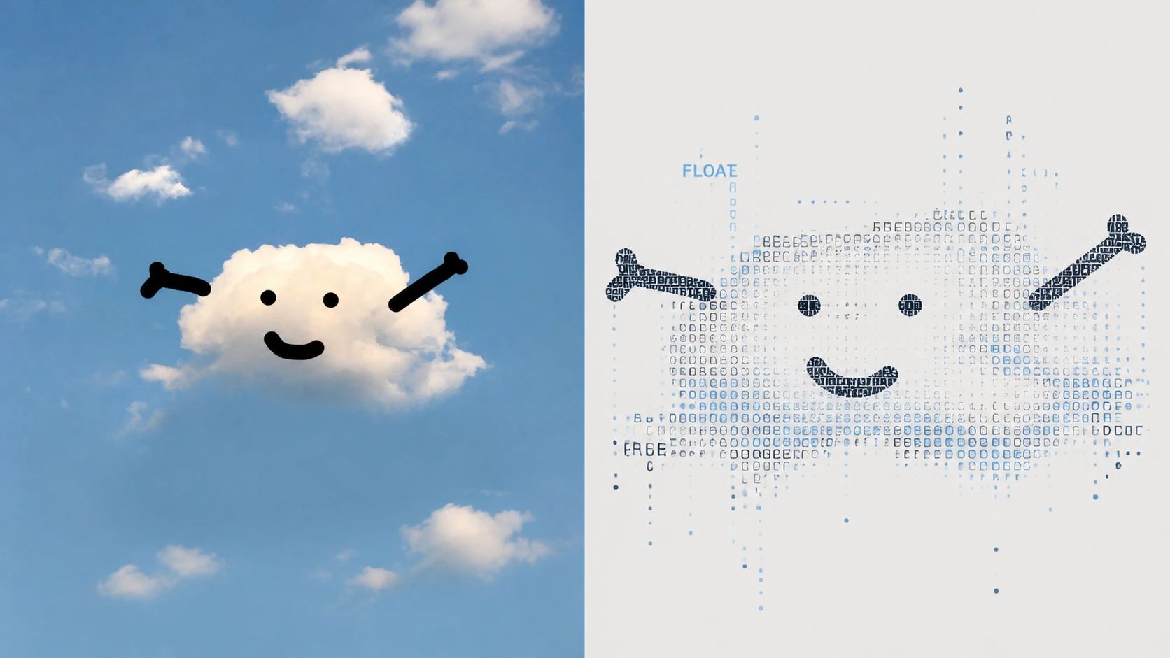
Complete AI image prompt
Please turn each photo I upload into a separate premium design poster. Do not combine multiple images; output each photo separately. Use an overall 3:4 portrait composition, with the upper and lower regions in a strict 1:1 height ratio, each occupying 50% of the image.

Retain the original photo in the upper half, preserving the subject's identity, structure, pose, realistic texture, natural light and shadow, and original colour atmosphere. Apply only subtle, refined colour grading so that it has the visual quality of an art magazine, independent publication, or exhibition image. The surrounding background may be extended naturally to fit the format, but the subject must not be stretched, distorted, or altered.

In the lower half, extract the photo's most recognisable **subject, contour, structure, pose, and narrative relationship**, and reconstruct them as an **Experimental Typographic Image / Type-as-Image Composition**. Do not depict the subject completely with conventional line art, and do not create ordinary ASCII Art. Instead, make **whole words, letters, Chinese characters, numerals, punctuation, text fragments, and dot matrices themselves the materials of form**. Rebuild the subject through variations in density, size, direction, rotation, letter spacing, and overlap, so that viewers first recognise the original subject from a distance and only discover up close that the entire image is made of text.

Keep the subject's most important outer contour clear, while using freer **deconstructed typography** within it: some text clusters densely to create dark areas and weight; some uses expanded spacing to create air and light; some is set vertically, inverted, rotated, broken apart, or reduced to a single character. Not all text needs to be readable. Follow the principle that “**visual form takes precedence over reading information**,” but do not let the whole composition become random character noise.

Key local structures may be expressed using **dotted contour / point-based contour**, replacing continuous lines with dot matrices that vary in size and density. For circles, eyes, lights, tyres, flower centres, window openings, suns, or other structures with a distinct centre, naturally use **concentric dot matrices, radial text, or circular character arrangements** to strengthen the visual focus. The dots, text, and subject contour must belong to the same compositional language rather than appearing as decoration added afterwards.

The composition should emphasise **visual centre of gravity, positive and negative form, typographic density gradients, directional tension, and extensive whitespace**. The subject may be centred or moderately offset. Some text may cross beyond the contour, extend into the whitespace, or stop abruptly; retain only a few text fragments and dotted traces around the perimeter so that the subject emerges naturally from the field of type. Avoid filling the entire layout, and create a rhythm that is both forceful and restrained between the whitespace and dense blocks of text.

Extract and refine the most distinctive and vibrant colours from the photograph above. The main palette should be **dark typographic ink + 1–2 accent colours derived from the original image + an extremely pale near-white background**. The subject's core may be darker and more concentrated, while a small number of key words, dot matrices, or local structures may use brightened and purified source colours as visual accents. Keep the overall result crisp, modern, and spirited; avoid muddy greys, chaotic multicolour, fluorescent effects, and a cheap digital-glitch aesthetic.

The textual content should also grow from the photograph itself, with no preset title, location, number, or language. Derive words, short phrases, sentence fragments, or even individual characters from the subject's identity, action, environment, sound, emotion, cultural context, memory, or metaphor, and freely mix different sizes, directions, and arrangements. **Use slender, rational modern editorial typefaces with slightly experimental cuts and irregular letter spacing**, allowing the text to carry information while also becoming the subject's skeleton, shadow, contour, and texture.

The overall result should have the refined artistic character of **experimental typography × deconstructed typography × visual poetry × type-as-image composition**: from a distance, it is a clear subject; up close, it is a complex visual system made of language, punctuation, and dot matrices. Whether the subject is a person, animal, plant, building, object, vehicle, or natural landscape, retain its clear identity and its narrative relationship to the original image. Avoid traditional ASCII character art, ordinary word clouds, a random-code feel, a cyber-glitch style, fully outlined illustration, commercial typography posters, and template-based layouts.
Original style prompt
Please turn each photo I upload into a separate premium design poster. Do not combine multiple images; output each photo separately. Use an overall 3:4 portrait composition, with the upper and lower regions in a strict 1:1 height ratio, each occupying 50% of the image.

Retain the original photo in the upper half, preserving the subject's identity, structure, pose, realistic texture, natural light and shadow, and original colour atmosphere. Apply only subtle, refined colour grading so that it has the visual quality of an art magazine, independent publication, or exhibition image. The surrounding background may be extended naturally to fit the format, but the subject must not be stretched, distorted, or altered.

In the lower half, extract the photo's most recognisable **subject, contour, structure, pose, and narrative relationship**, and reconstruct them as an **Experimental Typographic Image / Type-as-Image Composition**. Do not depict the subject completely with conventional line art, and do not create ordinary ASCII Art. Instead, make **whole words, letters, Chinese characters, numerals, punctuation, text fragments, and dot matrices themselves the materials of form**. Rebuild the subject through variations in density, size, direction, rotation, letter spacing, and overlap, so that viewers first recognise the original subject from a distance and only discover up close that the entire image is made of text.

Keep the subject's most important outer contour clear, while using freer **deconstructed typography** within it: some text clusters densely to create dark areas and weight; some uses expanded spacing to create air and light; some is set vertically, inverted, rotated, broken apart, or reduced to a single character. Not all text needs to be readable. Follow the principle that “**visual form takes precedence over reading information**,” but do not let the whole composition become random character noise.

Key local structures may be expressed using **dotted contour / point-based contour**, replacing continuous lines with dot matrices that vary in size and density. For circles, eyes, lights, tyres, flower centres, window openings, suns, or other structures with a distinct centre, naturally use **concentric dot matrices, radial text, or circular character arrangements** to strengthen the visual focus. The dots, text, and subject contour must belong to the same compositional language rather than appearing as decoration added afterwards.

The composition should emphasise **visual centre of gravity, positive and negative form, typographic density gradients, directional tension, and extensive whitespace**. The subject may be centred or moderately offset. Some text may cross beyond the contour, extend into the whitespace, or stop abruptly; retain only a few text fragments and dotted traces around the perimeter so that the subject emerges naturally from the field of type. Avoid filling the entire layout, and create a rhythm that is both forceful and restrained between the whitespace and dense blocks of text.

Extract and refine the most distinctive and vibrant colours from the photograph above. The main palette should be **dark typographic ink + 1–2 accent colours derived from the original image + an extremely pale near-white background**. The subject's core may be darker and more concentrated, while a small number of key words, dot matrices, or local structures may use brightened and purified source colours as visual accents. Keep the overall result crisp, modern, and spirited; avoid muddy greys, chaotic multicolour, fluorescent effects, and a cheap digital-glitch aesthetic.

The textual content should also grow from the photograph itself, with no preset title, location, number, or language. Derive words, short phrases, sentence fragments, or even individual characters from the subject's identity, action, environment, sound, emotion, cultural context, memory, or metaphor, and freely mix different sizes, directions, and arrangements. **Use slender, rational modern editorial typefaces with slightly experimental cuts and irregular letter spacing**, allowing the text to carry information while also becoming the subject's skeleton, shadow, contour, and texture.

The overall result should have the refined artistic character of **experimental typography × deconstructed typography × visual poetry × type-as-image composition**: from a distance, it is a clear subject; up close, it is a complex visual system made of language, punctuation, and dot matrices. Whether the subject is a person, animal, plant, building, object, vehicle, or natural landscape, retain its clear identity and its narrative relationship to the original image. Avoid traditional ASCII character art, ordinary word clouds, a random-code feel, a cyber-glitch style, fully outlined illustration, commercial typography posters, and template-based layouts.
More open images in the “XXD Panel 088 · Typographic Form Poem” style