

Open prompts
en sample 08 AI Image Prompt
en sample 08, its complete AI image prompt, and the XXD Panel 065 · Two-Line Editorial Journal style are free to view and copy.
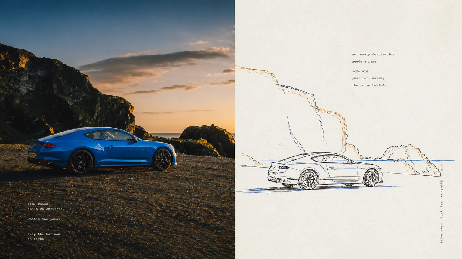
Complete AI image prompt
Please make each photo I upload into an independent high-end design poster. No splicing of multiple pictures, and each photo will be output separately. The overall composition adopts a 3:4 vertical layout, with the upper and lower areas strictly cut in a 50:50 ratio, each accounting for 50% of the screen.

The upper part retains the original photo, maintaining the main structure, real texture, natural light and shadow, and original color atmosphere. It only undergoes slight advanced photography color grading to give it the texture of art magazines, independent publications, and exhibition photography. The sky, ground, or environmental background can be naturally expanded to fit the frame, but the subject must not be stretched, distorted, or altered.

In the second half, the most identifiable subjects, contours, postures and narrative relationships in the photo are extracted. After understanding the most worthy actions, emotions, metaphors or visual relationships in the original picture, they are reorganized with minimalist hand-drawn line drawings. Rather than tracing a photo in its entirety, keep only a handful of key objects and their most meaningful relationships to make the original instantly recognizable while creating a smarter, more condensed visual narrative.

Black hand-drawn lines are used as the skeleton of the picture. The lines are slender, direct, and slightly clumsy. They have the slight jitters, pauses, thickness changes, line crossings, line breaks, and repeated corrections of real pens or stylus pens. Lines are allowed to cross, dislocate, and incompletely close in some areas. The imperfections of hand-drawing are maintained, but the main structure, posture, and direction must be accurate. No smooth vector lines, uniform technical drawing lines, or delicate cartoon strokes.

The color adopts a restrained system of black main line + two colored accent lines. The two colors extract the most recognizable, vital and visual tension with each other from the photo above, giving priority to forming a relationship of one cold and one warm or one dark and one light, which can be used for key outlines of the subject, repeated lines, local structure or narrative focus. Colored lines can be slightly misaligned, overlaid or parallel with black lines to form a rhythm similar to hand-painted color registration and old printing, but it is not allowed to fill a large area with color or add more noise.

The background is intelligently matched to an extremely light, almost white paper background based on the comprehensive color temperature of the original image, retaining only slight natural paper grain and fine particles. The composition emphasizes white space, visual center of gravity, scale contrast, density rhythm and directional relationship; the main body can be offset, reduced, partially cropped or suspended, and auxiliary elements are only used to strengthen the core narrative, making the large amount of blank space become part of the picture, rather than a background that needs to be filled.

The text is freely generated based on the theme, action, emotion, culture or metaphor of the photo, and the title, location, number and other information is not fixed. Text can enter the blank space, be arranged along the main direction, close to the structural line, form a vertical note, or be slightly interspersed with the graphics, so that the graphics and text can participate in the composition.

Use small, restrained, narrow type or machine-printed fonts with a slight hand-printing bias. The character weight is thin, the character spacing is slightly loose, and the baseline can be slightly uneven and misaligned. Vertical arrangement, rotation, or irregular spacing is allowed in some areas, so that the text has editorial order while maintaining the same real, imperfect temperament as clumsy hand-drawn lines.

The overall presentation shows the temperament of an independent publication working together with black structural lines, two-color accent lines, large areas of white space, and micro-editing and typesetting: clumsy, smart, restrained, humorous, relaxed, and with a sense of design. Avoid complex backgrounds, accumulation of details, large-area coloring, smooth vectors, cartoon stickers, 3D textures, commercial templates and meaningless decorations.
Original style prompt
Please make each photo I upload into an independent high-end design poster. No splicing of multiple pictures, and each photo will be output separately. The overall composition adopts a 3:4 vertical layout, with the upper and lower areas strictly cut in a 50:50 ratio, each accounting for 50% of the screen.

The upper part retains the original photo, maintaining the main structure, real texture, natural light and shadow, and original color atmosphere. It only undergoes slight advanced photography color grading to give it the texture of art magazines, independent publications, and exhibition photography. The sky, ground, or environmental background can be naturally expanded to fit the frame, but the subject must not be stretched, distorted, or altered.

In the second half, the most identifiable subjects, contours, postures and narrative relationships in the photo are extracted. After understanding the most worthy actions, emotions, metaphors or visual relationships in the original picture, they are reorganized with minimalist hand-drawn line drawings. Rather than tracing a photo in its entirety, keep only a handful of key objects and their most meaningful relationships to make the original instantly recognizable while creating a smarter, more condensed visual narrative.

Black hand-drawn lines are used as the skeleton of the picture. The lines are slender, direct, and slightly clumsy. They have the slight jitters, pauses, thickness changes, line crossings, line breaks, and repeated corrections of real pens or stylus pens. Lines are allowed to cross, dislocate, and incompletely close in some areas. The imperfections of hand-drawing are maintained, but the main structure, posture, and direction must be accurate. No smooth vector lines, uniform technical drawing lines, or delicate cartoon strokes.

The color adopts a restrained system of black main line + two colored accent lines. The two colors extract the most recognizable, vital and visual tension with each other from the photo above, giving priority to forming a relationship of one cold and one warm or one dark and one light, which can be used for key outlines of the subject, repeated lines, local structure or narrative focus. Colored lines can be slightly misaligned, overlaid or parallel with black lines to form a rhythm similar to hand-painted color registration and old printing, but it is not allowed to fill a large area with color or add more noise.

The background is intelligently matched to an extremely light, almost white paper background based on the comprehensive color temperature of the original image, retaining only slight natural paper grain and fine particles. The composition emphasizes white space, visual center of gravity, scale contrast, density rhythm and directional relationship; the main body can be offset, reduced, partially cropped or suspended, and auxiliary elements are only used to strengthen the core narrative, making the large amount of blank space become part of the picture, rather than a background that needs to be filled.

The text is freely generated based on the theme, action, emotion, culture or metaphor of the photo, and the title, location, number and other information is not fixed. Text can enter the blank space, be arranged along the main direction, close to the structural line, form a vertical note, or be slightly interspersed with the graphics, so that the graphics and text can participate in the composition.

Use small, restrained, narrow type or machine-printed fonts with a slight hand-printing bias. The character weight is thin, the character spacing is slightly loose, and the baseline can be slightly uneven and misaligned. Vertical arrangement, rotation, or irregular spacing is allowed in some areas, so that the text has editorial order while maintaining the same real, imperfect temperament as clumsy hand-drawn lines.

The overall presentation shows the temperament of an independent publication working together with black structural lines, two-color accent lines, large areas of white space, and micro-editing and typesetting: clumsy, smart, restrained, humorous, relaxed, and with a sense of design. Avoid complex backgrounds, accumulation of details, large-area coloring, smooth vectors, cartoon stickers, 3D textures, commercial templates and meaningless decorations.
More open images in the “XXD Panel 065 · Two-Line Editorial Journal” style