

Open prompts
en sample 08 AI Image Prompt
en sample 08, its complete AI image prompt, and the XXD Panel 050 · Travel Postcard style are free to view and copy.
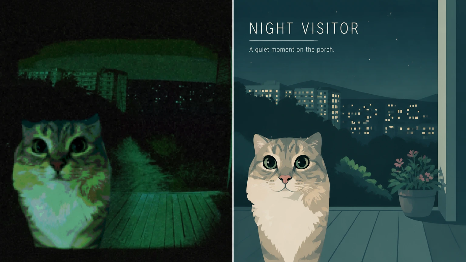
Complete AI image prompt
Please make every photo I upload into its own standalone high-end design poster; no multi-image collages, each photo output separately. The overall composition uses a 3:4 vertical format, with the upper and lower zones strictly 1:1 in height, each taking up 50% of the frame.

The upper half retains the original photo, preserving the subject's identity, structure, pose, real texture, natural light and shadow, and original color atmosphere, applying only a slight high-end photographic color grade so that it has the texture of art magazines, independent publications, and exhibition photography. To fit the frame, the sky, ground, or environmental background may be extended naturally, but the subject must not be stretched, distorted, or altered.

The lower half extracts the most recognizable **subject, outline, pose, and narrative relationships** from the photo and reconstructs them as a scene-based illustration in a premium minimalist flat-vector travel poster style. Do not mechanically trace the photo. Instead, based on the visual individuality of the original image, distill one most representative primary visual focal point and supplement it with 2–4 supporting elements that best convey the environmental character, everyday way of life, sense of place, or state of living. Whether the original image depicts a city, architecture, a person, an animal, a plant, an object, a vehicle, or a natural landscape, the lower half should look like a high-end travel visual poster tailor-made for it, rather than the application of a fixed template.

The composition should be reorganized according to the character of the subject itself rather than repeating the same layout. Build the image with one clear focal point, distinct foreground and background layers, appropriate negative space, and a quiet, orderly visual rhythm. Depending on the original image, it may naturally be transformed into a street, square, waterfront, courtyard, passageway, platform, botanical scene, interior corner, open landscape, or an environmental fragment containing traces of life. The subject is always the primary visual center; all other elements serve only to reinforce the uniqueness of “this place / this object / this situation.” Avoid collage-like accumulations of landmarks, postcard-style listings, and excessive narrative. If the image requires people, retain only 3–6 small-scale figures and integrate them naturally into the environment, without establishing a single protagonist.

The overall style uses **high-end minimalist flat vector illustration**: a Japanese stationery feel, boutique sticker illustration, and a modern editorial travel branding character, using simple geometric shapes, soft contours, consistent line weight, flat color blocks, and restrained detail. The image is fresh, quiet, refined, and contemporary. Avoid realism, heavy shadows, watercolor texture, paper texture, complex brushwork, gradients, crowded backgrounds, and excessive detail.

The color scheme is based on a soft, translucent, slightly desaturated high-end palette. A composite color temperature may be distilled from the original image and adjusted, but the overall result remains light and unified. Use **pale pink-blue, mist blue, sky blue, and airy cool blue** to create the primary atmosphere, balanced with **ivory white, cream white, light beige, soft gray-green, and architectural neutrals**. Permit only small amounts of dusty rose or muted blush as tiny accents for flowers, clothing, small signs, awnings, or local decoration, giving the image both room to breathe and refined layering.

The text logic should also be transformed into part of this style. Do not directly apply a city-name template. Instead, distill a short title from the **location, object name, theme word, state, or atmosphere** of the original image, place it in the upper left or in an area with ample negative space, and pair it with a short, restrained, characterful tagline. The typography should remain understated, editorial, spacious, and premium, without overpowering the image. Where necessary, add a small amount of fine-print information, coordinate-style annotations, or miniature notes, allowing the text to integrate naturally into the composition like the visual identity of a high-end travel brand or boutique postcard, rather than a title bar pasted on afterward.

The overall presentation should resemble a **high-end travel poster / boutique lifestyle postcard** designed specifically for the subject: fresh, elegant, quiet, modern, and refined, with ample negative space and a relaxed sense of presence. Every lower half must possess its own independent visual identity; it is not acceptable merely to replace the name while reusing the same composition, foreground, and arrangement of objects. Avoid a templated feel, a copied feel, generic travel-poster formulas, and repetitive compositions.
Original style prompt
Please make every photo I upload into its own standalone high-end design poster; no multi-image collages, each photo output separately. The overall composition uses a 3:4 vertical format, with the upper and lower zones strictly 1:1 in height, each taking up 50% of the frame.

The upper half retains the original photo, preserving the subject's identity, structure, pose, real texture, natural light and shadow, and original color atmosphere, applying only a slight high-end photographic color grade so that it has the texture of art magazines, independent publications, and exhibition photography. To fit the frame, the sky, ground, or environmental background may be extended naturally, but the subject must not be stretched, distorted, or altered.

The lower half extracts the most recognizable **subject, outline, pose, and narrative relationships** from the photo and reconstructs them as a scene-based illustration in a premium minimalist flat-vector travel poster style. Do not mechanically trace the photo. Instead, based on the visual individuality of the original image, distill one most representative primary visual focal point and supplement it with 2–4 supporting elements that best convey the environmental character, everyday way of life, sense of place, or state of living. Whether the original image depicts a city, architecture, a person, an animal, a plant, an object, a vehicle, or a natural landscape, the lower half should look like a high-end travel visual poster tailor-made for it, rather than the application of a fixed template.

The composition should be reorganized according to the character of the subject itself rather than repeating the same layout. Build the image with one clear focal point, distinct foreground and background layers, appropriate negative space, and a quiet, orderly visual rhythm. Depending on the original image, it may naturally be transformed into a street, square, waterfront, courtyard, passageway, platform, botanical scene, interior corner, open landscape, or an environmental fragment containing traces of life. The subject is always the primary visual center; all other elements serve only to reinforce the uniqueness of “this place / this object / this situation.” Avoid collage-like accumulations of landmarks, postcard-style listings, and excessive narrative. If the image requires people, retain only 3–6 small-scale figures and integrate them naturally into the environment, without establishing a single protagonist.

The overall style uses **high-end minimalist flat vector illustration**: a Japanese stationery feel, boutique sticker illustration, and a modern editorial travel branding character, using simple geometric shapes, soft contours, consistent line weight, flat color blocks, and restrained detail. The image is fresh, quiet, refined, and contemporary. Avoid realism, heavy shadows, watercolor texture, paper texture, complex brushwork, gradients, crowded backgrounds, and excessive detail.

The color scheme is based on a soft, translucent, slightly desaturated high-end palette. A composite color temperature may be distilled from the original image and adjusted, but the overall result remains light and unified. Use **pale pink-blue, mist blue, sky blue, and airy cool blue** to create the primary atmosphere, balanced with **ivory white, cream white, light beige, soft gray-green, and architectural neutrals**. Permit only small amounts of dusty rose or muted blush as tiny accents for flowers, clothing, small signs, awnings, or local decoration, giving the image both room to breathe and refined layering.

The text logic should also be transformed into part of this style. Do not directly apply a city-name template. Instead, distill a short title from the **location, object name, theme word, state, or atmosphere** of the original image, place it in the upper left or in an area with ample negative space, and pair it with a short, restrained, characterful tagline. The typography should remain understated, editorial, spacious, and premium, without overpowering the image. Where necessary, add a small amount of fine-print information, coordinate-style annotations, or miniature notes, allowing the text to integrate naturally into the composition like the visual identity of a high-end travel brand or boutique postcard, rather than a title bar pasted on afterward.

The overall presentation should resemble a **high-end travel poster / boutique lifestyle postcard** designed specifically for the subject: fresh, elegant, quiet, modern, and refined, with ample negative space and a relaxed sense of presence. Every lower half must possess its own independent visual identity; it is not acceptable merely to replace the name while reusing the same composition, foreground, and arrangement of objects. Avoid a templated feel, a copied feel, generic travel-poster formulas, and repetitive compositions.
More open images in the “XXD Panel 050 · Travel Postcard” style