

Open prompts
en sample 08 AI Image Prompt
en sample 08, its complete AI image prompt, and the XXD Panel 084 · Stipple-and-Line Journal style are free to view and copy.
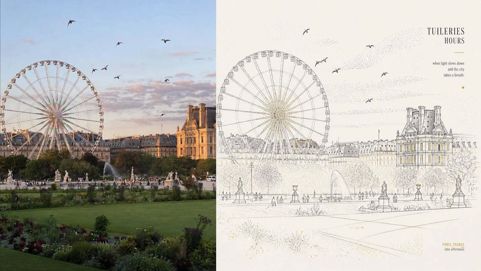
Complete AI image prompt
Turn each photograph I upload into a separate premium design poster. Do not combine multiple images; output each photograph separately. Use an overall 3:4 portrait composition, with the upper and lower regions kept at a strict 1:1 height ratio, each occupying 50% of the image.

Retain the original photograph in the upper half, preserving the subject's identity, structure, pose, authentic texture, natural light and shadow, and original colour atmosphere. Apply only subtle, premium colour grading to give it the quality of an art magazine, independent publication, or exhibition image. The surrounding environment may be extended naturally to fit the aspect ratio, but the subject must not be stretched, distorted, or altered.

In the lower half, extract the photograph's most recognisable **subject, silhouette, structure, pose, and narrative relationships**, and reconstruct them as an artwork combining **minimal line illustration + stippled texture**. Do not depict realistically or fill every detail. Instead, summarise the subject and space anew through geometric, structural linear composition: use fine black or dark lines to establish the main contours, perspective relationships, and visual guide lines of buildings, roads, plants, objects, or scenes, retaining only the essential traits needed to recognise the original at a glance.

The visual language should emphasise a **geometric linear framework + point-based atmospheric texture**. Construct the subject and environment from verticals, horizontals, broken lines, curves, and perspective lines. Let the linework remain slightly loose, hand-wobbled, and subtly irregular, creating restrained yet lively **pen-and-ink linework**. Add broad or local areas of **stippling / dotted texture**, using variations in dot density to create air, light, depth of field, and spatial hierarchy. Dots may occupy sky, ground, distance, tree shadows, lights, or the area around the subject, forming a gradient rhythm of **density-based stippling**.

Prioritise **the art of negative space, geometric order, visual centre of gravity, directional guidance, and image–text relationships**. The subject need not be fully centred, but it must have a clear focal point. Use road curves, architectural perspective lines, streetlights, wires, trees, or scene boundaries to create natural leading lines. Actively simplify complex backgrounds, retaining only a few key forms and spatial clues so the lower half resembles a distilled urban essay, architectural sketch, or scene-structure diagram rather than a complete landscape illustration.

Extract and reorganise the most characterful and memorable colours from the upper photograph. Use an overall **restricted colour system**, led by low-stimulation composite hues such as soft blue-grey, off-white, pale grey, and warm white, then add only a small amount of warm yellow, gold, or the original photograph's most life-filled hue as **spot color / color accents**. Apply these sparingly to lights, windows, small ground dots, local signage, or visual rhythm. Broad simple colour fields, such as a blue-grey sky or pale background, may remain, making the image quiet, poetic, transparent, and restrained.

Let a small amount of text enter freely, generating a concise title, phrase, or micro-annotation from the photograph's subject, place, emotion, sense of time, or symbolism. Do not fix the language or use menu-like information. Use a **slender, quiet, lightweight type style with slight printing error and handmade unevenness**, like small editorial notes in an independent publication. Arrange text naturally along negative space, subject edges, or visual guide lines, forming a relaxed yet refined image–text composition.

Reference **minimal urban illustration, urban sketch-inspired line-and-stipple illustration, architectural line drawing, and graphic simplification**. The result should feel premium, modern, quiet, poetic, restrained, and designed. Avoid realistic impasto, complete watercolour landscapes, complex textures, heavy black outlines, cartoon styling, excessive decoration, cheap filters, a strong computer-generated appearance, and template-based layout.
Original style prompt
Turn each photograph I upload into a separate premium design poster. Do not combine multiple images; output each photograph separately. Use an overall 3:4 portrait composition, with the upper and lower regions kept at a strict 1:1 height ratio, each occupying 50% of the image.

Retain the original photograph in the upper half, preserving the subject's identity, structure, pose, authentic texture, natural light and shadow, and original colour atmosphere. Apply only subtle, premium colour grading to give it the quality of an art magazine, independent publication, or exhibition image. The surrounding environment may be extended naturally to fit the aspect ratio, but the subject must not be stretched, distorted, or altered.

In the lower half, extract the photograph's most recognisable **subject, silhouette, structure, pose, and narrative relationships**, and reconstruct them as an artwork combining **minimal line illustration + stippled texture**. Do not depict realistically or fill every detail. Instead, summarise the subject and space anew through geometric, structural linear composition: use fine black or dark lines to establish the main contours, perspective relationships, and visual guide lines of buildings, roads, plants, objects, or scenes, retaining only the essential traits needed to recognise the original at a glance.

The visual language should emphasise a **geometric linear framework + point-based atmospheric texture**. Construct the subject and environment from verticals, horizontals, broken lines, curves, and perspective lines. Let the linework remain slightly loose, hand-wobbled, and subtly irregular, creating restrained yet lively **pen-and-ink linework**. Add broad or local areas of **stippling / dotted texture**, using variations in dot density to create air, light, depth of field, and spatial hierarchy. Dots may occupy sky, ground, distance, tree shadows, lights, or the area around the subject, forming a gradient rhythm of **density-based stippling**.

Prioritise **the art of negative space, geometric order, visual centre of gravity, directional guidance, and image–text relationships**. The subject need not be fully centred, but it must have a clear focal point. Use road curves, architectural perspective lines, streetlights, wires, trees, or scene boundaries to create natural leading lines. Actively simplify complex backgrounds, retaining only a few key forms and spatial clues so the lower half resembles a distilled urban essay, architectural sketch, or scene-structure diagram rather than a complete landscape illustration.

Extract and reorganise the most characterful and memorable colours from the upper photograph. Use an overall **restricted colour system**, led by low-stimulation composite hues such as soft blue-grey, off-white, pale grey, and warm white, then add only a small amount of warm yellow, gold, or the original photograph's most life-filled hue as **spot color / color accents**. Apply these sparingly to lights, windows, small ground dots, local signage, or visual rhythm. Broad simple colour fields, such as a blue-grey sky or pale background, may remain, making the image quiet, poetic, transparent, and restrained.

Let a small amount of text enter freely, generating a concise title, phrase, or micro-annotation from the photograph's subject, place, emotion, sense of time, or symbolism. Do not fix the language or use menu-like information. Use a **slender, quiet, lightweight type style with slight printing error and handmade unevenness**, like small editorial notes in an independent publication. Arrange text naturally along negative space, subject edges, or visual guide lines, forming a relaxed yet refined image–text composition.

Reference **minimal urban illustration, urban sketch-inspired line-and-stipple illustration, architectural line drawing, and graphic simplification**. The result should feel premium, modern, quiet, poetic, restrained, and designed. Avoid realistic impasto, complete watercolour landscapes, complex textures, heavy black outlines, cartoon styling, excessive decoration, cheap filters, a strong computer-generated appearance, and template-based layout.
More open images in the “XXD Panel 084 · Stipple-and-Line Journal” style