

Open prompts
en sample 08 AI Image Prompt
en sample 08, its complete AI image prompt, and the XXD Panel 086 · Negative-Space Print Journal style are free to view and copy.
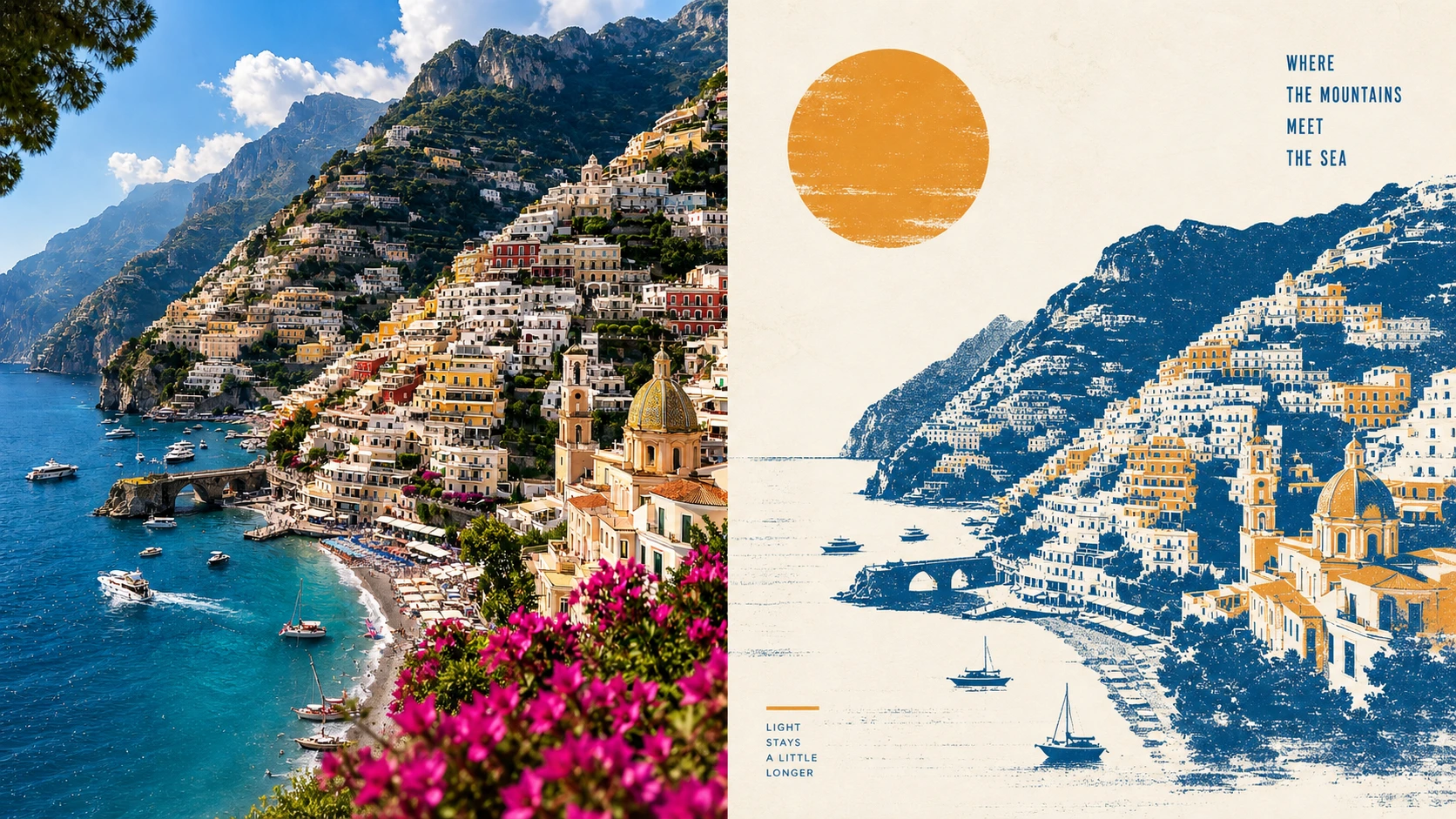
Complete AI image prompt
Turn each photograph I upload into a separate premium design poster. Do not combine multiple images; output each photograph separately. Use an overall 3:4 portrait composition, with the upper and lower regions kept at a strict 1:1 height ratio, each occupying 50% of the image.

Retain the original photograph in the upper half, preserving the subject's identity, structure, pose, authentic texture, natural light and shadow, and original colour atmosphere. Apply only subtle, premium colour grading to give it the quality of an art magazine, independent publication, or exhibition image. The surrounding environment may be extended naturally to fit the aspect ratio, but the subject must not be stretched, distorted, or altered.

In the lower half, first analyse the **subject, silhouette, pose, direction, spatial relationships, and narrative focus** that truly make the photograph work. Retain only the 3–5 most important pieces of visual information, then reconstruct them as a **limited-colour screen-print-style textured illustration** with a mid-century modernist character. Do not preserve every element equally or depict the original scene in full. Judge “what most deserves to be seen, and what can disappear,” so that the highly summarised subject remains instantly recognisable while gaining clearer visual order than the photograph.

Use **expansive negative space as an active design language**. Determine placement from the subject's orientation, movement, visual weight, and the photograph's most meaningful spatial relationship before organising the page; do not centre mechanically. The subject may be offset, reduced, partially cropped, or placed near an edge, creating tension of scale against the broad emptiness. Negative space may carry sky, distance, light, sea, ground, silence, or a sense of time. Build a premium layout through asymmetrical balance, positive and negative shapes, visual axes, density rhythm, and vertical displacement, always retaining **one clear focal point, one main direction, and one meaningful field of emptiness**.

Reshape the subject with silhouettes, geometric forms, concise colour fields, and a few key structural details. Keep only the few environmental forms that genuinely participate in the narrative. Use a **Risograph / Screen Print–inspired textured illustration** language, creating horizontal dragged ink, dry gaps, broken ink, and rough pigment through dry-brush, brayer texture, dragged ink, broken ink, and uneven ink coverage. One or a few geometric circles, colour bands, arcs, or facets may be added to contrast ordered geometry with organic print texture, but they must not become accumulated decoration.

Extract from the upper photograph **the clearest, most life-filled colour relationship that best represents the subject's character**, and compress it into 2–4 spot colours. Preserve the original hue memory while moderately increasing brightness, purity, and clarity. Build hierarchy with one vivid primary colour, one dark structural colour, one pale paper-base colour, and, only if needed, a tiny accent colour. Colours should be bright, warm, and alive while retaining the composite quality of printmaking ink. Avoid muddy greys, Morandi-style muting, fluorescent colour, cheap candy colour, and digital gradients.

Generate a small amount of short text freely from the subject analysis—its **emotion, action, place, direction, or metaphor**—without restricting the language or fixing the information type. Use a **simple, restrained condensed typeface with slight letterpress error and the character of a modernist book or journal**. Text is not an added caption; recompose it according to subject placement and negative-space structure. It may sit at the edge of a broad empty field, follow a visual axis, align with the horizon, hug a silhouette edge, or form one tiny typographic centre of gravity, allowing image and text together to balance the page.

The overall result should have the premium print-poster character created by **large areas of meaningful negative space, a vivid subject, limited spot colours, silhouette construction, geometric order, dry-brush dragged ink, and restrained image–text composition**. From afar, negative space, proportion, and composition should register first; only up close should the rough ink and printing details emerge. Avoid an oversized subject filling the page, evenly distributed elements, complex backgrounds, multiple visual centres, accumulated decoration, realistic painting, smooth vectors, 3D rendering, and template-based retro posters.
Original style prompt
Turn each photograph I upload into a separate premium design poster. Do not combine multiple images; output each photograph separately. Use an overall 3:4 portrait composition, with the upper and lower regions kept at a strict 1:1 height ratio, each occupying 50% of the image.

Retain the original photograph in the upper half, preserving the subject's identity, structure, pose, authentic texture, natural light and shadow, and original colour atmosphere. Apply only subtle, premium colour grading to give it the quality of an art magazine, independent publication, or exhibition image. The surrounding environment may be extended naturally to fit the aspect ratio, but the subject must not be stretched, distorted, or altered.

In the lower half, first analyse the **subject, silhouette, pose, direction, spatial relationships, and narrative focus** that truly make the photograph work. Retain only the 3–5 most important pieces of visual information, then reconstruct them as a **limited-colour screen-print-style textured illustration** with a mid-century modernist character. Do not preserve every element equally or depict the original scene in full. Judge “what most deserves to be seen, and what can disappear,” so that the highly summarised subject remains instantly recognisable while gaining clearer visual order than the photograph.

Use **expansive negative space as an active design language**. Determine placement from the subject's orientation, movement, visual weight, and the photograph's most meaningful spatial relationship before organising the page; do not centre mechanically. The subject may be offset, reduced, partially cropped, or placed near an edge, creating tension of scale against the broad emptiness. Negative space may carry sky, distance, light, sea, ground, silence, or a sense of time. Build a premium layout through asymmetrical balance, positive and negative shapes, visual axes, density rhythm, and vertical displacement, always retaining **one clear focal point, one main direction, and one meaningful field of emptiness**.

Reshape the subject with silhouettes, geometric forms, concise colour fields, and a few key structural details. Keep only the few environmental forms that genuinely participate in the narrative. Use a **Risograph / Screen Print–inspired textured illustration** language, creating horizontal dragged ink, dry gaps, broken ink, and rough pigment through dry-brush, brayer texture, dragged ink, broken ink, and uneven ink coverage. One or a few geometric circles, colour bands, arcs, or facets may be added to contrast ordered geometry with organic print texture, but they must not become accumulated decoration.

Extract from the upper photograph **the clearest, most life-filled colour relationship that best represents the subject's character**, and compress it into 2–4 spot colours. Preserve the original hue memory while moderately increasing brightness, purity, and clarity. Build hierarchy with one vivid primary colour, one dark structural colour, one pale paper-base colour, and, only if needed, a tiny accent colour. Colours should be bright, warm, and alive while retaining the composite quality of printmaking ink. Avoid muddy greys, Morandi-style muting, fluorescent colour, cheap candy colour, and digital gradients.

Generate a small amount of short text freely from the subject analysis—its **emotion, action, place, direction, or metaphor**—without restricting the language or fixing the information type. Use a **simple, restrained condensed typeface with slight letterpress error and the character of a modernist book or journal**. Text is not an added caption; recompose it according to subject placement and negative-space structure. It may sit at the edge of a broad empty field, follow a visual axis, align with the horizon, hug a silhouette edge, or form one tiny typographic centre of gravity, allowing image and text together to balance the page.

The overall result should have the premium print-poster character created by **large areas of meaningful negative space, a vivid subject, limited spot colours, silhouette construction, geometric order, dry-brush dragged ink, and restrained image–text composition**. From afar, negative space, proportion, and composition should register first; only up close should the rough ink and printing details emerge. Avoid an oversized subject filling the page, evenly distributed elements, complex backgrounds, multiple visual centres, accumulated decoration, realistic painting, smooth vectors, 3D rendering, and template-based retro posters.
More open images in the “XXD Panel 086 · Negative-Space Print Journal” style