

Open prompts
en sample 09 AI Image Prompt
en sample 09, its complete AI image prompt, and the XXD Panel 015 · Abstract Memoir style are free to view and copy.
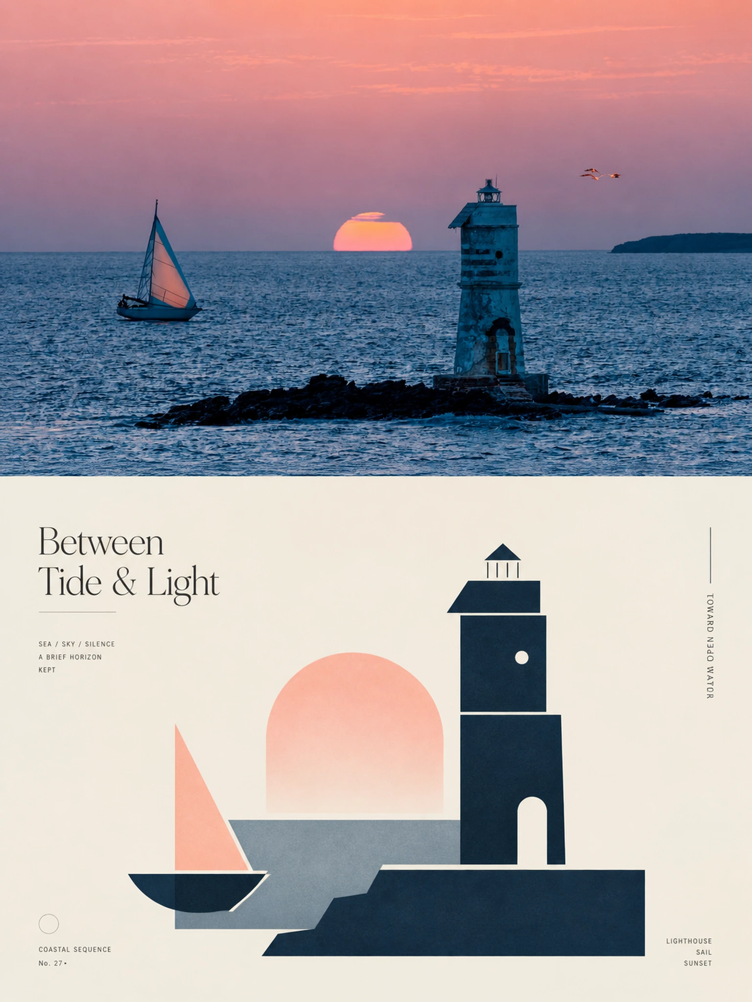
Complete AI image prompt
Please make every photo I upload into its own standalone high-end design poster; no multi-image collages, each photo output separately. The overall composition uses a 3:4 vertical format, with the upper and lower zones strictly 1:1 in height, each taking up 50% of the frame.

The upper half keeps the original photo, preserving the subject's structure, spatial relationships, real materials, natural light and shadow, and original color atmosphere, applying only a slight high-end photographic color grade so that it carries the texture of art magazines, independent publications, and exhibition photography. To fit the frame, the environmental background may be extended naturally, but the subject must not be stretched, distorted, or altered.

Against a clean ivory background, the lower half extracts the most recognizable subject, outline, pose, and narrative relationships from the photo and transforms them into a minimalist abstract visual according to a logic of “deconstruction—selection—distillation—reconstruction.” Focus on preserving the most distinctive volumetric proportions, axes, curves, interweaving, layering, occlusion, negative space, and asymmetrical relationships, reorganizing them with a small number of geometric forms; do not replicate every detail, but the correspondence with the original image above must be immediately perceptible. The composition emphasizes visual center of gravity, scale differences, primary and secondary hierarchy, positive and negative shapes, and the rhythm of negative space, avoiding iconization, uniform arrangement, and fragmented accumulation.

All colors are extracted from the photo above and distilled into 1 main color, 1 dark structural color, and 1 light/neutral color, with at most a small amount of a key accent color added. Prioritize the most recognizable, spirited colors in the original image, establishing layers through proportions of area, light-dark relationships, and local contrast; keep the result clean, restrained, and vibrant, avoiding overall graying and equal use of colors.

The text establishes a complete high-end editorial microtypography system: distill a poetic 2–5-word main title from the photo's light and shadow, space, action, material, or emotion, and pair it with 2–4 sets of extremely small supporting text, freely combining short phrases, status words, place or object information, numbering, chapter marks, serial numbers, scale-like numerals, direction words, material words, archival labels, or miniature descriptions, without using years. The main title conveys emotion, while the small text supplies order and detail, making the text resemble editorial annotations in an art book, architectural journal, or exhibition catalog rather than an ordinary title.

The text must be composed together with the abstract graphics. It may be arranged along geometric axes, edges, outlines, or negative space, or set vertically, rotated, divided into columns, widely letter-spaced, aligned to an edge, pressed into a corner, extended across color blocks, embedded between forms, or interwoven and aligned with the subject. One text group may be extremely small and another slightly larger; use contrasts in type size, letter spacing, direction, and position to establish a reading path. Overall, use a restrained combination of serif typefaces and slender editorial typefaces, allowing the abstract forms to carry the visual memory and the text to provide structure, rhythm, and a high-end quality.

The overall presentation has a visual temperament of real photography × abstract memory × editorial typography: modern, quiet, restrained, refined, artistic, and collectible. Avoid complex collage, cheap decoration, a commercial template feel, and meaningless abstraction.
Original style prompt
Please make every photo I upload into its own standalone high-end design poster; no multi-image collages, each photo output separately. The overall composition uses a 3:4 vertical format, with the upper and lower zones strictly 1:1 in height, each taking up 50% of the frame.

The upper half keeps the original photo, preserving the subject's structure, spatial relationships, real materials, natural light and shadow, and original color atmosphere, applying only a slight high-end photographic color grade so that it carries the texture of art magazines, independent publications, and exhibition photography. To fit the frame, the environmental background may be extended naturally, but the subject must not be stretched, distorted, or altered.

Against a clean ivory background, the lower half extracts the most recognizable subject, outline, pose, and narrative relationships from the photo and transforms them into a minimalist abstract visual according to a logic of “deconstruction—selection—distillation—reconstruction.” Focus on preserving the most distinctive volumetric proportions, axes, curves, interweaving, layering, occlusion, negative space, and asymmetrical relationships, reorganizing them with a small number of geometric forms; do not replicate every detail, but the correspondence with the original image above must be immediately perceptible. The composition emphasizes visual center of gravity, scale differences, primary and secondary hierarchy, positive and negative shapes, and the rhythm of negative space, avoiding iconization, uniform arrangement, and fragmented accumulation.

All colors are extracted from the photo above and distilled into 1 main color, 1 dark structural color, and 1 light/neutral color, with at most a small amount of a key accent color added. Prioritize the most recognizable, spirited colors in the original image, establishing layers through proportions of area, light-dark relationships, and local contrast; keep the result clean, restrained, and vibrant, avoiding overall graying and equal use of colors.

The text establishes a complete high-end editorial microtypography system: distill a poetic 2–5-word main title from the photo's light and shadow, space, action, material, or emotion, and pair it with 2–4 sets of extremely small supporting text, freely combining short phrases, status words, place or object information, numbering, chapter marks, serial numbers, scale-like numerals, direction words, material words, archival labels, or miniature descriptions, without using years. The main title conveys emotion, while the small text supplies order and detail, making the text resemble editorial annotations in an art book, architectural journal, or exhibition catalog rather than an ordinary title.

The text must be composed together with the abstract graphics. It may be arranged along geometric axes, edges, outlines, or negative space, or set vertically, rotated, divided into columns, widely letter-spaced, aligned to an edge, pressed into a corner, extended across color blocks, embedded between forms, or interwoven and aligned with the subject. One text group may be extremely small and another slightly larger; use contrasts in type size, letter spacing, direction, and position to establish a reading path. Overall, use a restrained combination of serif typefaces and slender editorial typefaces, allowing the abstract forms to carry the visual memory and the text to provide structure, rhythm, and a high-end quality.

The overall presentation has a visual temperament of real photography × abstract memory × editorial typography: modern, quiet, restrained, refined, artistic, and collectible. Avoid complex collage, cheap decoration, a commercial template feel, and meaningless abstraction.
More open images in the “XXD Panel 015 · Abstract Memoir” style