

Open prompts
en sample 09 AI Image Prompt
en sample 09, its complete AI image prompt, and the XXD Panel 038 · Textile Life Journal style are free to view and copy.
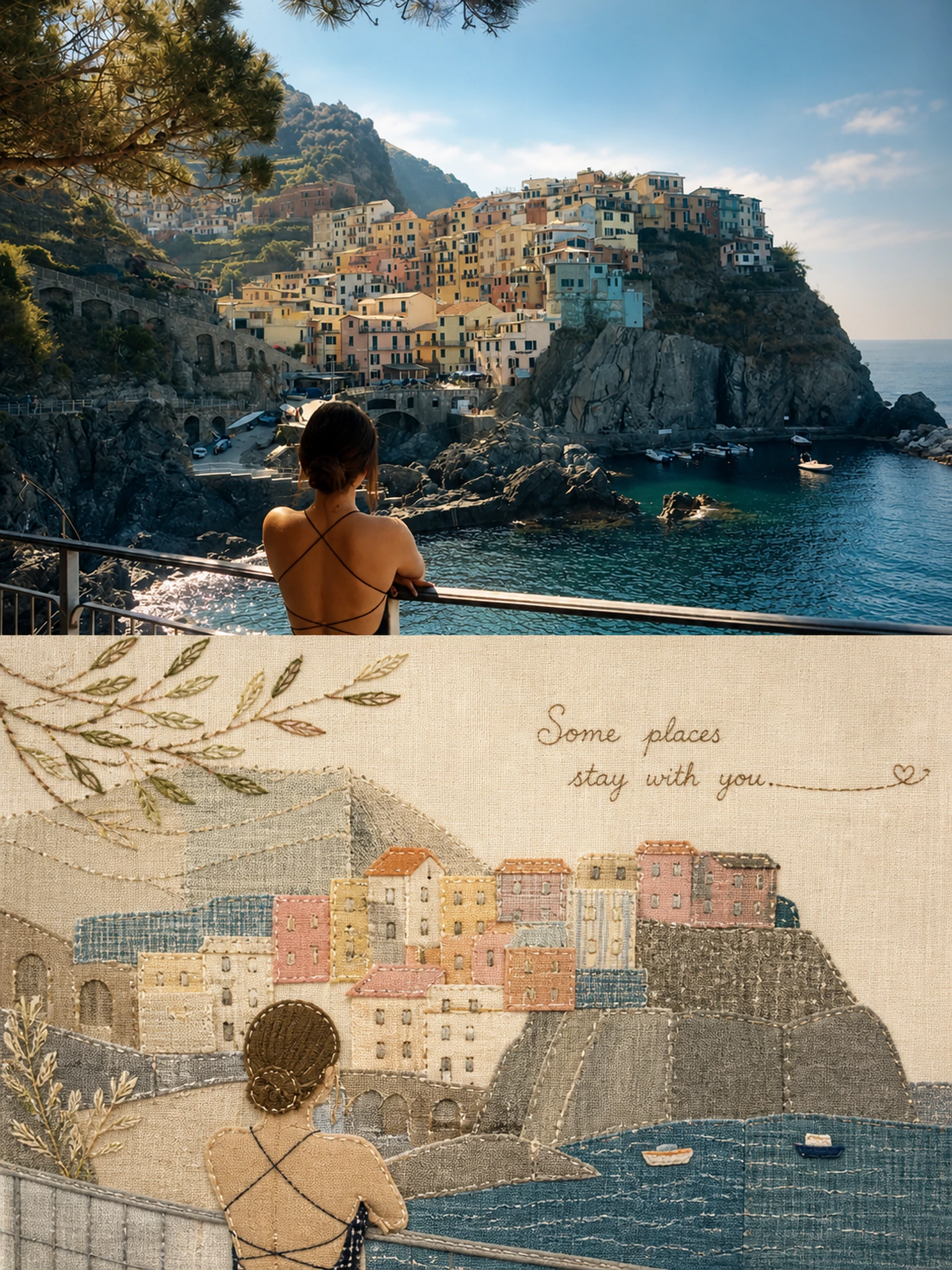
Complete AI image prompt
Please make every photo I upload into its own standalone high-end design poster; no multi-image collages, each photo output separately. The overall composition uses a 3:4 vertical format, with the upper and lower zones strictly 1:1 in height, each taking up 50% of the frame.

The upper half keeps the original photo, preserving the subject's structure, real texture, natural light and shadow, and original color atmosphere, applying only a slight high-end photographic color grade so that it carries the texture of art magazines, independent publications, and exhibition photography. To fit the frame, the sky, ground, or environmental background may be extended naturally, but the subject must not be stretched, distorted, or altered.

The lower half extracts the most recognizable subject, outline, pose, and narrative relationships from the photo, further understands the emotion, subtext, or metaphor in the photo, and then reconstructs them as a warm, vintage handmade patchwork appliqué. Do not mechanically copy the original image. Instead, use checked cotton, linen, washed coarse hemp, patch fabric, and stitching to generalize the most important forms and relationships into concise fabric pieces, so that the original subject is recognizable at a glance while the quiet, companionship, distance, lingering, growth, belonging, chance encounter, sense of time, or other inner emotions behind the photo can also be felt.

The composition emphasizes the art of negative space and visual breathing rather than spreading elements evenly across the frame. According to the subject's center of gravity, direction of motion, and narrative relationships, freely arrange the size, density, layering, cropping, and boundary crossing of the fabric pieces, allowing the main forms and large areas of blank space to create a relationship charged with tension. Some branches and leaves, contours, human movements, object edges, or scenery may naturally extend beyond the patchwork area, making the image feel as though it is growing, passing through, or continuing rather than sealed inside a frame. Negative space is not an absence; it is space that carries distance, emotion, time, and imagination.

Do not use a fixed color chart. Extract from the photo above the colors with the greatest vitality and those that best represent its spiritual character, and adaptively transform them into a healing, humanistic palette of soft textiles. Preserve the original image's own warm-cool relationships and color identity, softening, brightening, and harmonizing them moderately so that the whole feels warm, fresh, approachable, and lived-in. The subject may retain one more vivid accent color, with the remaining colors serving as soft support. Different photos should produce different color groups; avoid fixed beige, gray-brown, Morandi palettes, and deliberate aging.

Retain real fabric texture, fibers, frayed edges, stitches, patches, crossed stitching, and slightly irregular joins, making the traces of handwork naturally visible while still preserving the restraint and precision of high-end editorial design overall. The vintage quality comes from the materials and handcraft, not from dirty colors, yellowing, or cheap artificial aging.

Text is not simply a sentence placed on the image; it should become part of the emotion and composition. From the emotions, actions, relationships, or metaphors that the original image does not state directly, distill an extremely short word or phrase in the target language specified by the user, avoiding merely writing the location or object name. The text may take the form of fine-line embroidery, hand-sewn stitches, or slight handwriting, following the subject's flow, staying close to the edge of a fabric piece, hiding in negative space, or extending or pausing together with the stitching, so that image and text jointly form a reading rhythm. The text should be sparse and meaningful, like an unfinished sentence rather than an explanatory label.

The overall visual character is healing, warm, quiet, humane, vital, spacious, and rich in story, like a work combining a high-end lifestyle magazine, an independent picture book, and contemporary textile art. Whether the subject is a person, animal, plant, building, object, food, vehicle, or natural landscape, first understand what the original image truly seeks to express, then decide how to select, leave blank, patch, and typeset. Avoid the feel of a children's craft class, mechanical copying, evenly distributed composition, meaningless decoration, and templates.
Original style prompt
Please make every photo I upload into its own standalone high-end design poster; no multi-image collages, each photo output separately. The overall composition uses a 3:4 vertical format, with the upper and lower zones strictly 1:1 in height, each taking up 50% of the frame.

The upper half keeps the original photo, preserving the subject's structure, real texture, natural light and shadow, and original color atmosphere, applying only a slight high-end photographic color grade so that it carries the texture of art magazines, independent publications, and exhibition photography. To fit the frame, the sky, ground, or environmental background may be extended naturally, but the subject must not be stretched, distorted, or altered.

The lower half extracts the most recognizable subject, outline, pose, and narrative relationships from the photo, further understands the emotion, subtext, or metaphor in the photo, and then reconstructs them as a warm, vintage handmade patchwork appliqué. Do not mechanically copy the original image. Instead, use checked cotton, linen, washed coarse hemp, patch fabric, and stitching to generalize the most important forms and relationships into concise fabric pieces, so that the original subject is recognizable at a glance while the quiet, companionship, distance, lingering, growth, belonging, chance encounter, sense of time, or other inner emotions behind the photo can also be felt.

The composition emphasizes the art of negative space and visual breathing rather than spreading elements evenly across the frame. According to the subject's center of gravity, direction of motion, and narrative relationships, freely arrange the size, density, layering, cropping, and boundary crossing of the fabric pieces, allowing the main forms and large areas of blank space to create a relationship charged with tension. Some branches and leaves, contours, human movements, object edges, or scenery may naturally extend beyond the patchwork area, making the image feel as though it is growing, passing through, or continuing rather than sealed inside a frame. Negative space is not an absence; it is space that carries distance, emotion, time, and imagination.

Do not use a fixed color chart. Extract from the photo above the colors with the greatest vitality and those that best represent its spiritual character, and adaptively transform them into a healing, humanistic palette of soft textiles. Preserve the original image's own warm-cool relationships and color identity, softening, brightening, and harmonizing them moderately so that the whole feels warm, fresh, approachable, and lived-in. The subject may retain one more vivid accent color, with the remaining colors serving as soft support. Different photos should produce different color groups; avoid fixed beige, gray-brown, Morandi palettes, and deliberate aging.

Retain real fabric texture, fibers, frayed edges, stitches, patches, crossed stitching, and slightly irregular joins, making the traces of handwork naturally visible while still preserving the restraint and precision of high-end editorial design overall. The vintage quality comes from the materials and handcraft, not from dirty colors, yellowing, or cheap artificial aging.

Text is not simply a sentence placed on the image; it should become part of the emotion and composition. From the emotions, actions, relationships, or metaphors that the original image does not state directly, distill an extremely short word or phrase in the target language specified by the user, avoiding merely writing the location or object name. The text may take the form of fine-line embroidery, hand-sewn stitches, or slight handwriting, following the subject's flow, staying close to the edge of a fabric piece, hiding in negative space, or extending or pausing together with the stitching, so that image and text jointly form a reading rhythm. The text should be sparse and meaningful, like an unfinished sentence rather than an explanatory label.

The overall visual character is healing, warm, quiet, humane, vital, spacious, and rich in story, like a work combining a high-end lifestyle magazine, an independent picture book, and contemporary textile art. Whether the subject is a person, animal, plant, building, object, food, vehicle, or natural landscape, first understand what the original image truly seeks to express, then decide how to select, leave blank, patch, and typeset. Avoid the feel of a children's craft class, mechanical copying, evenly distributed composition, meaningless decoration, and templates.
More open images in the “XXD Panel 038 · Textile Life Journal” style