

Open prompts
en sample 09 AI Image Prompt
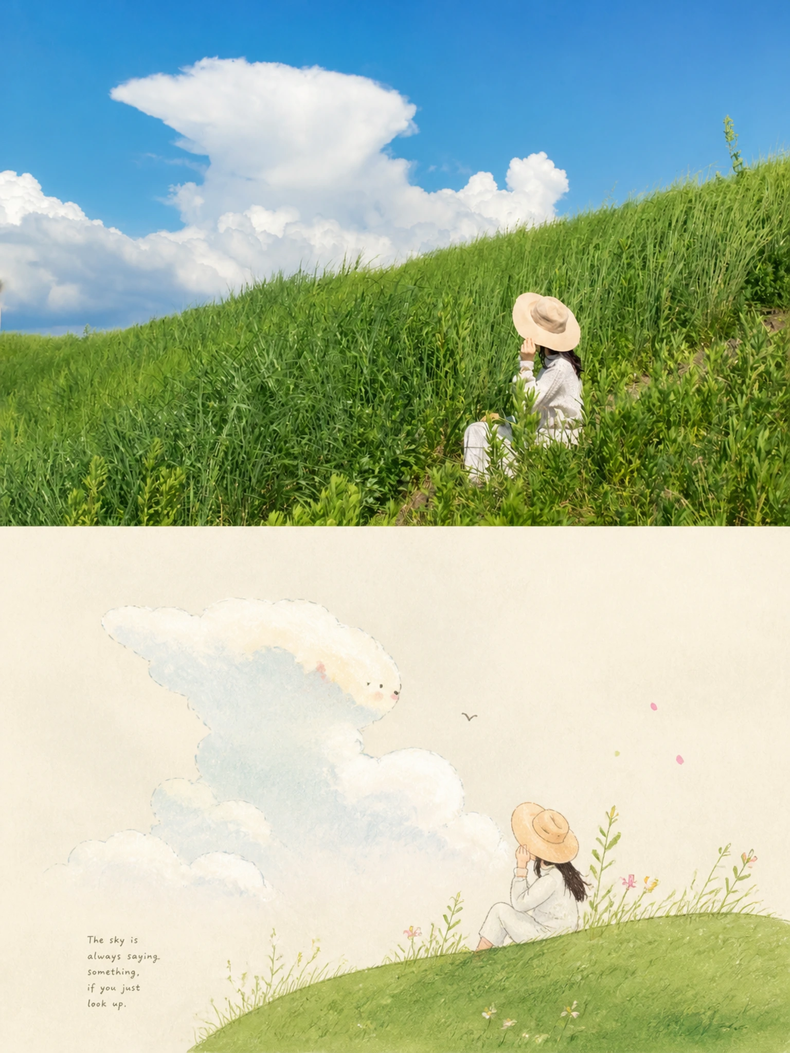
en sample 09, its complete AI image prompt, and the XXD Panel 059 · Hand-Drawn Fable Book style are free to view and copy.
Complete AI image prompt
Please make every photo I upload into its own standalone high-end design poster; no multi-image collages, and output each photo separately. The overall composition uses a 3:4 vertical format and continues the two-layer upper-and-lower logic: the upper half is real photography, and the lower half is a hand-drawn narrative reconstruction based on the core imagery and subtext.

The upper half retains the original photo, preserving the subject's identity, structure, pose, real texture, natural light and shadow, and original color atmosphere, applying only a slight high-end photographic color grade so that it has the texture of an art magazine, independent publication, and exhibition photography. To fit the frame, the environmental background may be extended naturally, but the subject must not be stretched, distorted, or altered.

The lower half no longer seeks to reproduce the entire scene. Instead, it extracts the photo's most recognizable subject, outline, pose, spatial relationships, and emotional metaphors, and, after understanding the original image's subtext, atmosphere, and symbolism, reconstructs them into an allegorical image with a hand-drawn narrative quality. Do not depict the photo in full or mechanically copy its details. Retain only the most essential and memorable core graphic logic, transforming complex reality into purer and more symbolic visual relationships, so that viewers immediately recognize the original subject while also sensing the emotions, memories, and meanings hidden behind it.

The style of the lower half should refer to the hand-drawn illustration quality on warm paper that you provided: the image should carry childlike innocence, metaphor, slight humor, and spontaneity, like a travel allegory picture book or a map of private mythology. The original image may be moderately reimagined and reorganized, translating the subjects, environment, and details in the real scene into more narrative symbolic elements. The original image's emotion, relationships, or spiritual core may be re-expressed through exaggerated proportions, personification, metaphorical scenery, repeated symbols, or a naïve yet intelligent approach to composition, but it must always revolve around the same core theme and not become a collage-like accumulation of elements.

The composition should be founded on a large pale background and clear primary-secondary relationships, retaining ample negative space so that emptiness carries air, distance, quiet, and room for imagination. The subject may be concentrated in the lower-middle area or another position with greater narrative tension, with only a small number of supporting scenic elements, paths, plants, buildings, objects, or symbolic signs retained around it. Use staggered heights, near-and-far layering, curved directional guidance, the rhythm of planes, and positive-negative shape relationships to create a more professional and aesthetically pleasing layout order. The image can feel like “a small piece of fantasy growing out of reality,” with both a sense of story and a restrained awareness of flat graphic design.

The overall visual style uses a flat illustration language with a clear hand-drawn feel: it may take the form of opaque gouache, pastel, colored pencil, crayon, acrylic, or picture-book-style coloring with a slight paper texture, retaining soft planes, slightly clumsy outlines, subtle handmade imperfections, and the feel of natural materials. Lines need not be numerous, but should show a moderate hand-drawn trace. Simplify forms, make the proportions endearing, and distill the details, keeping the result both gentle and interesting. Avoid smooth vectors, a 3D plastic feel, finely rendered realism, and an overly neat commercial illustration feel.

The color palette continues the current logic: overall, use a soft, translucent, slightly desaturated high-end color system, founded on a pale background and extensive negative space. Use pale pink-blue, mist blue, sky blue, and airy cool blue to establish the main atmosphere, balanced with ivory white, cream white, pale beige, soft gray-green, and architectural neutrals; a small amount of blush pink, soft peach, dusty rose, or muted blush may be added as a local accent to give the image more of an ins-style soothing quality, a sense of breathing room, and refined layering. Avoid dirty gray, overly strong contrast, highly saturated clashing colors, and a cheap retro feel.

Do not preset fixed titles, numbers, places, or languages for the text, and do not create menu-style information. Based on the photo's subject, emotion, action, memory, or metaphor, freely generate a very small amount of genuinely meaningful characters, words, short sentences, or fragments, and integrate them naturally into the negative-space areas through high-end editorial typography. The text should be small, light, restrained, and refined, like a poetic note or intelligent aside in an independent publication, forming a subtle echo with the image rather than explaining it directly.

The overall temperament should resemble an independently published art travel picture book or allegorical visual handbook: pale-colored, spacious, warm, childlike, intelligent, quiet, humorous, metaphorical, and spontaneous, while also having a clear core theme and high-end layout order. Avoid fully realistic landscapes, information overload, an overfilled subject, overly solid backgrounds, a templated poster feel, an e-commerce illustration feel, cartoon clichés, excessive decoration, and meaningless cuteness.
Original style prompt
Please make every photo I upload into its own standalone high-end design poster; no multi-image collages, and output each photo separately. The overall composition uses a 3:4 vertical format and continues the two-layer upper-and-lower logic: the upper half is real photography, and the lower half is a hand-drawn narrative reconstruction based on the core imagery and subtext.

The upper half retains the original photo, preserving the subject's identity, structure, pose, real texture, natural light and shadow, and original color atmosphere, applying only a slight high-end photographic color grade so that it has the texture of an art magazine, independent publication, and exhibition photography. To fit the frame, the environmental background may be extended naturally, but the subject must not be stretched, distorted, or altered.

The lower half no longer seeks to reproduce the entire scene. Instead, it extracts the photo's most recognizable subject, outline, pose, spatial relationships, and emotional metaphors, and, after understanding the original image's subtext, atmosphere, and symbolism, reconstructs them into an allegorical image with a hand-drawn narrative quality. Do not depict the photo in full or mechanically copy its details. Retain only the most essential and memorable core graphic logic, transforming complex reality into purer and more symbolic visual relationships, so that viewers immediately recognize the original subject while also sensing the emotions, memories, and meanings hidden behind it.

The style of the lower half should refer to the hand-drawn illustration quality on warm paper that you provided: the image should carry childlike innocence, metaphor, slight humor, and spontaneity, like a travel allegory picture book or a map of private mythology. The original image may be moderately reimagined and reorganized, translating the subjects, environment, and details in the real scene into more narrative symbolic elements. The original image's emotion, relationships, or spiritual core may be re-expressed through exaggerated proportions, personification, metaphorical scenery, repeated symbols, or a naïve yet intelligent approach to composition, but it must always revolve around the same core theme and not become a collage-like accumulation of elements.

The composition should be founded on a large pale background and clear primary-secondary relationships, retaining ample negative space so that emptiness carries air, distance, quiet, and room for imagination. The subject may be concentrated in the lower-middle area or another position with greater narrative tension, with only a small number of supporting scenic elements, paths, plants, buildings, objects, or symbolic signs retained around it. Use staggered heights, near-and-far layering, curved directional guidance, the rhythm of planes, and positive-negative shape relationships to create a more professional and aesthetically pleasing layout order. The image can feel like “a small piece of fantasy growing out of reality,” with both a sense of story and a restrained awareness of flat graphic design.

The overall visual style uses a flat illustration language with a clear hand-drawn feel: it may take the form of opaque gouache, pastel, colored pencil, crayon, acrylic, or picture-book-style coloring with a slight paper texture, retaining soft planes, slightly clumsy outlines, subtle handmade imperfections, and the feel of natural materials. Lines need not be numerous, but should show a moderate hand-drawn trace. Simplify forms, make the proportions endearing, and distill the details, keeping the result both gentle and interesting. Avoid smooth vectors, a 3D plastic feel, finely rendered realism, and an overly neat commercial illustration feel.

The color palette continues the current logic: overall, use a soft, translucent, slightly desaturated high-end color system, founded on a pale background and extensive negative space. Use pale pink-blue, mist blue, sky blue, and airy cool blue to establish the main atmosphere, balanced with ivory white, cream white, pale beige, soft gray-green, and architectural neutrals; a small amount of blush pink, soft peach, dusty rose, or muted blush may be added as a local accent to give the image more of an ins-style soothing quality, a sense of breathing room, and refined layering. Avoid dirty gray, overly strong contrast, highly saturated clashing colors, and a cheap retro feel.

Do not preset fixed titles, numbers, places, or languages for the text, and do not create menu-style information. Based on the photo's subject, emotion, action, memory, or metaphor, freely generate a very small amount of genuinely meaningful characters, words, short sentences, or fragments, and integrate them naturally into the negative-space areas through high-end editorial typography. The text should be small, light, restrained, and refined, like a poetic note or intelligent aside in an independent publication, forming a subtle echo with the image rather than explaining it directly.

The overall temperament should resemble an independently published art travel picture book or allegorical visual handbook: pale-colored, spacious, warm, childlike, intelligent, quiet, humorous, metaphorical, and spontaneous, while also having a clear core theme and high-end layout order. Avoid fully realistic landscapes, information overload, an overfilled subject, overly solid backgrounds, a templated poster feel, an e-commerce illustration feel, cartoon clichés, excessive decoration, and meaningless cuteness.
More open images in the “XXD Panel 059 · Hand-Drawn Fable Book” style