

Open prompts
en sample 10 AI Image Prompt
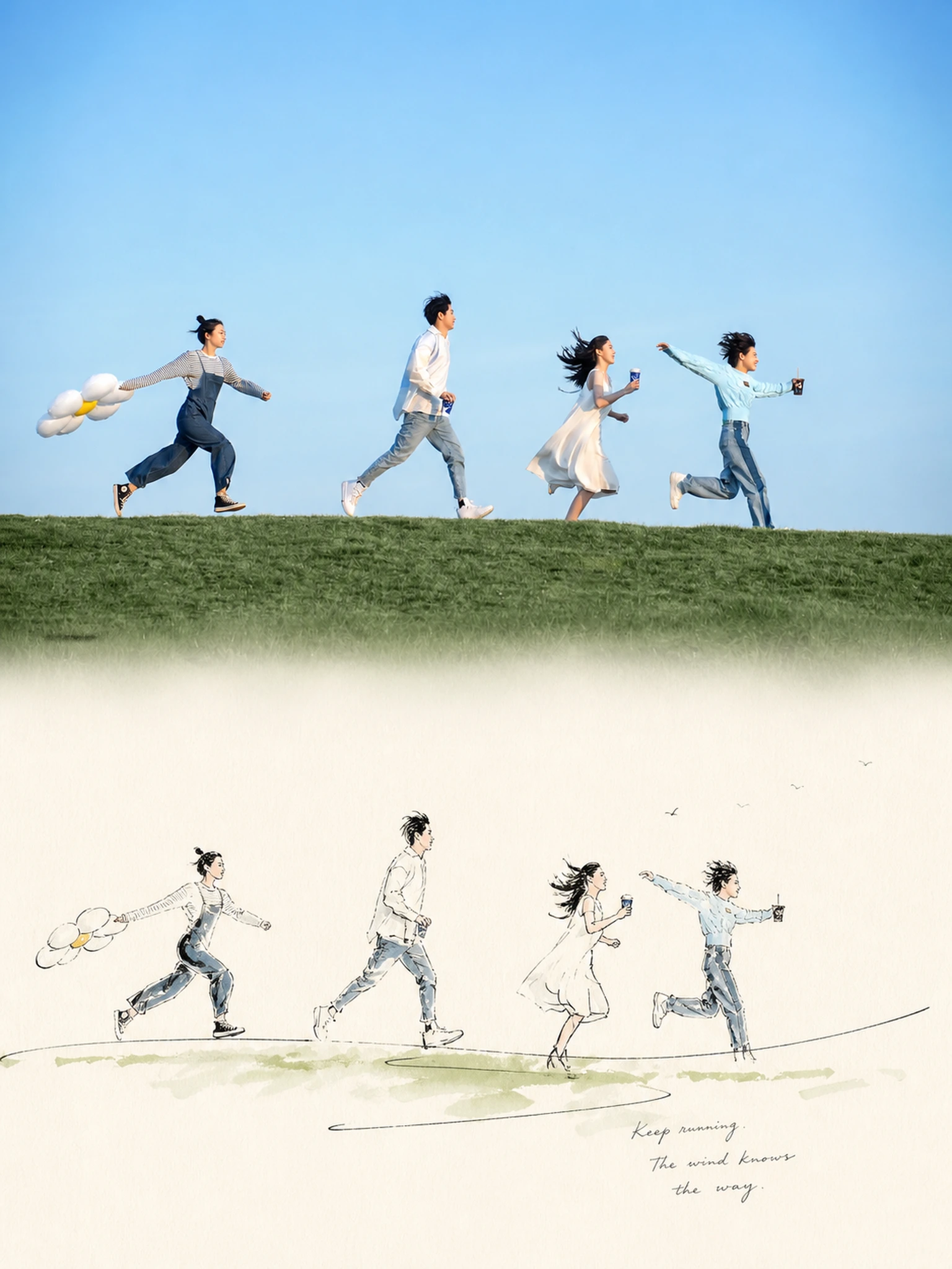
en sample 10, its complete AI image prompt, and the XXD Panel 053 · Pen-and-Wash Record style are free to view and copy.
Complete AI image prompt
Please turn each photo I upload into its own standalone premium design poster. Do not create multi-image collages; output each photo separately. Use an overall 3:4 vertical composition and continue the two-layer upper-and-lower logic: real photography in the upper half and an observational hand-drawn reconstruction in the lower half; connect the upper and lower sections naturally, avoiding a rigid 50:50 split.

The upper half retains the original photo, preserving the subject’s identity, structure, pose, realistic texture, natural light and shadow, and original color atmosphere. Apply only slight, sophisticated photographic color grading so it has the texture of an art magazine, independent publication, and exhibition photography. To fit the frame, the sky, ground, or environmental background may be extended naturally, but the subject must not be stretched, distorted, or altered.

In the lower half, extract the most recognizable subject, outline, pose, and narrative relationships from the photo and reconstruct them as an observational pen-and-light-wash sketch. Do not trace the photo in full. Retain only the visual clues most worth recording, using the least information possible to preserve the subject’s identity, proportions, direction, and the scene’s meaning, so the original can be recognized at a glance while traces of observation, omission, and the stopping of the pen remain visible.

The composition emphasizes musical rhythm within a minimalist page: treat the subject’s most important outline or action as a visual motif, and organize the image through repetition, variation, pauses, accents, and sudden negative space. The subject need not be complete or centered; it may be offset, cropped, suspended, or extend naturally in one direction. One or two more forceful free lines carry the visual accents, while the remaining lines quickly subside, allowing broad blank areas to function like rests in music. Avoid even distribution and complete filling, so the image presents improvisation within restrained order and a sense of completeness within incompletion.

Use fine, loose, uneven hand-drawn pen lines, allowing broken contours, searching lines, repeated corrections, sudden emphasis, slight deviations, and unfinished edges. More free and decisive long lines or rapid strokes may appear locally, creating rhythmic contrast with the quiet fine lines, but the key proportions, directions, and poses must remain accurate. Use light washes only in a few necessary areas, extracting 2–4 of the most distinctive colors from the original image for thin, transparent local touches. Crossing beyond the lines, water marks, grain, and uneven coverage are allowed, while environmental color should disappear rapidly.

The background paper color is not fixed. Intelligently match an extremely pale, clean, nearly white overall ground according to the original image’s combined color temperature, lighting, and mood. It may be slightly warm, slightly cool, or carry a very faint hue, but must always serve the original image and must not form an obviously colored background.

Generate text freely from the photo itself, without presetting a fixed title, number, location, year, or language. Distill a very small amount of genuinely meaningful characters, words, short phrases, or symbols from the subject, action, environment, mood, sound, sense of time, memory, or incidental details. The text also follows the rhythm of the image and may enter the negative space like a slight accent, pause, or echo, arranged naturally along an outline, line of sight, direction of movement, or unfinished edge. Prefer little, off-center, light, and clever text rather than forming a menu-like information area.

The whole should resemble a carefully edited private observation notebook: the page is minimalist, the negative space bold, the composition perceptive, the lines free but not disorderly, locally improvised yet highly restrained overall. Give the image the artistic quality of “a visual motif being observed, repeated, varied, and then stopped at exactly the right place.” Avoid complete watercolor landscapes, evenly balanced compositions, filled backgrounds, excessive fine rendering, decorative brushwork, thick black outlines, vector lines, cartoons, 3D rendering, menu-like layouts, and the feel of a commercial poster template.
🙃😋😍😍
Original style prompt
Please turn each photo I upload into its own standalone premium design poster. Do not create multi-image collages; output each photo separately. Use an overall 3:4 vertical composition and continue the two-layer upper-and-lower logic: real photography in the upper half and an observational hand-drawn reconstruction in the lower half; connect the upper and lower sections naturally, avoiding a rigid 50:50 split.

The upper half retains the original photo, preserving the subject’s identity, structure, pose, realistic texture, natural light and shadow, and original color atmosphere. Apply only slight, sophisticated photographic color grading so it has the texture of an art magazine, independent publication, and exhibition photography. To fit the frame, the sky, ground, or environmental background may be extended naturally, but the subject must not be stretched, distorted, or altered.

In the lower half, extract the most recognizable subject, outline, pose, and narrative relationships from the photo and reconstruct them as an observational pen-and-light-wash sketch. Do not trace the photo in full. Retain only the visual clues most worth recording, using the least information possible to preserve the subject’s identity, proportions, direction, and the scene’s meaning, so the original can be recognized at a glance while traces of observation, omission, and the stopping of the pen remain visible.

The composition emphasizes musical rhythm within a minimalist page: treat the subject’s most important outline or action as a visual motif, and organize the image through repetition, variation, pauses, accents, and sudden negative space. The subject need not be complete or centered; it may be offset, cropped, suspended, or extend naturally in one direction. One or two more forceful free lines carry the visual accents, while the remaining lines quickly subside, allowing broad blank areas to function like rests in music. Avoid even distribution and complete filling, so the image presents improvisation within restrained order and a sense of completeness within incompletion.

Use fine, loose, uneven hand-drawn pen lines, allowing broken contours, searching lines, repeated corrections, sudden emphasis, slight deviations, and unfinished edges. More free and decisive long lines or rapid strokes may appear locally, creating rhythmic contrast with the quiet fine lines, but the key proportions, directions, and poses must remain accurate. Use light washes only in a few necessary areas, extracting 2–4 of the most distinctive colors from the original image for thin, transparent local touches. Crossing beyond the lines, water marks, grain, and uneven coverage are allowed, while environmental color should disappear rapidly.

The background paper color is not fixed. Intelligently match an extremely pale, clean, nearly white overall ground according to the original image’s combined color temperature, lighting, and mood. It may be slightly warm, slightly cool, or carry a very faint hue, but must always serve the original image and must not form an obviously colored background.

Generate text freely from the photo itself, without presetting a fixed title, number, location, year, or language. Distill a very small amount of genuinely meaningful characters, words, short phrases, or symbols from the subject, action, environment, mood, sound, sense of time, memory, or incidental details. The text also follows the rhythm of the image and may enter the negative space like a slight accent, pause, or echo, arranged naturally along an outline, line of sight, direction of movement, or unfinished edge. Prefer little, off-center, light, and clever text rather than forming a menu-like information area.

The whole should resemble a carefully edited private observation notebook: the page is minimalist, the negative space bold, the composition perceptive, the lines free but not disorderly, locally improvised yet highly restrained overall. Give the image the artistic quality of “a visual motif being observed, repeated, varied, and then stopped at exactly the right place.” Avoid complete watercolor landscapes, evenly balanced compositions, filled backgrounds, excessive fine rendering, decorative brushwork, thick black outlines, vector lines, cartoons, 3D rendering, menu-like layouts, and the feel of a commercial poster template.
🙃😋😍😍
More open images in the “XXD Panel 053 · Pen-and-Wash Record” style