

Open prompts
en sample 10 AI Image Prompt
en sample 10, its complete AI image prompt, and the XXD Panel 077 · Travel Magazine Illustration style are free to view and copy.
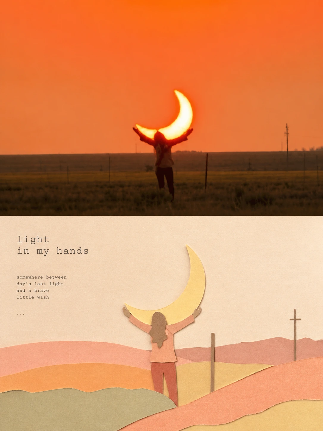
Complete AI image prompt
Turn every uploaded photograph into a separate high-end design poster. Do not combine multiple photographs; output each one independently. Use an overall 3:4 portrait composition with upper and lower regions of strictly equal height, each occupying 50% of the canvas.

Preserve the original photograph in the upper region, retaining subject identity, structure, pose, authentic texture, natural light and shadow, and the original colour atmosphere. Apply only subtle high-end grading for an art-magazine, independent-publication, and exhibition-image quality. The environment may be extended naturally to fit the format, but the subject must not be stretched, distorted, or altered.

In the lower region, reconstruct the photograph's most recognisable **subject, human action, contour structure, and scene relationship** as a minimalist paper-sculpture collage illustration. Keep the original subject and narrative logic consistent. Do not render it realistically; reorganise it with summarised forms, concise layered planes, and clear cut-paper silhouettes so the source is immediately recognisable while gaining a more refined and literary visual translation.

Make the composition subtler than an ordinary collage illustration, attending to **visual centre of gravity, proportional rhythm, whitespace distribution, layer relationships, positive–negative shape, and image–type order**. The subject may be moderately centred or slightly offset. Build a clear reading path through front–back layering, local cropping, echoed blocks, and quiet whitespace. Actively remove background and secondary detail, retaining only the few elements that best support mood and scene relationships, so the result feels balanced, restrained, relaxed, and designed.

Use **paper-sculpture collage and layered cut-paper materiality**: retain subtle paper texture, cut edges, front–back layers, soft shadows, and handmade collage traces. Keep the result clean, planar, and gentle, without excessive cartooning, slick vector finish, or heavy plastic 3D volume.

Avoid forest-like palettes dominated by dark green or sky blue. Instead use a **humanist, restorative macaron palette with gentle emotional value**. Extract the source photograph's most vital and emotionally warm colours, then recompose them at higher lightness and purity into soft, breathable pale relationships: cream white, oatmeal, mist pink, peach, apricot orange, lemon-milk yellow, pale lake blue, mist violet, soft haze green, and similarly warm bright combinations. Colour should feel light, approachable, warm, fresh, quiet, and sunlit. Avoid dirtiness, ageing, darkness, excessive coldness, fluorescence, and cheap candy colour.

Typography may use **minimal English magazine layout**, with **small, restrained typewriter lettering carrying slight mechanical irregularity** and very little supporting information. One concise large title and a tiny amount of auxiliary text are allowed, but typography must stay low in visual weight and never overpower the subject. Let text compose naturally with the subject, whitespace, and collage planes like refined travel-magazine or independent-art-journal design, not a template title bar.

The final result should feel **refined, literary, spacious, restorative, and humanist, like a travel-magazine poster**. Whether the subject is architecture, a person, animal, plant, object, vehicle, or natural landscape, the lower region must retain clear identity, concise narrative, and precise editorial design. Avoid excessive cartooning, accumulated complexity, cheap collage, template composition, and conspicuous computer generation.
Original style prompt
Turn every uploaded photograph into a separate high-end design poster. Do not combine multiple photographs; output each one independently. Use an overall 3:4 portrait composition with upper and lower regions of strictly equal height, each occupying 50% of the canvas.

Preserve the original photograph in the upper region, retaining subject identity, structure, pose, authentic texture, natural light and shadow, and the original colour atmosphere. Apply only subtle high-end grading for an art-magazine, independent-publication, and exhibition-image quality. The environment may be extended naturally to fit the format, but the subject must not be stretched, distorted, or altered.

In the lower region, reconstruct the photograph's most recognisable **subject, human action, contour structure, and scene relationship** as a minimalist paper-sculpture collage illustration. Keep the original subject and narrative logic consistent. Do not render it realistically; reorganise it with summarised forms, concise layered planes, and clear cut-paper silhouettes so the source is immediately recognisable while gaining a more refined and literary visual translation.

Make the composition subtler than an ordinary collage illustration, attending to **visual centre of gravity, proportional rhythm, whitespace distribution, layer relationships, positive–negative shape, and image–type order**. The subject may be moderately centred or slightly offset. Build a clear reading path through front–back layering, local cropping, echoed blocks, and quiet whitespace. Actively remove background and secondary detail, retaining only the few elements that best support mood and scene relationships, so the result feels balanced, restrained, relaxed, and designed.

Use **paper-sculpture collage and layered cut-paper materiality**: retain subtle paper texture, cut edges, front–back layers, soft shadows, and handmade collage traces. Keep the result clean, planar, and gentle, without excessive cartooning, slick vector finish, or heavy plastic 3D volume.

Avoid forest-like palettes dominated by dark green or sky blue. Instead use a **humanist, restorative macaron palette with gentle emotional value**. Extract the source photograph's most vital and emotionally warm colours, then recompose them at higher lightness and purity into soft, breathable pale relationships: cream white, oatmeal, mist pink, peach, apricot orange, lemon-milk yellow, pale lake blue, mist violet, soft haze green, and similarly warm bright combinations. Colour should feel light, approachable, warm, fresh, quiet, and sunlit. Avoid dirtiness, ageing, darkness, excessive coldness, fluorescence, and cheap candy colour.

Typography may use **minimal English magazine layout**, with **small, restrained typewriter lettering carrying slight mechanical irregularity** and very little supporting information. One concise large title and a tiny amount of auxiliary text are allowed, but typography must stay low in visual weight and never overpower the subject. Let text compose naturally with the subject, whitespace, and collage planes like refined travel-magazine or independent-art-journal design, not a template title bar.

The final result should feel **refined, literary, spacious, restorative, and humanist, like a travel-magazine poster**. Whether the subject is architecture, a person, animal, plant, object, vehicle, or natural landscape, the lower region must retain clear identity, concise narrative, and precise editorial design. Avoid excessive cartooning, accumulated complexity, cheap collage, template composition, and conspicuous computer generation.
More open images in the “XXD Panel 077 · Travel Magazine Illustration” style