

Open prompts
en sample 10 AI Image Prompt
en sample 10, its complete AI image prompt, and the XXD Panel 097 · Retro Instruction Card style are free to view and copy.
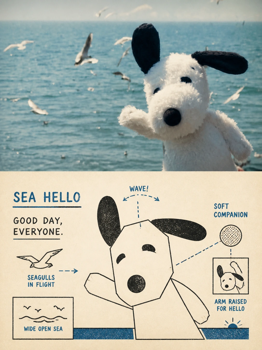
Complete AI image prompt
Create one independent premium poster for each uploaded photograph; never combine several photos. Use a 3:4 portrait canvas with equal upper and lower regions.

The upper region retains the photograph: preserve identity, structure, pose, real texture, natural light, and original colour atmosphere. Apply only subtle high-end grading. Extend the environment naturally if needed, but never stretch, distort, or alter the subject.

In the lower region, extract the most recognizable **subject, contour, structure, pose, and narrative relationship**, then rebuild them as **mid-century vernacular graphic illustration + schematic line drawing + two-colour spot printing**. Do not fully copy the photograph. Through **diagrammatic abstraction**, compress complex objects into a few clear geometric shapes, functional contours, and essential structures, like an old manual, advertising card, technical label, or folk print: immediately recognizable, but more direct, humorous, and symbolic than reality.

Emphasize **economy of line**: if one line explains a structure, add no extra strokes. Use direct black pen contours, rectangles, circles, diamonds, straight lines, and simple planes. Figures, animals, and objects may have moderately exaggerated proportions; machines, buildings, and complex structures become clear boxes, openings, panels, and contour relationships. Use flat schematic perspective rather than realistic lighting or rigorous spatial realism, keeping the image between illustration and technical diagram.

Reorganize the composition around the source's most important narrative relationship. Keep one clear subject and use only a few supporting objects, guide lines, directional relations, or structural symbols. Control **visual weight, geometric order, scale contrast, positive/negative shape, and whitespace**. The image may feel modestly awkward and vernacular, but never chaotic; every mark should explain rather than decorate.

Use restrained **two-colour spot-print logic**: deep or charcoal black carries contours, structure, and information; one distinctive, spirited colour extracted from the upper photograph becomes the second spot colour. Retune a signature source colour into brick red, vermilion, orange-red, deep green, cobalt blue, or another strong old-print composite—never mechanically default to red. Use warm ivory or pale cream uncoated paper with slight fibres, uneven ink, registration drift, and old-print grain, while staying clean rather than dirty, heavily yellowed, or cheaply distressed.

Typography participates in the diagram without preset titles, numbers, years, or languages. Generate only a few short words, labels, arrow notes, or handwritten fragments grounded in the subject, action, function, place, sound, state, or humorous implication. **Use direct, plain vintage commercial hand-lettering with slightly awkward proportions and human error.** Vary size and slant, follow structural edges, or answer guide lines, as if printed into a manual, package card, or folk advertisement rather than added later as modern typography.

The result combines **vernacular commercial graphics, technical schematics, geometric reduction, two-colour spot printing, hand lettering, and gentle functional humour**, like a preserved instruction card, package insert, QSL card, or technical promotional print. For people, animals, architecture, vehicles, objects, plants, or landscapes, maintain “contour + information + humour.” Avoid realistic illustration, exploratory repeated sketch lines, complex shading, realistic 3D, slick modern vectors, excessive texture, cartoon stickers, stacked vintage filters, and templated nostalgia posters.
Original style prompt
Create one independent premium poster for each uploaded photograph; never combine several photos. Use a 3:4 portrait canvas with equal upper and lower regions.

The upper region retains the photograph: preserve identity, structure, pose, real texture, natural light, and original colour atmosphere. Apply only subtle high-end grading. Extend the environment naturally if needed, but never stretch, distort, or alter the subject.

In the lower region, extract the most recognizable **subject, contour, structure, pose, and narrative relationship**, then rebuild them as **mid-century vernacular graphic illustration + schematic line drawing + two-colour spot printing**. Do not fully copy the photograph. Through **diagrammatic abstraction**, compress complex objects into a few clear geometric shapes, functional contours, and essential structures, like an old manual, advertising card, technical label, or folk print: immediately recognizable, but more direct, humorous, and symbolic than reality.

Emphasize **economy of line**: if one line explains a structure, add no extra strokes. Use direct black pen contours, rectangles, circles, diamonds, straight lines, and simple planes. Figures, animals, and objects may have moderately exaggerated proportions; machines, buildings, and complex structures become clear boxes, openings, panels, and contour relationships. Use flat schematic perspective rather than realistic lighting or rigorous spatial realism, keeping the image between illustration and technical diagram.

Reorganize the composition around the source's most important narrative relationship. Keep one clear subject and use only a few supporting objects, guide lines, directional relations, or structural symbols. Control **visual weight, geometric order, scale contrast, positive/negative shape, and whitespace**. The image may feel modestly awkward and vernacular, but never chaotic; every mark should explain rather than decorate.

Use restrained **two-colour spot-print logic**: deep or charcoal black carries contours, structure, and information; one distinctive, spirited colour extracted from the upper photograph becomes the second spot colour. Retune a signature source colour into brick red, vermilion, orange-red, deep green, cobalt blue, or another strong old-print composite—never mechanically default to red. Use warm ivory or pale cream uncoated paper with slight fibres, uneven ink, registration drift, and old-print grain, while staying clean rather than dirty, heavily yellowed, or cheaply distressed.

Typography participates in the diagram without preset titles, numbers, years, or languages. Generate only a few short words, labels, arrow notes, or handwritten fragments grounded in the subject, action, function, place, sound, state, or humorous implication. **Use direct, plain vintage commercial hand-lettering with slightly awkward proportions and human error.** Vary size and slant, follow structural edges, or answer guide lines, as if printed into a manual, package card, or folk advertisement rather than added later as modern typography.

The result combines **vernacular commercial graphics, technical schematics, geometric reduction, two-colour spot printing, hand lettering, and gentle functional humour**, like a preserved instruction card, package insert, QSL card, or technical promotional print. For people, animals, architecture, vehicles, objects, plants, or landscapes, maintain “contour + information + humour.” Avoid realistic illustration, exploratory repeated sketch lines, complex shading, realistic 3D, slick modern vectors, excessive texture, cartoon stickers, stacked vintage filters, and templated nostalgia posters.
More open images in the “XXD Panel 097 · Retro Instruction Card” style