

Open prompts
en sample 10 AI Image Prompt
en sample 10, its complete AI image prompt, and the XXD Panel 107 · Image-Word Poetry style are free to view and copy.
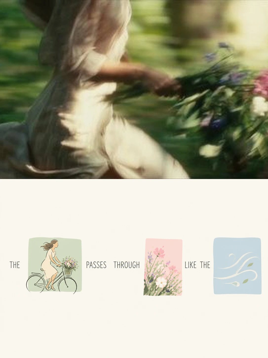
Complete AI image prompt
Turn each photograph I upload into a separate, high-end designed poster. Do not combine multiple images; output each photograph independently. Use an overall 3:4 portrait composition with two horizontal regions in a strict 1:1 height ratio, each occupying exactly 50% of the canvas.

Keep the original photograph in the upper half. Preserve the subject's identity, structure, pose, authentic texture, natural light and shadow, and original colour atmosphere, applying only subtle high-end colour grading so it feels like an art magazine, independent publication, or exhibition image. The surrounding environment may be extended naturally to fit the format, but the subject must not be stretched, distorted, or altered.

In the lower half, do not reproduce the photograph in full or simply shrink and redraw it. Extract its most memorable subject, action, partial contour, object, plant, architectural fragment, colour relationship, and symbolic detail; distil these into several visual elements transformed through one consistent style, then combine them with text to form a rebus-style visual sentence. These images are not decorative illustrations: they must genuinely replace words in the sentence. Once a word is replaced by an image, that word must not be repeated in the text. The full sentence must require both text and image to be understood.

First, freely write a short, imaginative sentence with a lightly poetic or editorial tone based on the photograph's emotion, action, relationship, place, memory, or metaphor. Then choose the nouns, action words, image-bearing words, or emotion words best suited to visualisation and directly replace them with corresponding image elements. A flower, window, bird, tree, cup, sea, wind, lamp, road, waiting, passing, returning, or morning, for example, may be carried by a visual element drawn from the original image. The image must occupy the word's original position, creating a genuinely continuous “text → image word → text → image word → text” reading logic, rather than placing a few small pictures beside a complete sentence.

Place every replaced “visual word” on its own small colour-block background, like a tiny fragment cut from the photograph's memory. Each block may have a different size, aspect ratio, and crop: near-square, a narrow horizontal strip, a tall vertical block, or a small irregular crop. The blocks need not share a size, but they must establish clear rhythm and hierarchy. The image inside each block is not a crop from the photograph; it is an artistically redrawn fragment in the shared visual language, retaining only the most recognisable contour, movement, structure, and spirit. It may be partly cropped, only partially visible, or extend naturally beyond the block, so that it behaves like a meaningful visual word rather than an ordinary little illustration.

Transform all visual elements through one modern hand-drawn editorial illustration language: rebuild source elements with simplified contours, generalised forms, a few flat colour areas, and a slight handmade quality. Avoid excessive realism, complex volume, photographic texture, and mechanical copying. Preserve the original object's soul and recognisability without trying to depict it completely; it should feel more like a distilled visual memory. The style may be light, intelligent, subtly designed, and suited to an art publication, so all image words feel coherent with one another.

The colour-block backgrounds behind the visual words should all follow one fresh, bright, eye-pleasing soft-colour logic, although each block may use a different colour. Extract and retune the brightest, liveliest, most vital colours from the upper photograph rather than averaging its colours. Raise lightness and chromatic cleanliness overall to create a softer, lighter, friendlier relationship; natural hues may include milk blue, aqua, mint green, fresh-leaf green, butter yellow, peach pink, cherry-blossom pink, apricot orange, and lavender. Blocks may jump gently between hues, but the whole palette must remain unified, comfortable, translucent, and clean, conveying an easy, joyful, healing mood with a touch of feminine and Instagram sensibility. Avoid dirty grey, darkness, aged or heavy Morandi styling, fluorescent colour, cheap candy tones, and harsh contrast.

Organise the composition around the sentence's reading path so that the lower half feels like a page of readable visual poetry. Text and image words may unfold freely over two to four lines. They need not align perfectly, but they must maintain a clear, elegant, natural reading rhythm. Scale image words according to semantic importance: some may be close to ordinary word size, while others may enlarge moderately to create visual pauses. Use varied height, density, slight offsets, whitespace, and baseline rhythm among text, image words, and colour blocks to establish an asymmetric yet stable editorial layout. Do not let it become a sticker wall, card list, regular grid, or chaotic collage.

Keep generous, purposeful whitespace in the lower half, allowing emptiness itself to provide breath, rhythm, and refinement. Use an off-white, warm white, or extremely pale background intelligently coordinated with the source image's overall colour temperature. Keep everything clean, quiet, and translucent. All image words, text, and colour blocks should float within ample whitespace, so the composition resembles an art magazine, independent publication, visual-poetry page, or experimental text-and-image work rather than a commercial poster template.

The text may use any language. Choose Chinese, English, bilingual wording, or another language that better suits the image's character, but keep it concise, natural, and imaginative. Do not use an ordinary commercial headline style. Use light, clean, delicate type with modern editorial character and a subtle humanist quality; spacing should feel natural and open, with ample room. Slight offsets, line breaks, and rhythmic variation are allowed so text and image words coexist as equals and jointly build the composition rather than overpowering one another.

The overall result should present a real image in the upper half and, in the lower half, one visual sentence jointly formed by “text + image words + colour blocks.” It should feel like an emotional short poem, memory fragment, and visual metaphor distilled from the photograph and reorganised into a light, intelligent, fresh, healing, modern, and highly designed artwork. The goal is not to explain what the photograph contains, but to translate its most moving content into a language that can both be read and viewed.

Avoid: using direct crops from the original photograph as visual words; treating images as decorative illustrations beside the text; keeping the complete sentence in text while adding pictures; sticker-wall effects; card grids; commercial-template styling; feed-style layouts; e-commerce styling; childish collage; disorder; dirty or grey colour; cheap candy colour; excessive realism; complex backgrounds; mechanical type; and crowded layouts without whitespace.
Original style prompt
Turn each photograph I upload into a separate, high-end designed poster. Do not combine multiple images; output each photograph independently. Use an overall 3:4 portrait composition with two horizontal regions in a strict 1:1 height ratio, each occupying exactly 50% of the canvas.

Keep the original photograph in the upper half. Preserve the subject's identity, structure, pose, authentic texture, natural light and shadow, and original colour atmosphere, applying only subtle high-end colour grading so it feels like an art magazine, independent publication, or exhibition image. The surrounding environment may be extended naturally to fit the format, but the subject must not be stretched, distorted, or altered.

In the lower half, do not reproduce the photograph in full or simply shrink and redraw it. Extract its most memorable subject, action, partial contour, object, plant, architectural fragment, colour relationship, and symbolic detail; distil these into several visual elements transformed through one consistent style, then combine them with text to form a rebus-style visual sentence. These images are not decorative illustrations: they must genuinely replace words in the sentence. Once a word is replaced by an image, that word must not be repeated in the text. The full sentence must require both text and image to be understood.

First, freely write a short, imaginative sentence with a lightly poetic or editorial tone based on the photograph's emotion, action, relationship, place, memory, or metaphor. Then choose the nouns, action words, image-bearing words, or emotion words best suited to visualisation and directly replace them with corresponding image elements. A flower, window, bird, tree, cup, sea, wind, lamp, road, waiting, passing, returning, or morning, for example, may be carried by a visual element drawn from the original image. The image must occupy the word's original position, creating a genuinely continuous “text → image word → text → image word → text” reading logic, rather than placing a few small pictures beside a complete sentence.

Place every replaced “visual word” on its own small colour-block background, like a tiny fragment cut from the photograph's memory. Each block may have a different size, aspect ratio, and crop: near-square, a narrow horizontal strip, a tall vertical block, or a small irregular crop. The blocks need not share a size, but they must establish clear rhythm and hierarchy. The image inside each block is not a crop from the photograph; it is an artistically redrawn fragment in the shared visual language, retaining only the most recognisable contour, movement, structure, and spirit. It may be partly cropped, only partially visible, or extend naturally beyond the block, so that it behaves like a meaningful visual word rather than an ordinary little illustration.

Transform all visual elements through one modern hand-drawn editorial illustration language: rebuild source elements with simplified contours, generalised forms, a few flat colour areas, and a slight handmade quality. Avoid excessive realism, complex volume, photographic texture, and mechanical copying. Preserve the original object's soul and recognisability without trying to depict it completely; it should feel more like a distilled visual memory. The style may be light, intelligent, subtly designed, and suited to an art publication, so all image words feel coherent with one another.

The colour-block backgrounds behind the visual words should all follow one fresh, bright, eye-pleasing soft-colour logic, although each block may use a different colour. Extract and retune the brightest, liveliest, most vital colours from the upper photograph rather than averaging its colours. Raise lightness and chromatic cleanliness overall to create a softer, lighter, friendlier relationship; natural hues may include milk blue, aqua, mint green, fresh-leaf green, butter yellow, peach pink, cherry-blossom pink, apricot orange, and lavender. Blocks may jump gently between hues, but the whole palette must remain unified, comfortable, translucent, and clean, conveying an easy, joyful, healing mood with a touch of feminine and Instagram sensibility. Avoid dirty grey, darkness, aged or heavy Morandi styling, fluorescent colour, cheap candy tones, and harsh contrast.

Organise the composition around the sentence's reading path so that the lower half feels like a page of readable visual poetry. Text and image words may unfold freely over two to four lines. They need not align perfectly, but they must maintain a clear, elegant, natural reading rhythm. Scale image words according to semantic importance: some may be close to ordinary word size, while others may enlarge moderately to create visual pauses. Use varied height, density, slight offsets, whitespace, and baseline rhythm among text, image words, and colour blocks to establish an asymmetric yet stable editorial layout. Do not let it become a sticker wall, card list, regular grid, or chaotic collage.

Keep generous, purposeful whitespace in the lower half, allowing emptiness itself to provide breath, rhythm, and refinement. Use an off-white, warm white, or extremely pale background intelligently coordinated with the source image's overall colour temperature. Keep everything clean, quiet, and translucent. All image words, text, and colour blocks should float within ample whitespace, so the composition resembles an art magazine, independent publication, visual-poetry page, or experimental text-and-image work rather than a commercial poster template.

The text may use any language. Choose Chinese, English, bilingual wording, or another language that better suits the image's character, but keep it concise, natural, and imaginative. Do not use an ordinary commercial headline style. Use light, clean, delicate type with modern editorial character and a subtle humanist quality; spacing should feel natural and open, with ample room. Slight offsets, line breaks, and rhythmic variation are allowed so text and image words coexist as equals and jointly build the composition rather than overpowering one another.

The overall result should present a real image in the upper half and, in the lower half, one visual sentence jointly formed by “text + image words + colour blocks.” It should feel like an emotional short poem, memory fragment, and visual metaphor distilled from the photograph and reorganised into a light, intelligent, fresh, healing, modern, and highly designed artwork. The goal is not to explain what the photograph contains, but to translate its most moving content into a language that can both be read and viewed.

Avoid: using direct crops from the original photograph as visual words; treating images as decorative illustrations beside the text; keeping the complete sentence in text while adding pictures; sticker-wall effects; card grids; commercial-template styling; feed-style layouts; e-commerce styling; childish collage; disorder; dirty or grey colour; cheap candy colour; excessive realism; complex backgrounds; mechanical type; and crowded layouts without whitespace.
More open images in the “XXD Panel 107 · Image-Word Poetry” style