

Open prompts
en sample 10 AI Image Prompt
en sample 10, its complete AI image prompt, and the XXD Panel 070 · Impasto Cozy Island style are free to view and copy.
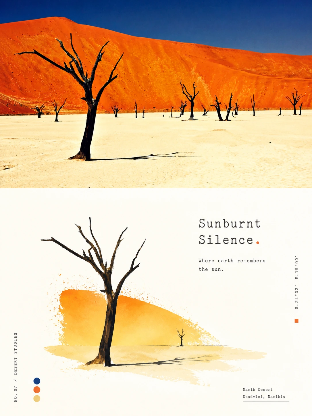
Complete AI image prompt
Please turn every photo I upload into its own standalone high-end design poster. Do not make a multi-image collage; output each photo separately. Use an overall 3:4 portrait composition, with the upper and lower regions in a strict 1:1 height ratio, each occupying 50% of the image.

The upper half retains the original photograph, preserving the subject's identity, structure, pose, authentic texture, natural light and shadow, and original colour atmosphere. Apply only a subtle high-end grade so it feels appropriate for an art magazine, independent publication, or exhibition image. The surrounding environment may be extended naturally to fit the canvas, but the subject must not be stretched, distorted, or changed.

The lower half extracts the photograph's most recognisable subject, silhouette, pose, and narrative relationships, then reconstructs them in the bright, healing, light, publication-minded hand-drawn design style of the reference. Do not fully trace the photograph or copy its complex background. Retain only the core theme, visual metaphor, and aesthetic logic most worth remembering, transforming them into an image that is more distilled, poetic, and editorially ordered. The source should remain immediately recognisable while gaining the refinement of selection, reduction, and reorganisation.

Use a large field of luminous warm-white negative space as the lower half's main breathing room. Place the subject at miniature or medium scale, building a professional composition through clear hierarchy, relaxed spacing, directional flow, and the relationship between image and type. The design should not depend on a complete scene; organise only a few necessary elements around the subject. Keep one main figure or a tightly connected group when naturally supported by the source. A few secondary elements, colour dots, fine grids, delicate spray marks, soft glows, or small geometric notations may act as editorial companions, but the result must remain quiet, light, and uncluttered.

Combine hand-drawn outlines with bright impasto or translucent colour blocks. Following the reference's aesthetic logic, edges should be clear without becoming overly regular and should retain slight handmade inaccuracies. Colour areas may mingle gouache, watercolour, pastel, or a small amount of oil-paint texture, combining soft coverage with faint grain, spray, overlapping colour, and pauses in the paint. The subject may be moderately simplified, exaggerated, or decorated, but its identity, pose, and defining features must remain clear. Avoid photographic realism filters, heavy oil painting, thick black outlines, polished vector graphics, 3D rendering, and cartoon styling.

Remix the brightest, most vivid, and most vital colours from the upper photograph rather than averaging its palette. Raise brightness and colour purity overall. Derive clear sky blue, lake cyan, fresh green, warm yellow, coral orange, peach pink, or other lively hues naturally from the source, using a fresh warm–cool relationship to create a healing quality. Keep abundant clean warm white as breathing room. Main colours should be distinct but never harsh, while small touches of warm orange, golden yellow, or pink may work as sunlight-like accents. The colour spirit should feel sunny, vivid, warm, buoyant, and alive. Avoid dirty greys, aged colour, subdued Morandi treatment, dark brown filters, fluorescent colour, and a cheap candy-like effect.

Use text sparingly. Distil a short title from the subject's identity, place, mood, or symbolic meaning, accompanied by only a tiny amount of secondary copy, numbering, or micro-annotation. Typography should be delicate, restrained, and surrounded by space; it may follow a diagonal axis, the subject's edge, or a large empty area like refined annotation in an art publication. Use a small, restrained, typewriter-like editorial face with fine forms, slight misalignment, and subtle printing irregularity for a touch of vintage publishing character. A small amount of even lighter supporting type may establish hierarchy, but the result must remain quiet and refined rather than commercially headline-driven.

The overall result should combine a bright white ground, vivid impasto, translucent colour, a miniature subject, generous negative space, refined image–text composition, and warm light into a high-end, healing atmosphere. Whether the subject is architecture, a person, an animal, a plant, an object, a vehicle, or a natural landscape, preserve clear identity, artistic breathing room, professional composition, and a light, lively editorial feeling. Avoid filled-in backgrounds, excessive explanatory text, templated poster design, e-commerce illustration, cheap ornament, and meaningless visual clutter.
Original style prompt
Please turn every photo I upload into its own standalone high-end design poster. Do not make a multi-image collage; output each photo separately. Use an overall 3:4 portrait composition, with the upper and lower regions in a strict 1:1 height ratio, each occupying 50% of the image.

The upper half retains the original photograph, preserving the subject's identity, structure, pose, authentic texture, natural light and shadow, and original colour atmosphere. Apply only a subtle high-end grade so it feels appropriate for an art magazine, independent publication, or exhibition image. The surrounding environment may be extended naturally to fit the canvas, but the subject must not be stretched, distorted, or changed.

The lower half extracts the photograph's most recognisable subject, silhouette, pose, and narrative relationships, then reconstructs them in the bright, healing, light, publication-minded hand-drawn design style of the reference. Do not fully trace the photograph or copy its complex background. Retain only the core theme, visual metaphor, and aesthetic logic most worth remembering, transforming them into an image that is more distilled, poetic, and editorially ordered. The source should remain immediately recognisable while gaining the refinement of selection, reduction, and reorganisation.

Use a large field of luminous warm-white negative space as the lower half's main breathing room. Place the subject at miniature or medium scale, building a professional composition through clear hierarchy, relaxed spacing, directional flow, and the relationship between image and type. The design should not depend on a complete scene; organise only a few necessary elements around the subject. Keep one main figure or a tightly connected group when naturally supported by the source. A few secondary elements, colour dots, fine grids, delicate spray marks, soft glows, or small geometric notations may act as editorial companions, but the result must remain quiet, light, and uncluttered.

Combine hand-drawn outlines with bright impasto or translucent colour blocks. Following the reference's aesthetic logic, edges should be clear without becoming overly regular and should retain slight handmade inaccuracies. Colour areas may mingle gouache, watercolour, pastel, or a small amount of oil-paint texture, combining soft coverage with faint grain, spray, overlapping colour, and pauses in the paint. The subject may be moderately simplified, exaggerated, or decorated, but its identity, pose, and defining features must remain clear. Avoid photographic realism filters, heavy oil painting, thick black outlines, polished vector graphics, 3D rendering, and cartoon styling.

Remix the brightest, most vivid, and most vital colours from the upper photograph rather than averaging its palette. Raise brightness and colour purity overall. Derive clear sky blue, lake cyan, fresh green, warm yellow, coral orange, peach pink, or other lively hues naturally from the source, using a fresh warm–cool relationship to create a healing quality. Keep abundant clean warm white as breathing room. Main colours should be distinct but never harsh, while small touches of warm orange, golden yellow, or pink may work as sunlight-like accents. The colour spirit should feel sunny, vivid, warm, buoyant, and alive. Avoid dirty greys, aged colour, subdued Morandi treatment, dark brown filters, fluorescent colour, and a cheap candy-like effect.

Use text sparingly. Distil a short title from the subject's identity, place, mood, or symbolic meaning, accompanied by only a tiny amount of secondary copy, numbering, or micro-annotation. Typography should be delicate, restrained, and surrounded by space; it may follow a diagonal axis, the subject's edge, or a large empty area like refined annotation in an art publication. Use a small, restrained, typewriter-like editorial face with fine forms, slight misalignment, and subtle printing irregularity for a touch of vintage publishing character. A small amount of even lighter supporting type may establish hierarchy, but the result must remain quiet and refined rather than commercially headline-driven.

The overall result should combine a bright white ground, vivid impasto, translucent colour, a miniature subject, generous negative space, refined image–text composition, and warm light into a high-end, healing atmosphere. Whether the subject is architecture, a person, an animal, a plant, an object, a vehicle, or a natural landscape, preserve clear identity, artistic breathing room, professional composition, and a light, lively editorial feeling. Avoid filled-in backgrounds, excessive explanatory text, templated poster design, e-commerce illustration, cheap ornament, and meaningless visual clutter.
More open images in the “XXD Panel 070 · Impasto Cozy Island” style