

Open prompts
en sample 11 AI Image Prompt
en sample 11, its complete AI image prompt, and the XXD Panel 013 · Travel Ticket Album style are free to view and copy.
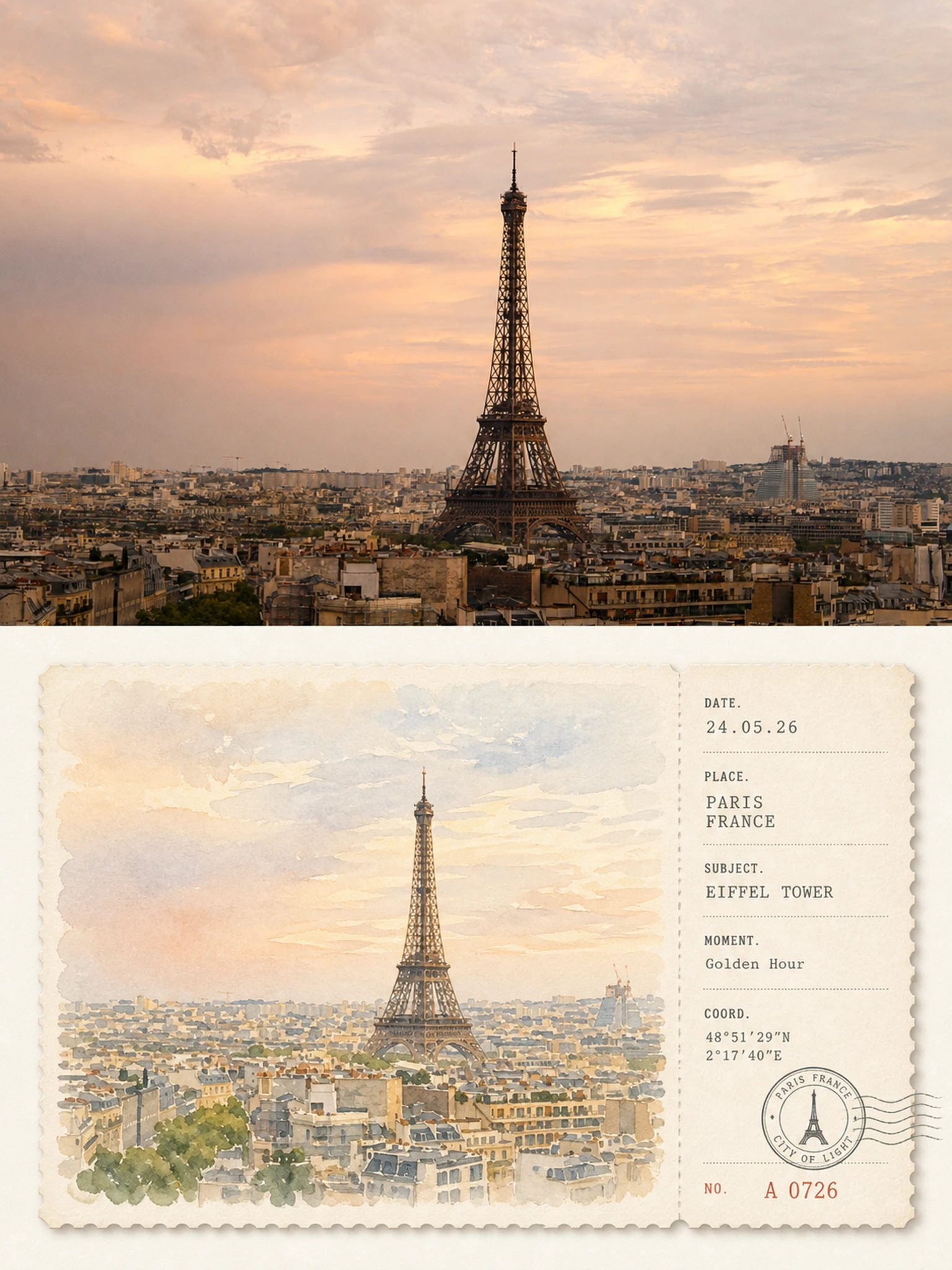
Complete AI image prompt
Please make every photo I upload into its own standalone high-end design poster; no multi-image collages, each photo output separately. The overall composition uses a 3:4 vertical format, with the upper and lower zones strictly 1:1 in height, each taking up 50% of the frame.

The upper half keeps the original photo, preserving the subject's structure, real texture, natural light and shadow, and original color atmosphere, applying only a slight high-end photographic color grade so that it carries the texture of art magazines, travel publications, and exhibition photography. To fit the frame, the sky, ground, or environmental background may be extended naturally, but the subject must not be stretched, distorted, or altered.

The lower half extracts the most recognizable **subject, outline, pose, and narrative relationships** from the photo and reconceives the original scene as a horizontal watercolor ticket stub that combines the forms of a postcard and a ticket. Rather than drawing an object in isolation, preserve the most memorable relationship between the subject and the necessary environment, reorganizing it with concise watercolor brushstrokes so that the image both corresponds at a glance to the photo above and resembles a carefully collected travel-sketch ticket.

The ticket is centered and suspended within a large expanse of ivory-white negative space, using a strict **large-left, small-right geometric division**: about 74% on the left is the watercolor image, and about 26% on the right is the information stub, precisely separated in the middle by a vertical dashed line, perforations, or a ticket-tear line; the top and bottom margins are uniform, and the image, text, postmark, and numbering all conform to the same implicit grid and alignment lines, creating an orderly, quiet, professional editorial order. The card stock is thick matte watercolor paper, with finely serrated edges and an extremely subtle natural shadow.

The watercolor on the left readjusts the original image's colors with a **high-value, low- to medium-saturation soothing palette**, rather than directly copying muddy gray values. Prioritize the freshest, most vibrant colors in the original image, then translate them uniformly into a natural, composite color family such as soft sage green, mist blue, pale blue-gray, creamy yellow, warm sand, and pale terracotta; use 2–4 related colors to establish a sense of airiness, with only a very small amount of warm contrasting color to illuminate the subject. The overall effect is bright, clean, transparent, and soft, avoiding haziness, yellow casts, heavy browns, intense clashing colors, and cheap vintage filters.

The watercolor brushstrokes are clear and light, retaining the paper's unpainted white, soft diffusion, wet-dry variation, and a small amount of granulation. The subject is slightly clearer, while the distant view and secondary environment naturally recede. Do not render realistic light and shadow or complex details, giving the image the quiet, relaxed, gentle feel of a picture book and travel journal.

The ticket stub on the right uses a restrained **geometric information layout system**, flexibly generating a small number of fields such as DATE, PLACE, SUBJECT, MOMENT, FIELD, and NO. according to the photo's content, paired with a date, number, short rules, dotted lists, coordinate-like numerals, and one circular stamp. All text is arranged strictly along unified left edges, baselines, and spacing, with a clear type-size hierarchy and ample negative space; the postmark may overlap slightly with the dividing line or bottom grid, allowing the information elements to form an ingenious relationship with the ticket structure rather than being scattered arbitrarily. If the subject is not urban or travel-related, the place field may naturally become an object name, state, project, chapter, season, or emotional record.

The overall references are **high-end travel postcards, vintage tickets, artists' journals, watercolor publications, and modern editorial design**, emphasizing soothing colors, geometric order, paper texture, and a collectible quality, and presenting a fresh, gentle, quiet, orderly, refined visual temperament without overdesign. Avoid dirty, aged tones, loose layout, floating information, complex decoration, realistic illustration, an e-commerce template feel, and cheap vintage effects.
Original style prompt
Please make every photo I upload into its own standalone high-end design poster; no multi-image collages, each photo output separately. The overall composition uses a 3:4 vertical format, with the upper and lower zones strictly 1:1 in height, each taking up 50% of the frame.

The upper half keeps the original photo, preserving the subject's structure, real texture, natural light and shadow, and original color atmosphere, applying only a slight high-end photographic color grade so that it carries the texture of art magazines, travel publications, and exhibition photography. To fit the frame, the sky, ground, or environmental background may be extended naturally, but the subject must not be stretched, distorted, or altered.

The lower half extracts the most recognizable **subject, outline, pose, and narrative relationships** from the photo and reconceives the original scene as a horizontal watercolor ticket stub that combines the forms of a postcard and a ticket. Rather than drawing an object in isolation, preserve the most memorable relationship between the subject and the necessary environment, reorganizing it with concise watercolor brushstrokes so that the image both corresponds at a glance to the photo above and resembles a carefully collected travel-sketch ticket.

The ticket is centered and suspended within a large expanse of ivory-white negative space, using a strict **large-left, small-right geometric division**: about 74% on the left is the watercolor image, and about 26% on the right is the information stub, precisely separated in the middle by a vertical dashed line, perforations, or a ticket-tear line; the top and bottom margins are uniform, and the image, text, postmark, and numbering all conform to the same implicit grid and alignment lines, creating an orderly, quiet, professional editorial order. The card stock is thick matte watercolor paper, with finely serrated edges and an extremely subtle natural shadow.

The watercolor on the left readjusts the original image's colors with a **high-value, low- to medium-saturation soothing palette**, rather than directly copying muddy gray values. Prioritize the freshest, most vibrant colors in the original image, then translate them uniformly into a natural, composite color family such as soft sage green, mist blue, pale blue-gray, creamy yellow, warm sand, and pale terracotta; use 2–4 related colors to establish a sense of airiness, with only a very small amount of warm contrasting color to illuminate the subject. The overall effect is bright, clean, transparent, and soft, avoiding haziness, yellow casts, heavy browns, intense clashing colors, and cheap vintage filters.

The watercolor brushstrokes are clear and light, retaining the paper's unpainted white, soft diffusion, wet-dry variation, and a small amount of granulation. The subject is slightly clearer, while the distant view and secondary environment naturally recede. Do not render realistic light and shadow or complex details, giving the image the quiet, relaxed, gentle feel of a picture book and travel journal.

The ticket stub on the right uses a restrained **geometric information layout system**, flexibly generating a small number of fields such as DATE, PLACE, SUBJECT, MOMENT, FIELD, and NO. according to the photo's content, paired with a date, number, short rules, dotted lists, coordinate-like numerals, and one circular stamp. All text is arranged strictly along unified left edges, baselines, and spacing, with a clear type-size hierarchy and ample negative space; the postmark may overlap slightly with the dividing line or bottom grid, allowing the information elements to form an ingenious relationship with the ticket structure rather than being scattered arbitrarily. If the subject is not urban or travel-related, the place field may naturally become an object name, state, project, chapter, season, or emotional record.

The overall references are **high-end travel postcards, vintage tickets, artists' journals, watercolor publications, and modern editorial design**, emphasizing soothing colors, geometric order, paper texture, and a collectible quality, and presenting a fresh, gentle, quiet, orderly, refined visual temperament without overdesign. Avoid dirty, aged tones, loose layout, floating information, complex decoration, realistic illustration, an e-commerce template feel, and cheap vintage effects.
More open images in the “XXD Panel 013 · Travel Ticket Album” style