

Open prompts
en sample 11 AI Image Prompt
en sample 11, its complete AI image prompt, and the XXD Panel 010 · Black-and-White Storybook style are free to view and copy.
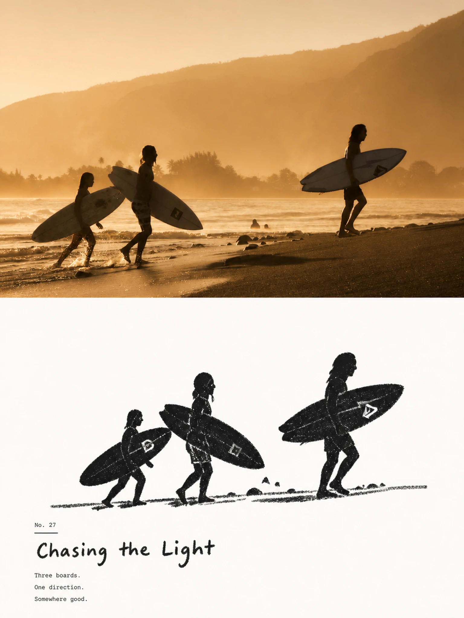
Complete AI image prompt
Please make every photo I upload into its own standalone high-end design poster; no multi-image collages, each photo output separately. The overall composition uses a 3:4 vertical format, with the upper and lower zones strictly 1:1 in height, each taking up 50% of the frame.

The upper half keeps the original photo, preserving the subject's identity, structure, pose, real texture, natural light and shadow, and original color atmosphere, applying only a slight high-end photographic color grade so that it carries the texture of art magazines, independent publications, and exhibition photography. To fit the frame, the sky, ground, or environmental background may be extended naturally, but the subject must not be stretched, distorted, or altered.

The lower half extracts the most recognizable subject, outline, pose, and narrative relationships from the photo and reconstructs them into a minimal, rough black dry-media silhouette illustration. Do not mechanically trace the photo's details; instead, compress the subject into rounded, sturdy, slightly naive generalized forms. The head, main outline, or most memorable detail may be enlarged moderately so that the original remains instantly recognizable with very little information. If the photo contains multiple subjects, preserve the most important interactive relationship and treat them as one overall visual unit rather than distributing the focus evenly.

The lower half uses only a near-pure-white paper ground + rich black crayon, charcoal, or dry-rub marks, with no color and no grayscale gradients. The black forms are not smooth, solid vector blocks; they are built from repeated short, forceful crayon strokes, retaining paper grain, broken strokes, pressure marks, rough edges, uneven density, and local white gaps. The outlines are slightly wavering, incomplete, and imprecise, keeping the image genuinely handmade.

The subject's most critical identifying feature may be strengthened through a “white feature area suddenly cut out of the black silhouette,” such as the face, the area around the eyes, a window opening, the mouth of a vessel, an animal's face, the core structure of an object, or its most distinctive detail; then use only a very few black dots, short lines, or symbols to complete the expression and details. Do not pursue realistic facial features or precise structures; instead, let black and white form a direct, interesting, and powerful relationship of recognition.

Keep the composition to a large area of clean negative space + one primary visual relationship. The subject may float in the center, or be slightly offset, partially cropped, or placed near the bottom of the frame, using only one rough ground friction line, a few short lines, or very few environmental symbols to suggest space. Blades of grass, rain streaks, smoke, a tabletop, shadows, roads, wind, or other environmental information should all be compressed into a very small number of crayon marks so the background stays quiet and open. The overall work does not pursue a complex scene; instead, one pose, action, distance, or relationship carries the main narrative.

Retain a small-type system that combines a high-end editorial feel with a children's-book feel. Do not write only the place or object name; instead, distill a short title in the user's specified target language from the emotion, action, relationship, time, or small story in the photo, then pair it with a number, an apt memorable line, a chapter number, or one extremely short, understated piece of copy. The text may use restrained small print, with a very small amount of clumsy handwriting, crayon lettering, or incompletely regular letterforms, so it feels as though it originally belonged to the illustration.

The text needs to form a clever relationship with the graphic: it may be arranged along the ground line, extend in the direction of the subject's movement, hide in the broad negative space, overlap the outline slightly, sit in the negative shape between two subjects, or use a thin line to connect the number to the subject. Keep only “one short title + 1–2 groups of tiny supporting text,” making the text part of the compositional rhythm rather than an ordinary poster headline.

The whole presents visual traits in which the black is coarse, the white is clean, the forms are simple, and the texture is rough, maintaining a subtle balance among childlikeness, warmth, quiet, humor, and loneliness, like an old black-and-white children's book re-edited by a high-end design studio. Avoid smooth digital outlines, precise line drawings, realistic light and shadow, heavy paint, 3D effects, color, large areas of gray rendering, a cartoon-sticker feel, and templated commercial illustration.
Original style prompt
Please make every photo I upload into its own standalone high-end design poster; no multi-image collages, each photo output separately. The overall composition uses a 3:4 vertical format, with the upper and lower zones strictly 1:1 in height, each taking up 50% of the frame.

The upper half keeps the original photo, preserving the subject's identity, structure, pose, real texture, natural light and shadow, and original color atmosphere, applying only a slight high-end photographic color grade so that it carries the texture of art magazines, independent publications, and exhibition photography. To fit the frame, the sky, ground, or environmental background may be extended naturally, but the subject must not be stretched, distorted, or altered.

The lower half extracts the most recognizable subject, outline, pose, and narrative relationships from the photo and reconstructs them into a minimal, rough black dry-media silhouette illustration. Do not mechanically trace the photo's details; instead, compress the subject into rounded, sturdy, slightly naive generalized forms. The head, main outline, or most memorable detail may be enlarged moderately so that the original remains instantly recognizable with very little information. If the photo contains multiple subjects, preserve the most important interactive relationship and treat them as one overall visual unit rather than distributing the focus evenly.

The lower half uses only a near-pure-white paper ground + rich black crayon, charcoal, or dry-rub marks, with no color and no grayscale gradients. The black forms are not smooth, solid vector blocks; they are built from repeated short, forceful crayon strokes, retaining paper grain, broken strokes, pressure marks, rough edges, uneven density, and local white gaps. The outlines are slightly wavering, incomplete, and imprecise, keeping the image genuinely handmade.

The subject's most critical identifying feature may be strengthened through a “white feature area suddenly cut out of the black silhouette,” such as the face, the area around the eyes, a window opening, the mouth of a vessel, an animal's face, the core structure of an object, or its most distinctive detail; then use only a very few black dots, short lines, or symbols to complete the expression and details. Do not pursue realistic facial features or precise structures; instead, let black and white form a direct, interesting, and powerful relationship of recognition.

Keep the composition to a large area of clean negative space + one primary visual relationship. The subject may float in the center, or be slightly offset, partially cropped, or placed near the bottom of the frame, using only one rough ground friction line, a few short lines, or very few environmental symbols to suggest space. Blades of grass, rain streaks, smoke, a tabletop, shadows, roads, wind, or other environmental information should all be compressed into a very small number of crayon marks so the background stays quiet and open. The overall work does not pursue a complex scene; instead, one pose, action, distance, or relationship carries the main narrative.

Retain a small-type system that combines a high-end editorial feel with a children's-book feel. Do not write only the place or object name; instead, distill a short title in the user's specified target language from the emotion, action, relationship, time, or small story in the photo, then pair it with a number, an apt memorable line, a chapter number, or one extremely short, understated piece of copy. The text may use restrained small print, with a very small amount of clumsy handwriting, crayon lettering, or incompletely regular letterforms, so it feels as though it originally belonged to the illustration.

The text needs to form a clever relationship with the graphic: it may be arranged along the ground line, extend in the direction of the subject's movement, hide in the broad negative space, overlap the outline slightly, sit in the negative shape between two subjects, or use a thin line to connect the number to the subject. Keep only “one short title + 1–2 groups of tiny supporting text,” making the text part of the compositional rhythm rather than an ordinary poster headline.

The whole presents visual traits in which the black is coarse, the white is clean, the forms are simple, and the texture is rough, maintaining a subtle balance among childlikeness, warmth, quiet, humor, and loneliness, like an old black-and-white children's book re-edited by a high-end design studio. Avoid smooth digital outlines, precise line drawings, realistic light and shadow, heavy paint, 3D effects, color, large areas of gray rendering, a cartoon-sticker feel, and templated commercial illustration.
More open images in the “XXD Panel 010 · Black-and-White Storybook” style