

Open prompts
en sample 11 AI Image Prompt
en sample 11, its complete AI image prompt, and the XXD Panel 106 · Pastel Pixel Memory style are free to view and copy.
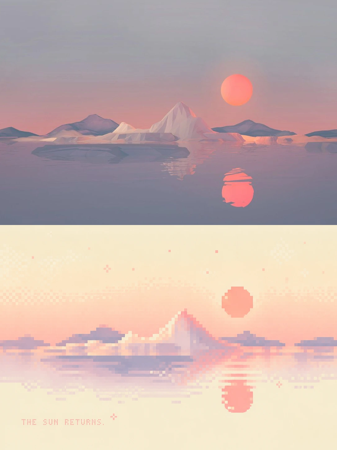
Complete AI image prompt
Please turn each photo I upload into a separate premium design poster, with no multi-image collage and one independent output per photo. Use an overall 3:4 portrait composition with two upper and lower regions in a strict 1:1 height ratio, each occupying 50% of the canvas.

Retain the original photograph in the upper half, preserving the subject's identity, structure, pose, authentic texture, natural light and shadow, and original colour atmosphere. Apply only subtle premium colour grading so it has the image quality of an art magazine, independent publication, or exhibition. The environmental background may be extended naturally to fit the format, but the subject must not be stretched, distorted, or altered.

In the lower half, do not reproduce every object in the photograph. Instead, extract the image's most recognisable **essential subject, contour rhythm, pose relationships, spatial direction, and emotional memory**. Keep only 2–4 visual anchors that truly determine the photograph's identity, then reconstruct them as limited-palette pixel art with a clear geometric order. Large amounts of secondary objects, background detail, material information, and structure may be deleted, merged, or concealed outright, so the image feels like fragments left by memory rather than a pixelated copy of the photograph.

The subject does not need to be shown in full. You may retain only a distinctive contour, a fragment of movement, a proportional relationship, a representative patch of colour, an architectural turn, a plant form, or the most meaningful distance between subject and environment. Local cropping, absence, floating, simplification, overlap, and negative space are allowed, so that “what is not drawn” also participates in the narrative; however, the most important identity features must remain accurate, allowing viewers to sense the original without seeing every detail.

Organise the pixels through **regular grids, modular colour blocks, and geometric rhythm**, rather than pursuing realistic object volume. Build hierarchy through large pixel shapes, hard-edged contours, repeated arrays, local dithering, and positive–negative form relationships, so that from a distance it first reads as a sophisticated abstract composition and only gradually reveals the subject up close. Avoid fussy depictions such as individual leaves, individual windows, complete facial features, realistic clothing folds, or vehicle mechanics.

The composition should emphasise **generous purposeful negative space, one visual core, a small number of high-value shapes, and clear geometric order**. The subject may be off-centre, locally enlarged, or compressed into a very small visual symbol; decide its position anew from the source image's direction and mood rather than mechanically reproducing the original layout. Let emptiness, colour blocks, pixel density, and typography form the rhythm together, giving the result the character of an independent art poster rather than a game-scene screenshot.

Extract the softest, brightest, and most approachable colours from the upper photograph and remix them into a limited palette with a slightly feminine, soothing Instagram sensibility. Use cream white, vanilla yellow, peach pink, cherry-blossom pink, almond orange, lavender purple, milk blue, and mint green as directions, adjusting flexibly to the source image's overall colour temperature. The colours should be sweet without becoming cloying, soft without turning dull; small amounts of coral pink, apricot orange, or bright yellow may provide visual accents. Avoid dirty greys, fluorescent colours, cheap candy colours, and a heavy retro mood.

Typography should intervene only minimally and editorially. Freely generate a small number of words or short phrases from the photograph's mood, action, memory, or metaphor, without restricting the language. Use small, light pixel or dot-matrix type with a hint of retro-digital order, forming a restrained relationship with the subject and negative space rather than a menu-like title system.

The overall aim is a feeling of **“it no longer looks like a photograph, yet it is still unmistakably this photograph”**: geometric pixels, soft colour, abstract form, expansive negative space, and memory-led storytelling form the image together. The point is not to draw everything, but to remove until only what matters remains; not to describe the object, but to distil its soul.
Original style prompt
Please turn each photo I upload into a separate premium design poster, with no multi-image collage and one independent output per photo. Use an overall 3:4 portrait composition with two upper and lower regions in a strict 1:1 height ratio, each occupying 50% of the canvas.

Retain the original photograph in the upper half, preserving the subject's identity, structure, pose, authentic texture, natural light and shadow, and original colour atmosphere. Apply only subtle premium colour grading so it has the image quality of an art magazine, independent publication, or exhibition. The environmental background may be extended naturally to fit the format, but the subject must not be stretched, distorted, or altered.

In the lower half, do not reproduce every object in the photograph. Instead, extract the image's most recognisable **essential subject, contour rhythm, pose relationships, spatial direction, and emotional memory**. Keep only 2–4 visual anchors that truly determine the photograph's identity, then reconstruct them as limited-palette pixel art with a clear geometric order. Large amounts of secondary objects, background detail, material information, and structure may be deleted, merged, or concealed outright, so the image feels like fragments left by memory rather than a pixelated copy of the photograph.

The subject does not need to be shown in full. You may retain only a distinctive contour, a fragment of movement, a proportional relationship, a representative patch of colour, an architectural turn, a plant form, or the most meaningful distance between subject and environment. Local cropping, absence, floating, simplification, overlap, and negative space are allowed, so that “what is not drawn” also participates in the narrative; however, the most important identity features must remain accurate, allowing viewers to sense the original without seeing every detail.

Organise the pixels through **regular grids, modular colour blocks, and geometric rhythm**, rather than pursuing realistic object volume. Build hierarchy through large pixel shapes, hard-edged contours, repeated arrays, local dithering, and positive–negative form relationships, so that from a distance it first reads as a sophisticated abstract composition and only gradually reveals the subject up close. Avoid fussy depictions such as individual leaves, individual windows, complete facial features, realistic clothing folds, or vehicle mechanics.

The composition should emphasise **generous purposeful negative space, one visual core, a small number of high-value shapes, and clear geometric order**. The subject may be off-centre, locally enlarged, or compressed into a very small visual symbol; decide its position anew from the source image's direction and mood rather than mechanically reproducing the original layout. Let emptiness, colour blocks, pixel density, and typography form the rhythm together, giving the result the character of an independent art poster rather than a game-scene screenshot.

Extract the softest, brightest, and most approachable colours from the upper photograph and remix them into a limited palette with a slightly feminine, soothing Instagram sensibility. Use cream white, vanilla yellow, peach pink, cherry-blossom pink, almond orange, lavender purple, milk blue, and mint green as directions, adjusting flexibly to the source image's overall colour temperature. The colours should be sweet without becoming cloying, soft without turning dull; small amounts of coral pink, apricot orange, or bright yellow may provide visual accents. Avoid dirty greys, fluorescent colours, cheap candy colours, and a heavy retro mood.

Typography should intervene only minimally and editorially. Freely generate a small number of words or short phrases from the photograph's mood, action, memory, or metaphor, without restricting the language. Use small, light pixel or dot-matrix type with a hint of retro-digital order, forming a restrained relationship with the subject and negative space rather than a menu-like title system.

The overall aim is a feeling of **“it no longer looks like a photograph, yet it is still unmistakably this photograph”**: geometric pixels, soft colour, abstract form, expansive negative space, and memory-led storytelling form the image together. The point is not to draw everything, but to remove until only what matters remains; not to describe the object, but to distil its soul.
More open images in the “XXD Panel 106 · Pastel Pixel Memory” style