

Open prompts
en sample 12 AI Image Prompt
en sample 12, its complete AI image prompt, and the XXD Panel 096 · Folk Correspondence Card style are free to view and copy.
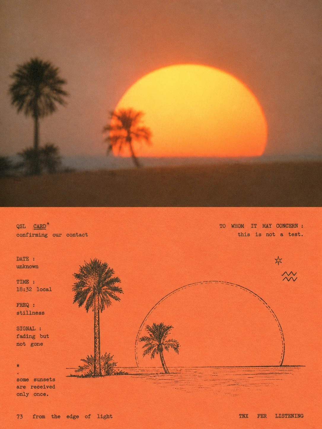
Complete AI image prompt
Turn each uploaded photograph into a separate premium design poster. Do not combine multiple images; output each photograph independently. Use an overall 3:4 portrait composition with two strictly equal upper and lower regions, each occupying 50% of the canvas.

Keep the original photograph in the upper half, preserving the subject’s identity, structure, pose, real texture, natural light, and original colour atmosphere. Apply only subtle premium photographic grading for the quality of an art magazine, independent publication, or exhibition image. The surrounding environment may be naturally extended to fit the frame, but the subject must never be stretched, distorted, or altered.

In the lower half, extract the photograph’s most recognisable **subject, silhouette, pose, and narrative relationship**, and reconstruct them through the vernacular print language of vintage communication cards, QSL cards, and ephemera. Do not fully trace the photograph. Retain only a few structures, actions, and local details that confirm identity, then redraw them as a direct, slightly awkward **pen-and-ink line drawing**, as though a private hobbyist had recorded the subject on a communication card.

Shape the illustration with fine ink lines, broken contours, slight hand-drawn deviations, and limited **hatching / cross-hatching**, without pursuing realistic light and shade. Suggest hair, fabric, architectural shadow, plants, or material only where necessary. Actively reduce complex backgrounds; a few small symbols, diagrammatic lines, hand-drawn icons, or technical marks may remain, but every element must support the subject’s narrative and preserve the directness, plainness, and accidental quality of vernacular print.

Base the composition on early radio communication cards, private announcement cards, and underground publications. Subject and text form a free but ordered mixture: the subject may sit off-centre, be partially cropped, or interweave with text, while irregular blank space remains on the opposite side and around the edges. Avoid the over-precision of a modern grid. Build a natural page rhythm through scale contrast, misaligned alignment, narrow margins, local density, and sudden emptiness, so the result feels like a paper record personally made, typed, photocopied, and mailed.

Typography is an essential part of the style. From the photograph’s subject, place, action, condition, memory, or cultural context, freely generate a small amount of meaningful titles, phrases, numbers, symbols, or communication-style information, without fixing a language or section structure. **Use narrow, small, mechanical vintage typewriter lettering with slight wear and misregistration, preserving uneven spacing, baseline drift, character-density variation, and striking errors.** Place it above or below the illustration, thread it sideways through the image, or run it along an edge, so it feels typed directly onto the card rather than added later in modern software.

The lower half follows the core colour logic of **single-colour reproduction printing + coloured paper**. Extract one composite colour from the upper photograph that has the most vitality and best represents its character, then translate it into a vivid, sophisticated paper stock—perhaps lemon yellow, fluorescent yellow-green, coral orange, sky blue, grass green, pink, or another bright hue related to the source. Image and text use black, deep ink, or one single ink that contrasts clearly with the paper. Maintain a true two-component logic: **one coloured paper + one printing ink**. Build visual tension with paper colour, ink colour, blank space, and line density, not by adding a rich palette.

Retain subtle photocopy grain, uneven ink density, worn type, paper fibres, imperfect registration, and signs of private hand production, while keeping the result clean and consciously designed. It should feel like a vintage QSL communication card, amateur-radio confirmation card, private print, or underground zine accidentally preserved: **technical, handmade, direct, personal, slightly awkward but visually confident**.

Overall, reference **Typewriter typography with pen-and-ink illustration, reproduced as a single-colour print on coloured paper**, combining vernacular graphic design and DIY print culture with contemporary editorial design. Avoid commercial retro templates, sterile modern typography, colour illustration, gradients, 3D rendering, smooth vectors, polished commercial cartoons, piles of fake vintage postmarks, and meaningless pseudo-text.
Original style prompt
Turn each uploaded photograph into a separate premium design poster. Do not combine multiple images; output each photograph independently. Use an overall 3:4 portrait composition with two strictly equal upper and lower regions, each occupying 50% of the canvas.

Keep the original photograph in the upper half, preserving the subject’s identity, structure, pose, real texture, natural light, and original colour atmosphere. Apply only subtle premium photographic grading for the quality of an art magazine, independent publication, or exhibition image. The surrounding environment may be naturally extended to fit the frame, but the subject must never be stretched, distorted, or altered.

In the lower half, extract the photograph’s most recognisable **subject, silhouette, pose, and narrative relationship**, and reconstruct them through the vernacular print language of vintage communication cards, QSL cards, and ephemera. Do not fully trace the photograph. Retain only a few structures, actions, and local details that confirm identity, then redraw them as a direct, slightly awkward **pen-and-ink line drawing**, as though a private hobbyist had recorded the subject on a communication card.

Shape the illustration with fine ink lines, broken contours, slight hand-drawn deviations, and limited **hatching / cross-hatching**, without pursuing realistic light and shade. Suggest hair, fabric, architectural shadow, plants, or material only where necessary. Actively reduce complex backgrounds; a few small symbols, diagrammatic lines, hand-drawn icons, or technical marks may remain, but every element must support the subject’s narrative and preserve the directness, plainness, and accidental quality of vernacular print.

Base the composition on early radio communication cards, private announcement cards, and underground publications. Subject and text form a free but ordered mixture: the subject may sit off-centre, be partially cropped, or interweave with text, while irregular blank space remains on the opposite side and around the edges. Avoid the over-precision of a modern grid. Build a natural page rhythm through scale contrast, misaligned alignment, narrow margins, local density, and sudden emptiness, so the result feels like a paper record personally made, typed, photocopied, and mailed.

Typography is an essential part of the style. From the photograph’s subject, place, action, condition, memory, or cultural context, freely generate a small amount of meaningful titles, phrases, numbers, symbols, or communication-style information, without fixing a language or section structure. **Use narrow, small, mechanical vintage typewriter lettering with slight wear and misregistration, preserving uneven spacing, baseline drift, character-density variation, and striking errors.** Place it above or below the illustration, thread it sideways through the image, or run it along an edge, so it feels typed directly onto the card rather than added later in modern software.

The lower half follows the core colour logic of **single-colour reproduction printing + coloured paper**. Extract one composite colour from the upper photograph that has the most vitality and best represents its character, then translate it into a vivid, sophisticated paper stock—perhaps lemon yellow, fluorescent yellow-green, coral orange, sky blue, grass green, pink, or another bright hue related to the source. Image and text use black, deep ink, or one single ink that contrasts clearly with the paper. Maintain a true two-component logic: **one coloured paper + one printing ink**. Build visual tension with paper colour, ink colour, blank space, and line density, not by adding a rich palette.

Retain subtle photocopy grain, uneven ink density, worn type, paper fibres, imperfect registration, and signs of private hand production, while keeping the result clean and consciously designed. It should feel like a vintage QSL communication card, amateur-radio confirmation card, private print, or underground zine accidentally preserved: **technical, handmade, direct, personal, slightly awkward but visually confident**.

Overall, reference **Typewriter typography with pen-and-ink illustration, reproduced as a single-colour print on coloured paper**, combining vernacular graphic design and DIY print culture with contemporary editorial design. Avoid commercial retro templates, sterile modern typography, colour illustration, gradients, 3D rendering, smooth vectors, polished commercial cartoons, piles of fake vintage postmarks, and meaningless pseudo-text.
More open images in the “XXD Panel 096 · Folk Correspondence Card” style