

Open prompts
en sample 12 AI Image Prompt
en sample 12, its complete AI image prompt, and the XXD Panel 007 · Hand-Drawn Observation Page style are free to view and copy.
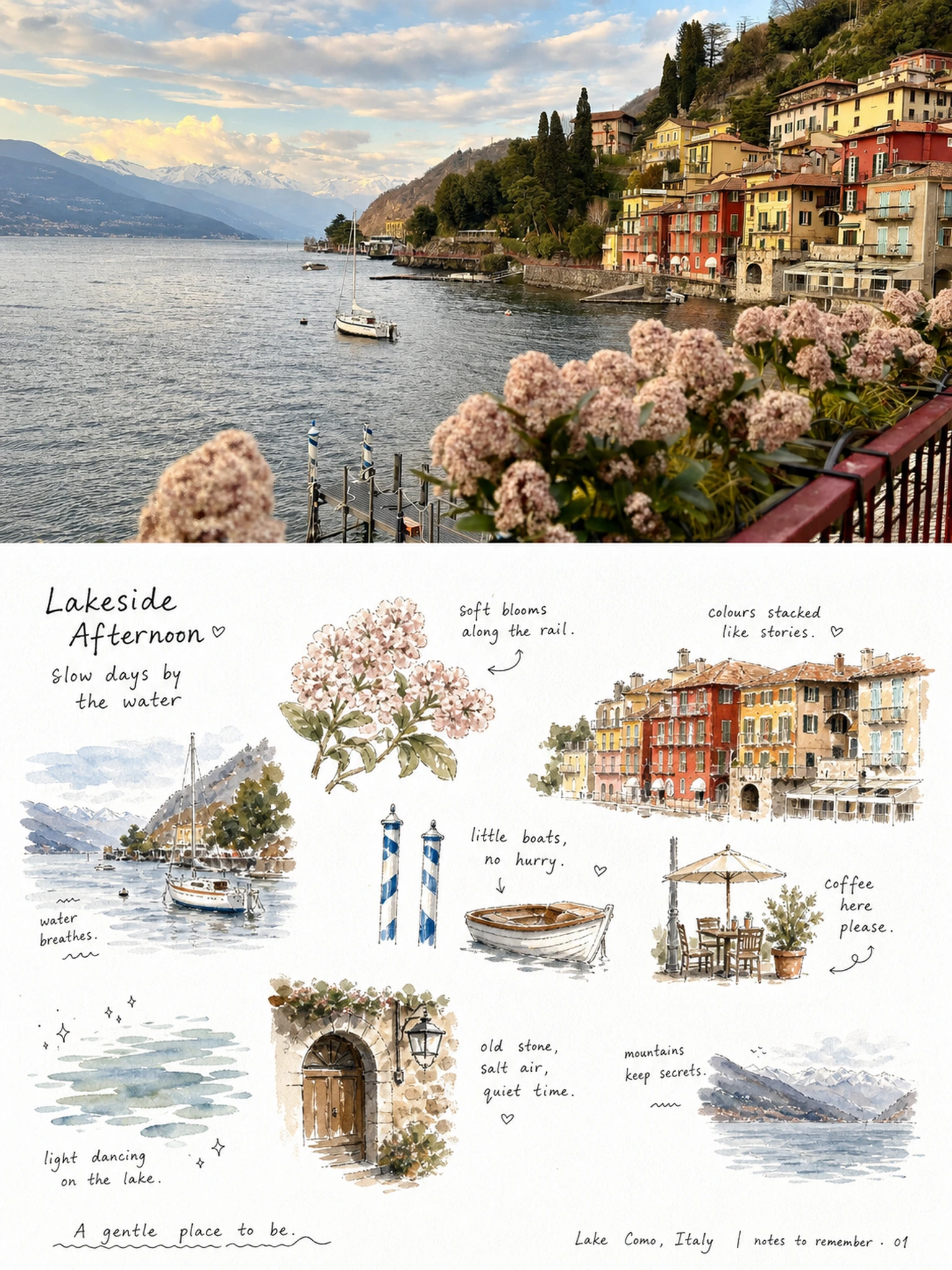
Complete AI image prompt
Please make every photo I upload into its own standalone high-end design poster; no multi-image collages, each photo output separately. The overall composition uses a 3:4 vertical format, with the upper and lower zones strictly 1:1 in height, each taking up 50% of the frame.

The upper half keeps the original photo, preserving the subject's structure, real texture, natural light and shadow, and original color atmosphere, applying only a slight high-end photographic color grade so that it carries the texture of magazine photography and art publications. To fit the frame, the sky, ground, or surrounding background may be extended naturally, but the subject must not be stretched, distorted, or altered.

The lower half extracts the most recognizable subject, outline, pose, and narrative relationships from the photo and reconstructs them into a relaxed, approachable, and refreshing handwritten observation chart. Use a large expanse of clean white paper as the main space, breaking the theme down into several small object-like graphics, close-up details, small sectional views, repeated small items, or detail fragments, loosely distributed across the upper-middle and middle parts of the frame. Do not use a rigid table; instead, connect them naturally with staggered negative space, an approximately horizontal reading rhythm, and short handwritten phrases, forming a casual observational record of taste, touch, sound, movement, or memory. The small graphics should retain the theme's own material qualities, colors, and identifying features, presented at a small scale with rounded contours, slight perspective, and traces of hand-applied color. Some areas should include grain, browned edges, crumbs, textures, or sectional details. Do not standardize them into conventional icons; they should have the feel of object notes somewhere between picture-book illustrations and journal stickers.

Text is an important framework for the lower half. Use fine black short words, short sentences, onomatopoeia, and annotations with a slightly childlike or handwritten feel, interspersed around the left and right sides of the graphics. Some should sit close to graphic edges, while others float in the blank space; keep letter spacing relaxed and let baselines shift slightly, creating an intimate “look as you read” rhythm. A smaller signature-like note, number, date, title, or short thematic phrase may be added along the bottom, allowing the text to blend naturally into the image rather than appearing as typographic labels pasted on afterward.

Extract the overall palette from the photo above. White-paper negative space should occupy the largest area, fine black lettering should carry the information, and the subject colors should be warm, clean, and slightly high in value. Use only small amounts of highly saturated warm colors, dark colors, or thematic accent colors for focal points, shadows, textures, and rhythmic accents. Preserve the slight softness, natural compression, uneven edges, and paint-absorption effect of scanned paper. Do not add heavy shadows, decorative borders, or a strongly modern typographic feel. Overall, reference handwritten observation pages, picture-book information pages, art publications, and relaxed editorial design, presenting a visual character that is refreshing, gentle, naïve, lively, readable, and rich in everyday life, while avoiding a templated look, cartoonification, cheapness, and overdesign.
Original style prompt
Please make every photo I upload into its own standalone high-end design poster; no multi-image collages, each photo output separately. The overall composition uses a 3:4 vertical format, with the upper and lower zones strictly 1:1 in height, each taking up 50% of the frame.

The upper half keeps the original photo, preserving the subject's structure, real texture, natural light and shadow, and original color atmosphere, applying only a slight high-end photographic color grade so that it carries the texture of magazine photography and art publications. To fit the frame, the sky, ground, or surrounding background may be extended naturally, but the subject must not be stretched, distorted, or altered.

The lower half extracts the most recognizable subject, outline, pose, and narrative relationships from the photo and reconstructs them into a relaxed, approachable, and refreshing handwritten observation chart. Use a large expanse of clean white paper as the main space, breaking the theme down into several small object-like graphics, close-up details, small sectional views, repeated small items, or detail fragments, loosely distributed across the upper-middle and middle parts of the frame. Do not use a rigid table; instead, connect them naturally with staggered negative space, an approximately horizontal reading rhythm, and short handwritten phrases, forming a casual observational record of taste, touch, sound, movement, or memory. The small graphics should retain the theme's own material qualities, colors, and identifying features, presented at a small scale with rounded contours, slight perspective, and traces of hand-applied color. Some areas should include grain, browned edges, crumbs, textures, or sectional details. Do not standardize them into conventional icons; they should have the feel of object notes somewhere between picture-book illustrations and journal stickers.

Text is an important framework for the lower half. Use fine black short words, short sentences, onomatopoeia, and annotations with a slightly childlike or handwritten feel, interspersed around the left and right sides of the graphics. Some should sit close to graphic edges, while others float in the blank space; keep letter spacing relaxed and let baselines shift slightly, creating an intimate “look as you read” rhythm. A smaller signature-like note, number, date, title, or short thematic phrase may be added along the bottom, allowing the text to blend naturally into the image rather than appearing as typographic labels pasted on afterward.

Extract the overall palette from the photo above. White-paper negative space should occupy the largest area, fine black lettering should carry the information, and the subject colors should be warm, clean, and slightly high in value. Use only small amounts of highly saturated warm colors, dark colors, or thematic accent colors for focal points, shadows, textures, and rhythmic accents. Preserve the slight softness, natural compression, uneven edges, and paint-absorption effect of scanned paper. Do not add heavy shadows, decorative borders, or a strongly modern typographic feel. Overall, reference handwritten observation pages, picture-book information pages, art publications, and relaxed editorial design, presenting a visual character that is refreshing, gentle, naïve, lively, readable, and rich in everyday life, while avoiding a templated look, cartoonification, cheapness, and overdesign.
More open images in the “XXD Panel 007 · Hand-Drawn Observation Page” style