

Open prompts
en sample 12 AI Image Prompt
en sample 12, its complete AI image prompt, and the XXD Panel 061 · Visual Memory Notebook style are free to view and copy.
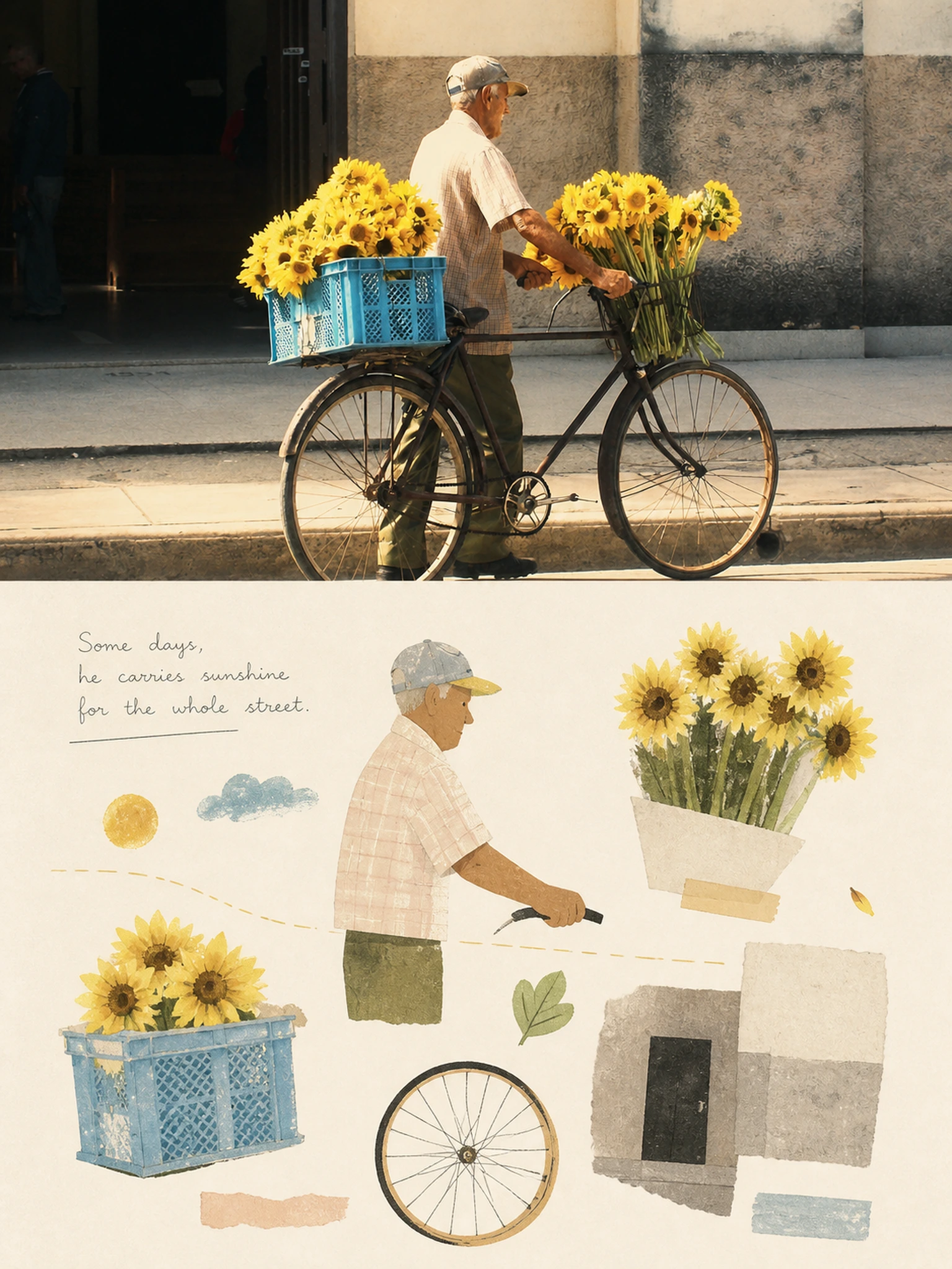
Complete AI image prompt
Please make each photo I upload into an independent high-end design poster. No splicing of multiple pictures, and each photo will be output separately. The overall composition adopts a 3:4 vertical version, continuing the two-layer logic of the upper and lower parts: the upper part is real photography, and the lower part is artistic reconstruction based on theme association and selective memory, and the upper and lower parts naturally echo. The upper part retains the original photo, maintaining the subject's identity, structure, posture, real texture, natural light and shadow, and original color atmosphere. It only undergoes slight advanced photography color grading to give it the quality of art magazines, independent publications, and exhibition photography. The environmental background can be naturally expanded to fit the frame, but the subject must not be stretched, distorted, or changed. The lower part extracts the most identifiable ** subjects, contours, postures and narrative relationships ** in the photo, further understands the emotions, actions, environmental clues and visual metaphors that are truly worth remembering in the picture, and reconstructs them into a set of interrelated ** visual memory fragments **. Don’t completely redraw the original picture, and don’t randomly arrange objects; around a core theme, independently refine about 3-6 of the most meaningful images, which can be the subject itself, local features, actions, environmental elements, or symbolic shapes that are naturally associated with the original picture, and let these fragments jointly tell the same theme. The shape adopts light, naive and advanced ** paper cutting, gouache, pink wax, Risograph and screen printing graphic language **. The shape is bold and general, with slight manual errors in the outline. It is expressed with simple color blocks, silhouettes, geometric shapes and a few hand-painted traces, without pursuing realistic details. It is allowed to juxtapose real objects with poetic metaphors, such as turning sound into ripples, distance into a line, emotions into clouds or spots of light, but all associations must come from the subject of the original photo and not be meaningless decoration. The background combines color temperature, light and emotion based on the original image to intelligently generate **an extremely light, clean, almost white comprehensive color background **, which can be slightly warmer, colder, pinker, bluer or greener. Large areas of blank space are the main visual language, allowing different fragments to maintain breathing and distance from each other like observations, thoughts and memories scattered on the paper. The composition adopts ** controlled improvisation **: no regular grid is used, nor is the center or left-right structure fixed. According to the visual weight, shape direction and narrative relationship of each fragment, the size, position, rotation, spacing and blank space are freely determined; a hidden visual path is established through size contrast, oblique echo, high and low staggered, virtual and solid density, and positive and negative shapes. The picture may not be completely symmetrical or slightly casual, but the overall center of gravity must be stable, allowing the viewing sequence to flow naturally between several clips, forming a layout that "seems casual, but is actually artistically directed." The color matching adopts , **a soft, transparent, slightly desaturated healing advanced color palette**, which is flexibly adjusted from the comprehensive color temperature and the most vital characteristic color of the original image. You can use light colors such as light pink blue, fog blue, sky blue, cream white, ivory white, light beige, soft gray green, milky apricot, blush pink, soft peach, dusty rose, etc., and retain a small amount of clearer original color features as visual jump points. The overall look is bright, clean, and airy, and avoids dirty gray, highly saturated contrasting colors, and thick repetitive vintage filters. Text does not have a preset title, number, location, year, or language. Based on the theme, action, emotion, sound, memory or metaphor of the photo, freely generate a very small number of words, phrases, short sentences or essay-like fragments that are truly related to the picture. Text can be like handwritten observation notes, or mixed with extremely fine editorial fonts; it can be scattered between fragments, close to a graphic, written along the visual direction, hidden in a large area of blank space, or even become a narrative clue connecting two graphics. The text content and layout should change according to the theme. No menu-like information should be used, and no pseudo-text should be added for decoration. The whole thing is like **a private visual diary of, an independent art journal and a poetic observation manual** that was accidentally opened: light, healing, smart, relaxed, slightly naive and humorous, and at the same time possessing mature composition judgment and editorial design sense. In the end, it is not an "illustrated version of the original photo", but a reorganization of the core beauty and metaphor of the original photo into a page of visual memory worth viewing again and again.
Original style prompt
Please make each photo I upload into an independent high-end design poster. No splicing of multiple pictures, and each photo will be output separately. The overall composition adopts a 3:4 vertical version, continuing the two-layer logic of the upper and lower parts: the upper part is real photography, and the lower part is artistic reconstruction based on theme association and selective memory, and the upper and lower parts naturally echo. The upper part retains the original photo, maintaining the subject's identity, structure, posture, real texture, natural light and shadow, and original color atmosphere. It only undergoes slight advanced photography color grading to give it the quality of art magazines, independent publications, and exhibition photography. The environmental background can be naturally expanded to fit the frame, but the subject must not be stretched, distorted, or changed. The lower part extracts the most identifiable ** subjects, contours, postures and narrative relationships ** in the photo, further understands the emotions, actions, environmental clues and visual metaphors that are truly worth remembering in the picture, and reconstructs them into a set of interrelated ** visual memory fragments **. Don’t completely redraw the original picture, and don’t randomly arrange objects; around a core theme, independently refine about 3-6 of the most meaningful images, which can be the subject itself, local features, actions, environmental elements, or symbolic shapes that are naturally associated with the original picture, and let these fragments jointly tell the same theme. The shape adopts light, naive and advanced ** paper cutting, gouache, pink wax, Risograph and screen printing graphic language **. The shape is bold and general, with slight manual errors in the outline. It is expressed with simple color blocks, silhouettes, geometric shapes and a few hand-painted traces, without pursuing realistic details. It is allowed to juxtapose real objects with poetic metaphors, such as turning sound into ripples, distance into a line, emotions into clouds or spots of light, but all associations must come from the subject of the original photo and not be meaningless decoration. The background combines color temperature, light and emotion based on the original image to intelligently generate **an extremely light, clean, almost white comprehensive color background **, which can be slightly warmer, colder, pinker, bluer or greener. Large areas of blank space are the main visual language, allowing different fragments to maintain breathing and distance from each other like observations, thoughts and memories scattered on the paper. The composition adopts ** controlled improvisation **: no regular grid is used, nor is the center or left-right structure fixed. According to the visual weight, shape direction and narrative relationship of each fragment, the size, position, rotation, spacing and blank space are freely determined; a hidden visual path is established through size contrast, oblique echo, high and low staggered, virtual and solid density, and positive and negative shapes. The picture may not be completely symmetrical or slightly casual, but the overall center of gravity must be stable, allowing the viewing sequence to flow naturally between several clips, forming a layout that "seems casual, but is actually artistically directed." The color matching adopts , **a soft, transparent, slightly desaturated healing advanced color palette**, which is flexibly adjusted from the comprehensive color temperature and the most vital characteristic color of the original image. You can use light colors such as light pink blue, fog blue, sky blue, cream white, ivory white, light beige, soft gray green, milky apricot, blush pink, soft peach, dusty rose, etc., and retain a small amount of clearer original color features as visual jump points. The overall look is bright, clean, and airy, and avoids dirty gray, highly saturated contrasting colors, and thick repetitive vintage filters. Text does not have a preset title, number, location, year, or language. Based on the theme, action, emotion, sound, memory or metaphor of the photo, freely generate a very small number of words, phrases, short sentences or essay-like fragments that are truly related to the picture. Text can be like handwritten observation notes, or mixed with extremely fine editorial fonts; it can be scattered between fragments, close to a graphic, written along the visual direction, hidden in a large area of blank space, or even become a narrative clue connecting two graphics. The text content and layout should change according to the theme. No menu-like information should be used, and no pseudo-text should be added for decoration. The whole thing is like **a private visual diary of, an independent art journal and a poetic observation manual** that was accidentally opened: light, healing, smart, relaxed, slightly naive and humorous, and at the same time possessing mature composition judgment and editorial design sense. In the end, it is not an "illustrated version of the original photo", but a reorganization of the core beauty and metaphor of the original photo into a page of visual memory worth viewing again and again.
More open images in the “XXD Panel 061 · Visual Memory Notebook” style