

Open prompts
sample 01 AI Image Prompt
sample 01, its complete AI image prompt, and the Creator Covers & Editorial Images · Paper Texture · Bright · 273 style are free to view and copy.
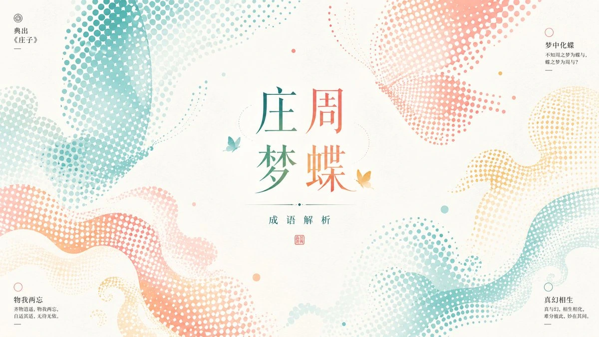
Complete AI image prompt
Build the first read around an expansive field of warm paper white held between oversized theme-derived forms that enter under strong crops from several edges. Translate every surrounding form through one precise circular halftone system: dot diameter and spacing change continuously with value, dense screens close into recognizable silhouettes, and lighter passages dissolve into sparse airborne dots. Let the subject determine whether these screened masses become curling bands, vortices and opposing arcs, or compressed silhouettes of its objects, environments, repeated figures and symbolic markers; they may continue beyond the frame, but must preserve a quiet open center. Establish dynamic equilibrium rather than fixed coordinates: unequal peripheral masses counterweight one another across generous emptiness, the eye enters through a dense screen, follows an arc or diagonal pulse, stops at the primary lettering, then exits through a thinning field. Keep secondary information on a light modular grid and allow one thematic mass to cross that order as a controlled break. Treat the central display lockup as a typographic monument occupying roughly half the visual authority of the image: use a small set of orthographically valid glyphs with an upright skeleton and pronounced stroke contrast, compacted into a square or concise linear unit, with alternating width, scale, or ink color creating the word rhythm. Pair it with much smaller, fine-stroked, widely tracked explanatory copy and tiny rules, dots, seals, or diagrammatic marks, creating a decisive jump in scale and density. Derive two to four clean flat inks from the subject's meaning and material associations; assign one cool family and one warm family to the opposing major masses, reserving any third hue for sparse links and cues. Permit restrained analogous shifts inside a screened form while keeping overlaps and color layers legible. Render an evenly bright matte paper field with flat screen-printed or duotone ink behavior, crisp circular dot edges, readable intervals, solid sharp lettering, and exact miniature marks. Create depth through screen scale, closure, occupied-to-empty contrast, and unequal warm-cool area rather than modeled illumination or volumetric shading. The subject supplies the message carried by the central type, the identifying contours of the edge masses, the repeating satellite symbols, the color source, and the information hierarchy, so image and lettering express one semantic system while the open paper remains an active zone of calm tension.
Original style prompt
Build the first read around an expansive field of warm paper white held between oversized theme-derived forms that enter under strong crops from several edges. Translate every surrounding form through one precise circular halftone system: dot diameter and spacing change continuously with value, dense screens close into recognizable silhouettes, and lighter passages dissolve into sparse airborne dots. Let the subject determine whether these screened masses become curling bands, vortices and opposing arcs, or compressed silhouettes of its objects, environments, repeated figures and symbolic markers; they may continue beyond the frame, but must preserve a quiet open center. Establish dynamic equilibrium rather than fixed coordinates: unequal peripheral masses counterweight one another across generous emptiness, the eye enters through a dense screen, follows an arc or diagonal pulse, stops at the primary lettering, then exits through a thinning field. Keep secondary information on a light modular grid and allow one thematic mass to cross that order as a controlled break. Treat the central display lockup as a typographic monument occupying roughly half the visual authority of the image: use a small set of orthographically valid glyphs with an upright skeleton and pronounced stroke contrast, compacted into a square or concise linear unit, with alternating width, scale, or ink color creating the word rhythm. Pair it with much smaller, fine-stroked, widely tracked explanatory copy and tiny rules, dots, seals, or diagrammatic marks, creating a decisive jump in scale and density. Derive two to four clean flat inks from the subject's meaning and material associations; assign one cool family and one warm family to the opposing major masses, reserving any third hue for sparse links and cues. Permit restrained analogous shifts inside a screened form while keeping overlaps and color layers legible. Render an evenly bright matte paper field with flat screen-printed or duotone ink behavior, crisp circular dot edges, readable intervals, solid sharp lettering, and exact miniature marks. Create depth through screen scale, closure, occupied-to-empty contrast, and unequal warm-cool area rather than modeled illumination or volumetric shading. The subject supplies the message carried by the central type, the identifying contours of the edge masses, the repeating satellite symbols, the color source, and the information hierarchy, so image and lettering express one semantic system while the open paper remains an active zone of calm tension.
More open images in the “Creator Covers & Editorial Images · Paper Texture · Bright · 273” style