

Open prompts
sample 01 AI Image Prompt
sample 01, its complete AI image prompt, and the Typography & Posters · X Archive · 256 style are free to view and copy.
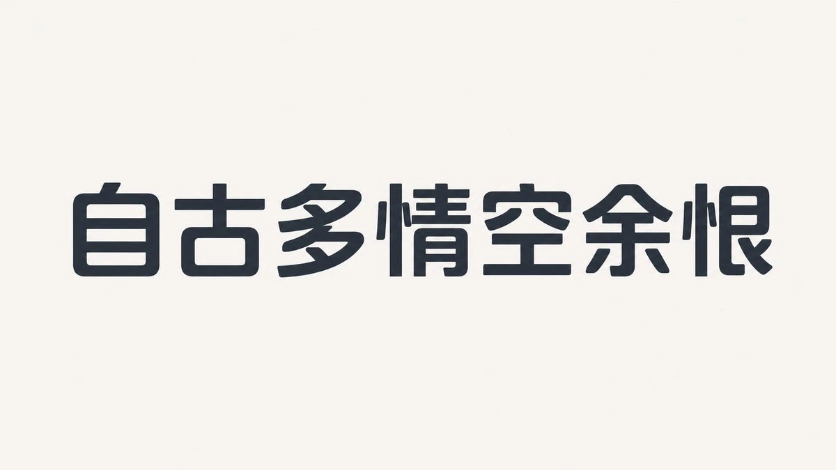
Complete AI image prompt
Make the subject’s core message the dominant image by constructing it as monumental custom lettering rather than an added headline. Preserve correct orthographic topology for the requested writing system while compressing the glyph proportions around a low-contrast sans-serif skeleton: tall upright stems, broad stabilizing horizontals, alternating narrow and wide components, selectively flattened or enlarged counters, clipped corners, short diagonal impulses, and tightened joins. Keep the characters optically level and closely spaced so the phrase reads as one forceful elongated mass. Govern the space through an extreme dominant-to-subordinate scale jump, with the main glyph group carrying roughly four times the visual weight of everything else; establish a clear axis, surround the letter mass with generous uninterrupted emptiness, and use tiny copy or symbols only as distant counterweights near edges and structural turns. The eye should enter through the heaviest glyph, travel along stroke direction and lines crossing open space, then resolve at the smallest information layer. Derive shared strokes, apertures, omissions, and contour turns from the subject’s meaning instead of attaching generic decoration. For a concise message, use near-black solid lettering on a warm, even matte light field, allowing minimal color and expansive emptiness to create a direct, restrained declaration with emotional pressure. For denser narrative content, switch the same glyph anatomy to a bright monoline outline over a quiet subject-derived environment; the scene contributes scale, atmosphere, and one symbolic focus while the lettering remains visually sovereign. Extend selected strokes into a continuous routing system that passes between glyphs and across open fields with consistent line weight, rounded bends, open terminals, filled dots, hollow rings, and small directional arrows. Let some paths escape the letter boundary and return, combining closed and incomplete contours into a legible circuit, and attach brief copy, numerals, or subject-specific symbols only at meaningful nodes. Let the subject determine hue families while preserving the role structure of one deep dominant field, one luminous structural color, and a very small warm focal accent; use dense flat dark ink over light grounds or crisp luminous outlines over dark environments so the value reversal always protects glyph priority. Maintain an even surface, sharp solid edges, continuous clean outlines, and progressive suppression of environmental detail outside the lettering, yielding a contemporary typographic language that feels disciplined, resilient, and driven by visible paths.
Original style prompt
Make the subject’s core message the dominant image by constructing it as monumental custom lettering rather than an added headline. Preserve correct orthographic topology for the requested writing system while compressing the glyph proportions around a low-contrast sans-serif skeleton: tall upright stems, broad stabilizing horizontals, alternating narrow and wide components, selectively flattened or enlarged counters, clipped corners, short diagonal impulses, and tightened joins. Keep the characters optically level and closely spaced so the phrase reads as one forceful elongated mass. Govern the space through an extreme dominant-to-subordinate scale jump, with the main glyph group carrying roughly four times the visual weight of everything else; establish a clear axis, surround the letter mass with generous uninterrupted emptiness, and use tiny copy or symbols only as distant counterweights near edges and structural turns. The eye should enter through the heaviest glyph, travel along stroke direction and lines crossing open space, then resolve at the smallest information layer. Derive shared strokes, apertures, omissions, and contour turns from the subject’s meaning instead of attaching generic decoration. For a concise message, use near-black solid lettering on a warm, even matte light field, allowing minimal color and expansive emptiness to create a direct, restrained declaration with emotional pressure. For denser narrative content, switch the same glyph anatomy to a bright monoline outline over a quiet subject-derived environment; the scene contributes scale, atmosphere, and one symbolic focus while the lettering remains visually sovereign. Extend selected strokes into a continuous routing system that passes between glyphs and across open fields with consistent line weight, rounded bends, open terminals, filled dots, hollow rings, and small directional arrows. Let some paths escape the letter boundary and return, combining closed and incomplete contours into a legible circuit, and attach brief copy, numerals, or subject-specific symbols only at meaningful nodes. Let the subject determine hue families while preserving the role structure of one deep dominant field, one luminous structural color, and a very small warm focal accent; use dense flat dark ink over light grounds or crisp luminous outlines over dark environments so the value reversal always protects glyph priority. Maintain an even surface, sharp solid edges, continuous clean outlines, and progressive suppression of environmental detail outside the lettering, yielding a contemporary typographic language that feels disciplined, resilient, and driven by visible paths.
More open images in the “Typography & Posters · X Archive · 256” style