

Open prompts
sample 01 AI Image Prompt
sample 01, its complete AI image prompt, and the Illustration & Visual Styles · Printmaking · Paper Texture · 009 style are free to view and copy.
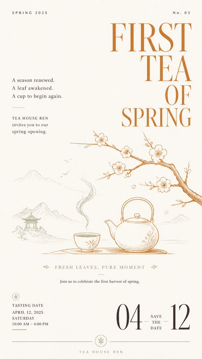
Complete AI image prompt
Make monumental high-contrast serif lettering the first read: tall narrow proportions, dramatic thick-to-thin modulation, sharp wedge serifs, taut terminals, and open counters, broken into two to five tightly led semantic lines. The display block may stack on a commanding axis or shift into an asymmetrical weight, yet it must outweigh all other elements and press against an expansive quiet field. Build a pronounced scale cascade from giant lettering to a finely drawn thematic scene, then to tiny editorial information; lead the eye from the title into the illustration and out through hairline rules, dots, compact emblems, and widely tracked marginal notes. Govern the space with a single-axis editorial grid and dynamic equilibrium: one dominant mass, a low-spreading subordinate scene, light peripheral annotations, generous unoccupied paper, and one controlled breach where a contour or branching line crosses an implied column. Let the subject's meaning determine every illustrated form, symbol, attachment, setting, and narrative cue rather than preserving any fixed object family. Draw it with the precision of copperplate etching and technical pen work: lucid contours, sparse parallel strokes, short hatching, and restrained solid fills; concentrate detail in the nearest semantic carrier, simplify distant forms, and create shallow legible depth through overlap, pathways, and diminishing scale. The scene may condense into a circular frame-within-frame miniature world or grow openly through the quiet field, with its boundary chosen by the subject while the dramatic contrast between huge type and intricate small drawing remains fixed. Use an even warm ivory uncoated-paper ground whose fine fibers register only at close viewing. Choose a deep cool or natural main ink from the subject's emotional register, then derive one warmer, brighter spot ink for selected display letters, focal objects, emblems, and a few rhythmic points; its tiny area must activate the whole field while linework and text retain a flat, translucent printed-ink clarity. Create calm luminosity through paper white, line density, and open intervals rather than theatrical illumination. Set supporting copy in small classical serif forms and widely tracked capitals with restrained sizes and exact baselines; when another writing system is required, preserve valid glyph topology, stroke contrast, terminal logic, spacing rhythm, and hierarchy. Keep every ornament semantically generated and structurally useful, with a continuously smooth paper field, crisp unbroken ink edges, and an alert, elegant, ceremonial editorial character.
Original style prompt
Make monumental high-contrast serif lettering the first read: tall narrow proportions, dramatic thick-to-thin modulation, sharp wedge serifs, taut terminals, and open counters, broken into two to five tightly led semantic lines. The display block may stack on a commanding axis or shift into an asymmetrical weight, yet it must outweigh all other elements and press against an expansive quiet field. Build a pronounced scale cascade from giant lettering to a finely drawn thematic scene, then to tiny editorial information; lead the eye from the title into the illustration and out through hairline rules, dots, compact emblems, and widely tracked marginal notes. Govern the space with a single-axis editorial grid and dynamic equilibrium: one dominant mass, a low-spreading subordinate scene, light peripheral annotations, generous unoccupied paper, and one controlled breach where a contour or branching line crosses an implied column. Let the subject's meaning determine every illustrated form, symbol, attachment, setting, and narrative cue rather than preserving any fixed object family. Draw it with the precision of copperplate etching and technical pen work: lucid contours, sparse parallel strokes, short hatching, and restrained solid fills; concentrate detail in the nearest semantic carrier, simplify distant forms, and create shallow legible depth through overlap, pathways, and diminishing scale. The scene may condense into a circular frame-within-frame miniature world or grow openly through the quiet field, with its boundary chosen by the subject while the dramatic contrast between huge type and intricate small drawing remains fixed. Use an even warm ivory uncoated-paper ground whose fine fibers register only at close viewing. Choose a deep cool or natural main ink from the subject's emotional register, then derive one warmer, brighter spot ink for selected display letters, focal objects, emblems, and a few rhythmic points; its tiny area must activate the whole field while linework and text retain a flat, translucent printed-ink clarity. Create calm luminosity through paper white, line density, and open intervals rather than theatrical illumination. Set supporting copy in small classical serif forms and widely tracked capitals with restrained sizes and exact baselines; when another writing system is required, preserve valid glyph topology, stroke contrast, terminal logic, spacing rhythm, and hierarchy. Keep every ornament semantically generated and structurally useful, with a continuously smooth paper field, crisp unbroken ink edges, and an alert, elegant, ceremonial editorial character.
More open images in the “Illustration & Visual Styles · Printmaking · Paper Texture · 009” style