

Open prompts
sample 02 AI Image Prompt
sample 02, its complete AI image prompt, and the Typography & Posters · Bright · 221 style are free to view and copy.
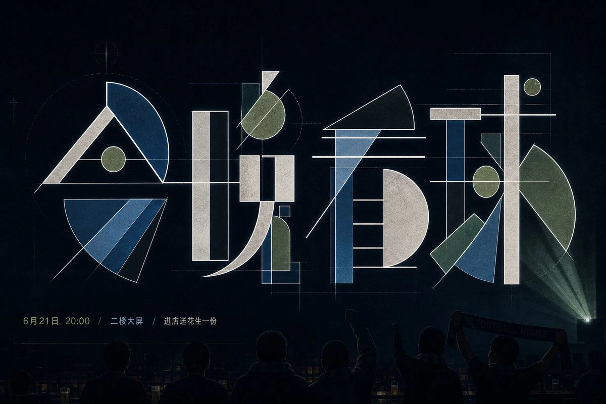
Complete AI image prompt
Make the theme lettering read first as monumental geometric glyphs caught in the act of being engineered. Preserve valid orthography and reading order in the chosen writing system while rebuilding principal strokes, turns, components, and counters from narrow rectangles, circles and semicircles, sectors, triangular wedges, curved bands, and bevel-cut slabs. Set heavy upright bones against fine acute parts with strong scale changes; let neighboring glyphs meet through extended crossbars, shared axes, or tangent arcs while keeping their defining counters and closures legible. Govern the group with a visible modular drafting grid: most pieces obey horizontal and vertical datums, while a few long diagonals and overshooting curves cross the modules to create dynamic equilibrium. The main letterforms carry nearly all visual weight, generous dark space isolates them, and tiny peripheral information acts as a distant counterweight; guide the eye along a baseline through staggered dots, diagonal cuts, and lines that bridge glyphs. Draw hairline warm-white construction geometry around the strokes—crosshair targets, dashed guide circles, endpoints, ticks, short dimension rules, and partial rectangular frames—each aligned to an actual tangent, center, boundary, or proportion of the letter construction, paced with deliberate changes in density rather than scattered as symbols. Use a matte ink-black to blue-black field, three or four muted theme-derived fill colors, warm paper white or pale gray for structural highlights, and one small warmer or brighter node accent. Derive hues from the theme’s emotional temperature, material associations, and symbolic logic while preserving the unequal balance of expansive darkness, restrained color blocks, and sparse bright points. Render the geometry as flat screen-printed ink; allow fine paper fibers to register evenly only within broad ink fields and the dark substrate, while construction lines and cut edges remain crisp and continuous. Keep illumination low and locally focused, suggesting a design specimen on a dark work surface or in a dim presentation space. Reduce one theme-derived object, identifying attachment, or environmental cue to a peripheral narrative anchor, allowing it to enter the edge and echo one fill color or construction line. Add micro-scale, widely tracked bilingual information, dates, indices, or functional notes whose content follows the theme and remains subordinate to the display glyphs. Maintain a restrained, analytical, experimental precision: photographic cues establish scale, while lettering, grid, color blocks, and information all obey the same geometric logic.
Original style prompt
Make the theme lettering read first as monumental geometric glyphs caught in the act of being engineered. Preserve valid orthography and reading order in the chosen writing system while rebuilding principal strokes, turns, components, and counters from narrow rectangles, circles and semicircles, sectors, triangular wedges, curved bands, and bevel-cut slabs. Set heavy upright bones against fine acute parts with strong scale changes; let neighboring glyphs meet through extended crossbars, shared axes, or tangent arcs while keeping their defining counters and closures legible. Govern the group with a visible modular drafting grid: most pieces obey horizontal and vertical datums, while a few long diagonals and overshooting curves cross the modules to create dynamic equilibrium. The main letterforms carry nearly all visual weight, generous dark space isolates them, and tiny peripheral information acts as a distant counterweight; guide the eye along a baseline through staggered dots, diagonal cuts, and lines that bridge glyphs. Draw hairline warm-white construction geometry around the strokes—crosshair targets, dashed guide circles, endpoints, ticks, short dimension rules, and partial rectangular frames—each aligned to an actual tangent, center, boundary, or proportion of the letter construction, paced with deliberate changes in density rather than scattered as symbols. Use a matte ink-black to blue-black field, three or four muted theme-derived fill colors, warm paper white or pale gray for structural highlights, and one small warmer or brighter node accent. Derive hues from the theme’s emotional temperature, material associations, and symbolic logic while preserving the unequal balance of expansive darkness, restrained color blocks, and sparse bright points. Render the geometry as flat screen-printed ink; allow fine paper fibers to register evenly only within broad ink fields and the dark substrate, while construction lines and cut edges remain crisp and continuous. Keep illumination low and locally focused, suggesting a design specimen on a dark work surface or in a dim presentation space. Reduce one theme-derived object, identifying attachment, or environmental cue to a peripheral narrative anchor, allowing it to enter the edge and echo one fill color or construction line. Add micro-scale, widely tracked bilingual information, dates, indices, or functional notes whose content follows the theme and remains subordinate to the display glyphs. Maintain a restrained, analytical, experimental precision: photographic cues establish scale, while lettering, grid, color blocks, and information all obey the same geometric logic.
More open images in the “Typography & Posters · Bright · 221” style