

Open prompts
sample 02 AI Image Prompt
sample 02, its complete AI image prompt, and the Typography & Posters · 3D · Minimal · 260 style are free to view and copy.
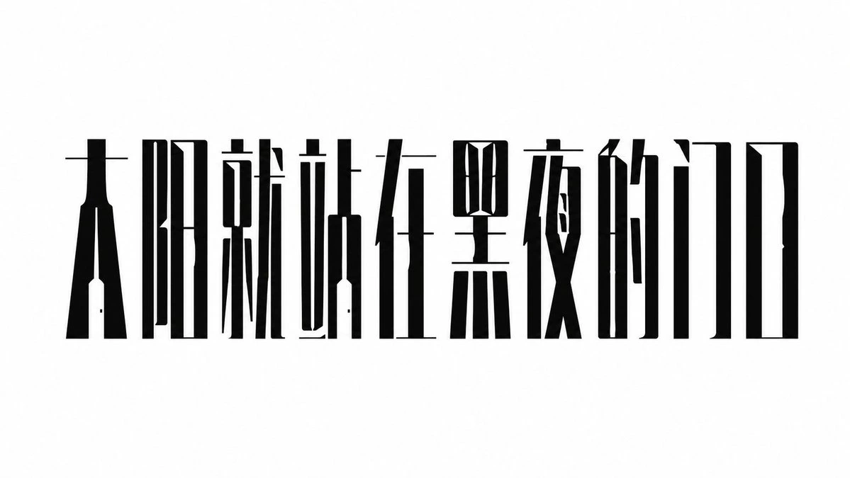
Complete AI image prompt
Make lettering read at once as language and as the subject image. Use the subject’s core wording as the dominant form, preserve valid topology and unmistakable recognition in the target writing system, then convert meaning into merged or omitted components, shared strokes, internal contours, and symbolic counters. The first read should be a continuous dark word silhouette; the eye then enters the cutout emblems and action points before returning to the full message. Build the line on a strong axis and continuous baseline, with the main lettering carrying nearly all visual weight. Pack glyphs tightly while narrow white channels keep character boundaries legible; allow controlled shifts from extremely condensed to moderately condensed widths while cap height and optical center remain disciplined. Let a few hairline horizontals bridge adjacent glyphs, and let selected components cross modules, nest, or share structure so proximity and closure turn the phrase into one engineered object. Contrast massive vertical stems with hairline horizontals and long slit counters. Alternate rectangular chambers, sharp notches, wedge terminals, curved incisions, and abrupt expansions of solid black. Subject-derived symbols replace only the decisive counter, joint, or descending node, retaining orthographic recognition while making every substitution carry semantic work. Choose one controlled surface family from the subject’s emotional and material associations: analytical or austere content uses flat black planes, exact geometric edges, and sharp white fracture cuts; visceral or forceful content uses authentic brush pressure, changing ink load, dry-brush lift at terminals, and outward gestures, with the symbol growing directly from a stroke or counter. Both families obey the same compression, interruption, negative-space, and semantic-fusion logic; when combined, one clearly dominates and the other acts only as a focal contrast. Set the lettering against an expansive, even paper-white or single pale field, using emptiness to isolate the dense structure. Keep the palette to a high-contrast dark subject, luminous ground, and one minute subject-derived accent reserved for a seal-like mark or semantic hinge. Push supporting information to the periphery at a sharply reduced scale with generous tracking, as a short column or light marker that corrects rhythm and balance. Keep the rendering flat, frontal, and depthless. Geometric ink areas remain continuous and crisp; brush fibers appear only where real stroke entry, turning, and release create them, while the surrounding field stays clear. Across any change of subject, preserve the defining event: condense the glyph skeleton, fracture its negative space, embed meaning inside its anatomy, and connect the phrase into one unified image-bearing structure.
Original style prompt
Make lettering read at once as language and as the subject image. Use the subject’s core wording as the dominant form, preserve valid topology and unmistakable recognition in the target writing system, then convert meaning into merged or omitted components, shared strokes, internal contours, and symbolic counters. The first read should be a continuous dark word silhouette; the eye then enters the cutout emblems and action points before returning to the full message. Build the line on a strong axis and continuous baseline, with the main lettering carrying nearly all visual weight. Pack glyphs tightly while narrow white channels keep character boundaries legible; allow controlled shifts from extremely condensed to moderately condensed widths while cap height and optical center remain disciplined. Let a few hairline horizontals bridge adjacent glyphs, and let selected components cross modules, nest, or share structure so proximity and closure turn the phrase into one engineered object. Contrast massive vertical stems with hairline horizontals and long slit counters. Alternate rectangular chambers, sharp notches, wedge terminals, curved incisions, and abrupt expansions of solid black. Subject-derived symbols replace only the decisive counter, joint, or descending node, retaining orthographic recognition while making every substitution carry semantic work. Choose one controlled surface family from the subject’s emotional and material associations: analytical or austere content uses flat black planes, exact geometric edges, and sharp white fracture cuts; visceral or forceful content uses authentic brush pressure, changing ink load, dry-brush lift at terminals, and outward gestures, with the symbol growing directly from a stroke or counter. Both families obey the same compression, interruption, negative-space, and semantic-fusion logic; when combined, one clearly dominates and the other acts only as a focal contrast. Set the lettering against an expansive, even paper-white or single pale field, using emptiness to isolate the dense structure. Keep the palette to a high-contrast dark subject, luminous ground, and one minute subject-derived accent reserved for a seal-like mark or semantic hinge. Push supporting information to the periphery at a sharply reduced scale with generous tracking, as a short column or light marker that corrects rhythm and balance. Keep the rendering flat, frontal, and depthless. Geometric ink areas remain continuous and crisp; brush fibers appear only where real stroke entry, turning, and release create them, while the surrounding field stays clear. Across any change of subject, preserve the defining event: condense the glyph skeleton, fracture its negative space, embed meaning inside its anatomy, and connect the phrase into one unified image-bearing structure.
More open images in the “Typography & Posters · 3D · Minimal · 260” style