

Open prompts
sample 02 AI Image Prompt
sample 02, its complete AI image prompt, and the Infographics & Visual Guides · Dark Tones · Bright · 141 style are free to view and copy.
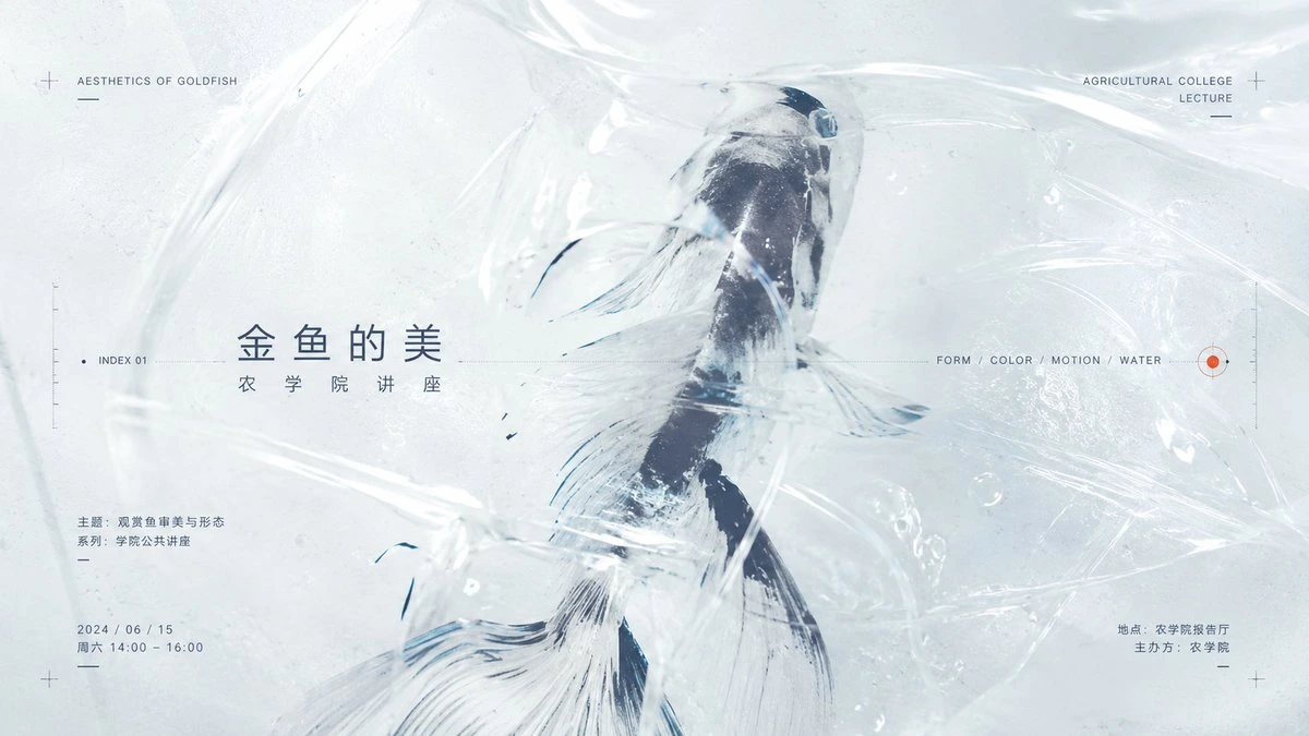
Complete AI image prompt
Reveal the theme’s primary subject through a physically convincing transparent medium: overlapping foreground membranes alternate between clinging and suspended folds, while waterlike or condensation-covered glass regions refract, enlarge, flatten, and soften selected passages, shifting the most recognizable contour between sharp visibility and partial concealment. Let the theme generate the central form, symbolic cues, points of contact, and narrative action; make the medium wrap, cross, or separate them according to their own material logic. Build a high-key field of cool white and palest cyan gray with roughly three quarters of the space left luminous and breathable. Anchor it with a small concentration of deep, cool tones sampled from the theme, then use a pin-sized warm signal mark as the only chromatic alert. Enveloping diffuse light passes through every clear layer, creating continuous highlights along folds, rounded specular points on droplets and bubbles, and readable depth within the dark forms. Organize the space as asymmetrical dynamic equilibrium: one expansive translucent field dominates, a compact dark subject cluster balances a distant group of tiny information marks, and the eye moves from the obscured subject along a fold, liquid current, or action axis toward a peripheral annotation. Allow the subject to break an implied editorial grid, while hairline rules, scales, coordinates, crosshairs, short dashes, index numbers, and micro-captions remain aligned to generous margins and structural axes, setting precise measurement against organic flow. Typography carries hierarchy rather than a fixed industry message: use a low-contrast modern sans serif with clear strokes and open tracking for display text; keep supporting copy extremely small and airy, mixing horizontal and vertical runs where the writing system permits, balancing multilingual scripts by optical weight, and connecting only a few labels to the subject with fine leader lines. Preserve controlled changes in the transparent edges, from crisp creases to naturally disappearing refracted boundaries; keep lettering and instrument-like details exact and restrained against an even, luminous background. The result should feel clean, cool, experimental, and quietly poetic, as if the theme were suspended between light, water, and clear film while retaining rigorous commercial information order.
Original style prompt
Reveal the theme’s primary subject through a physically convincing transparent medium: overlapping foreground membranes alternate between clinging and suspended folds, while waterlike or condensation-covered glass regions refract, enlarge, flatten, and soften selected passages, shifting the most recognizable contour between sharp visibility and partial concealment. Let the theme generate the central form, symbolic cues, points of contact, and narrative action; make the medium wrap, cross, or separate them according to their own material logic. Build a high-key field of cool white and palest cyan gray with roughly three quarters of the space left luminous and breathable. Anchor it with a small concentration of deep, cool tones sampled from the theme, then use a pin-sized warm signal mark as the only chromatic alert. Enveloping diffuse light passes through every clear layer, creating continuous highlights along folds, rounded specular points on droplets and bubbles, and readable depth within the dark forms. Organize the space as asymmetrical dynamic equilibrium: one expansive translucent field dominates, a compact dark subject cluster balances a distant group of tiny information marks, and the eye moves from the obscured subject along a fold, liquid current, or action axis toward a peripheral annotation. Allow the subject to break an implied editorial grid, while hairline rules, scales, coordinates, crosshairs, short dashes, index numbers, and micro-captions remain aligned to generous margins and structural axes, setting precise measurement against organic flow. Typography carries hierarchy rather than a fixed industry message: use a low-contrast modern sans serif with clear strokes and open tracking for display text; keep supporting copy extremely small and airy, mixing horizontal and vertical runs where the writing system permits, balancing multilingual scripts by optical weight, and connecting only a few labels to the subject with fine leader lines. Preserve controlled changes in the transparent edges, from crisp creases to naturally disappearing refracted boundaries; keep lettering and instrument-like details exact and restrained against an even, luminous background. The result should feel clean, cool, experimental, and quietly poetic, as if the theme were suspended between light, water, and clear film while retaining rigorous commercial information order.
More open images in the “Infographics & Visual Guides · Dark Tones · Bright · 141” style