

Open prompts
sample 02 AI Image Prompt
sample 02, its complete AI image prompt, and the Photo Restyling · Paper Cut · Vector · 204 style are free to view and copy.
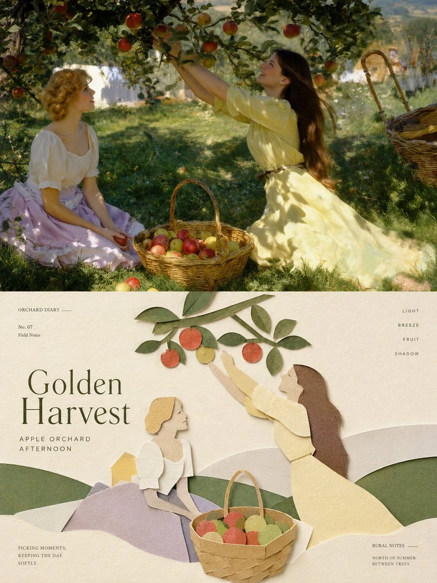
Complete AI image prompt
Stage one subject as a paired perceptual event: a fully resolved lifestyle photograph establishes its literal world, then an adjoining editorial field reconstructs the same subject through layered paper shapes and reduced graphic logic. In the photographic field, preserve a credible place, an intimate human scale, natural directional light, atmospheric depth, tactile materials, and only the props needed to imply a lived moment. Cross a clean, decisive boundary into a broad warm-ivory paper ground. Carry over the semantic focus, gesture, viewing direction, distinctive attachments, and color relationships, but do not trace incidental detail: enlarge the highest-recognition silhouette into the dominant shape, simplify the scene into roughly three to five overlapping depth tiers, and translate people, objects, architecture, foliage, or terrain into complete cut forms. Use broad curved bands to carry spatial recession; let a few theme-derived branches, petals, implements, pathways, rails, or symbolic marks cross quiet space and steer the eye. Build the illustration from intact matte color areas, restrained angular breaks, and gentle organic curves, with precisely hand-cut edges. Create shallow relief only through narrow contact shadows, slight paper thickness, and localized pressed seams between overlapping pieces, while exposed paper remains even and finely finished. Govern the whole with two strongly related fields: the literal scene and the graphic interpretation carry comparable visual weight, while one major illustrated form outweighs its supporting elements; generous emptiness counterbalances the concentrated subject asymmetrically. Lead the gaze from the photographic focal point through the division into its corresponding illustrated contour, then return it through a theme-generated branch, route, railing, or color band toward the information layer. Derive the palette from the subject’s own environment, materials, symbolism, and emotional temperature: warm paper white is the largest field, supported by two to four low- or medium-chroma colors and one small, lucid accent. Keep the photograph naturally color-balanced; compress those same relationships below into matte papers and flat ink, reserving the darkest value for structural contours, hair, architecture, or typographic anchors. Introduce a sharp hierarchy jump in the lettering: one concise title acts as a major visual mass, using either high-contrast serif construction, restrained geometric sans construction, or structurally valid native letterforms suited to the requested writing system, with open spacing, recognizable counters, lawful joins, and legible stroke topology. Scatter tiny captions, numbering, locational notes, and short rules near the margins as a field-guide index, creating an airy counter-rhythm to the title; all wording and script come from the subject. The finished system should feel warm, composed, contemporary, and humane, with vivid photographic light calibrated against quiet paper order, so the two fields remain instantly recognizable as the same idea while each retains a complete visual logic.


——————
Create one standalone premium poster per uploaded photo; no multi-image collage. Use a 3:4 portrait canvas divided into two strictly equal-height sections, each exactly 50%. In the upper half, preserve the original photograph’s subject structure, authentic texture, natural light, and original color atmosphere, applying only subtle editorial-grade color correction. Extend sky, ground, or surroundings naturally if necessary, but never stretch, distort, or alter the subject. In the lower half, reinterpret the most recognizable subject, silhouette, pose, and narrative relationship as a minimalist handcrafted layered paper-cut and paper-sculpture collage. Use one core subject as the anchor, simplifying its essential silhouette, proportions, and structure through folding, cutting, layering, and overlap rather than literal detail. Select only a few environmental relationships from the source and convert them into foreground, middle-ground, and background paper layers. Establish hierarchy through scale, compositional axes, positive/negative space, front-to-back overlap, and generous emptiness. Keep the subject immediately recognizable and editorially restrained. Derive a limited harmonious paper palette from the upper photo’s most distinctive, energetic colors: warm ivory or light paper as the base, one dominant hue, one darker structural tone, lighter layering tones, and only a tiny accent. Use refined matte cardstock, visible fibers, crisp cut edges, soft contact shadows, and naturally diffused light that reveals folded thickness and handmade tactility. Avoid plastic 3D, cheap craft paper, neon, and complex gradients. Build a complete editorial micro-typography system: one short main title based on identity, location, action, material, mood, or symbolism, plus 2–4 groups of microcopy selected from subject/object names, location, numbering, chapter markers, serial numbers, coordinate-like numerals, directional or status words, material descriptors, category labels, or one extremely short poetic note. Use no years or dates. Compose type with the paper art: follow layer edges, contours, axes, or negative space; set it horizontal, vertical, rotated, widely tracked, edge-aligned, corner-anchored, crossing blocks, embedded between layers, or partially obscured. The title may become paper-cut or folded lettering; supporting type stays thin, restrained, and contemporary. Use strong contrasts of size, direction, and orientation to guide reading. The result should feel clean, elegant, tactile, contemporary, refined, and collectible. Maintain one primary subject, few layers, generous negative space, and precise micro-type. Avoid childish crafts, excessive stacking, duplicated subjects, e-commerce presentation, and templates.
Original style prompt
Stage one subject as a paired perceptual event: a fully resolved lifestyle photograph establishes its literal world, then an adjoining editorial field reconstructs the same subject through layered paper shapes and reduced graphic logic. In the photographic field, preserve a credible place, an intimate human scale, natural directional light, atmospheric depth, tactile materials, and only the props needed to imply a lived moment. Cross a clean, decisive boundary into a broad warm-ivory paper ground. Carry over the semantic focus, gesture, viewing direction, distinctive attachments, and color relationships, but do not trace incidental detail: enlarge the highest-recognition silhouette into the dominant shape, simplify the scene into roughly three to five overlapping depth tiers, and translate people, objects, architecture, foliage, or terrain into complete cut forms. Use broad curved bands to carry spatial recession; let a few theme-derived branches, petals, implements, pathways, rails, or symbolic marks cross quiet space and steer the eye. Build the illustration from intact matte color areas, restrained angular breaks, and gentle organic curves, with precisely hand-cut edges. Create shallow relief only through narrow contact shadows, slight paper thickness, and localized pressed seams between overlapping pieces, while exposed paper remains even and finely finished. Govern the whole with two strongly related fields: the literal scene and the graphic interpretation carry comparable visual weight, while one major illustrated form outweighs its supporting elements; generous emptiness counterbalances the concentrated subject asymmetrically. Lead the gaze from the photographic focal point through the division into its corresponding illustrated contour, then return it through a theme-generated branch, route, railing, or color band toward the information layer. Derive the palette from the subject’s own environment, materials, symbolism, and emotional temperature: warm paper white is the largest field, supported by two to four low- or medium-chroma colors and one small, lucid accent. Keep the photograph naturally color-balanced; compress those same relationships below into matte papers and flat ink, reserving the darkest value for structural contours, hair, architecture, or typographic anchors. Introduce a sharp hierarchy jump in the lettering: one concise title acts as a major visual mass, using either high-contrast serif construction, restrained geometric sans construction, or structurally valid native letterforms suited to the requested writing system, with open spacing, recognizable counters, lawful joins, and legible stroke topology. Scatter tiny captions, numbering, locational notes, and short rules near the margins as a field-guide index, creating an airy counter-rhythm to the title; all wording and script come from the subject. The finished system should feel warm, composed, contemporary, and humane, with vivid photographic light calibrated against quiet paper order, so the two fields remain instantly recognizable as the same idea while each retains a complete visual logic.
More open images in the “Photo Restyling · Paper Cut · Vector · 204” style