



Open prompts
sample 02 AI Image Prompt
sample 02, its complete AI image prompt, and the Typography & Posters · Paper Texture · 247 style are free to view and copy.
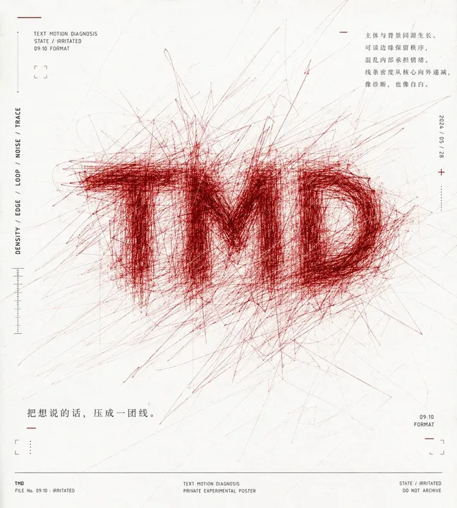
Complete AI image prompt
Build the first-read focal form from the theme’s most recognizable word, phrase, or symbol, using accumulated linework as the lettering substance. Establish an orthographically valid skeleton for the chosen writing system—credible proportions, component relationships, counters, joins, and apertures—then retrace every stroke and contour with hundreds of hairline hand-drawn paths carrying slight pressure variation. Pack the paths most densely along stems, turns, connections, and counter edges until they approach a solid dark value; use localized loops, displacement, crossings, and shared strokes to stitch adjacent glyphs into one continuously agitated body while preserving enough positive and negative shape for distant recognition. Let every glyph-building line escape its skeleton: tight tangles remain near the contour, longer angular paths, arcs, and abrupt directional changes radiate outward, progressively thinning and lightening with distance, with a few trajectories touching or continuing beyond the frame so the form reads as sustained vibration and repeated displacement. Set this dominant linear event against an expansive warm pale paper field, giving it overwhelming visual weight and ample breathing room. Balance the monumental central mass dynamically against a sparse perimeter information layer: the eye should strike the dense lettering first, travel outward along the escaping paths, then be caught again by small marginal nodes. Use limited-ink logic. Let paper white or a theme-derived near-neutral control most of the field; derive one saturated warm or alert hue from the theme’s emotional temperature for all principal paths and a few marks, and reserve charcoal-black for microcopy and scales. Generate value solely through repeated line density to retain a flat graphic character. Along the perimeter, construct a restrained editorial-diagnostic system of tiny captions, identifiers, timestamps, short rules, crosses, corner brackets, hairline dividers, scales, and density bars, separated by generous intervals and disciplined through strict alignment, wide tracking, and light line weight. Let theme content supply their status, measurement, annotation, and narrative functions, keeping them a precise counterpressure to the focal mass. Finish with an even matte paper surface, clearly resolved hairline edges, natural darkening where the principal paths overlap, and sharply controlled peripheral information, sustaining the contradiction between an orderly archival framework and uncontrolled writing energy.
More open images in the “Typography & Posters · Paper Texture · 247” style